
By Dr. Denis G. Rancourt, Dr. Marine Baudin, and Dr. Jérémie Mercier
Global Research, October 26, 2021
All Global Research articles can be read in 51 languages by activating the “Translate Website” drop down menu on the top banner of our home page (Desktop version).
Visit and follow us on Instagram at @crg_globalresearch.
***
Abstract
We investigate why the USA, unlike Canada and Western European countries, has a sustained exceedingly large mortality in the “COVID-era” occurring from March 2020 to present (October 2021). All-cause mortality by time is the most reliable data for detecting true catastrophic events causing death, and for gauging the population-level impact of any surge in deaths from any cause.
The behaviour of the USA all-cause mortality by time (week, year), by age group, by sex, and by state is contrary to pandemic behaviour caused by a new respiratory disease virus for which there is no prior natural immunity in the population. Its seasonal structure (summer maxima), age-group distribution (young residents), and large state-wise heterogeneity are unprecedented and are opposite to viral respiratory disease behaviour, pandemic or not. We conclude that a pandemic did not occur.
We infer that persistent chronic psychological stress induced by the long-lasting government-imposed societal and economic transformations during the COVID-era converted the existing societal (poverty), public-health (obesity) and hot-climate risk factors into deadly agents, largely acting together, with devastating population-level consequences against large pools of vulnerable and disadvantaged residents of the USA, far above preexisting pre-COVID-era mortality in those pools.
We also find a large COVID-era USA pneumonia epidemic that is not mentioned in the media or significantly in the scientific literature, which was not adequately addressed. Many COVID-19-assigned deaths may be misdiagnosed bacterial pneumonia deaths. The massive vaccination campaign (380 M administered doses, 178 M fully vaccinated individuals, mainly January-August 2021 and March-August 2021, respectively) had no detectable mitigating effect, and may have contributed to making the younger population more vulnerable (35-64 years, summer-2021 mortality).
***
Table of Contents
Abstract
Summary
List of figures
Table of abbreviations and definitions
1. Introduction
2. Data and methods
3. Results, analysis and discussion
3.1. All-cause mortality per year, USA, 1900-2020
3.2. ACM by week (ACM/w), USA, 2013-2021
3.3. ACM by week (ACM/w), USA, 2013-2021, by state
3.4. Late June 2021 heatwave event in ACM/w for Oregon and Washington
3.5. ACM-SB/w normalized by population (ACM-SB/w/pop), by state
3.6. ACM-SB by cycle-year (winter burden, WB) by population (WB/pop), USA and state-to-state variations
3.7. Geographical distribution and correlations between COVID-era above-SB seasonal deaths: cvp1 (spring 2020), smp1 (summer 2020), and cvp2 (fall-winter 2020-2021)
3.8. Associations for COVID-era mortality outcomes with socio-geo-economic and climatic variables
- Obesity
- Poverty
- Climatic temperature
- Obesity, poverty, and climatic temperature
- Age structure of the population
- Population density
- All-cause mortality by week (ACM/w) by age group
- Comparing all-cause excess mortality and COVID-assigned mortality
- Vaccination
4. Comparison with Canada, and implications
5. Mechanistic causes for COVID-era deaths
6. Conclusion
7. References
Appendix: ACM/w 2013-2021, with color-differentiated cycle-years, for all the individual states of continental USA
***
About the Authors
Dr. Denis Rancourt is a former tenured Full Professor of Physics, University of Ottawa, Canada. During his 23-year career as a university professor, he taught over 2000 students in Science, Engineering, and Arts. He supervised more than 80 junior researchers including post-doctoral fellows, graduate students, and undergraduate researchers with over 100 research publications in leading peer-reviewed scientific journals in physics, chemistry, geology, bio-geochemistry, measurement science, soil science, and environmental science.
Dr. Marine Baudin is an independent French researcher. She got her PhD in microbiology within CentraleSupélec and École Normale Supérieure Paris-Saclay in 2017. She also holds a Magister in Biology and Biotechnology from University Paris-Saclayduring which she was trained at Pasteur Institute (Paris, France), at Institute of Medical and Biological Engineering(University of Leeds, UK) and at Institute of Food Research (Norwich, UK).
Dr. Jérémie Mercier is a French researcher and health educator. He was a normalien in chemistry at École Normale Supérieure deLyon and holds a PhD in environnemental research from Imperial College London (2011). Concerned with the “Covid-crisis”, he’s conducted multiple interviews of physicians and independent researchers to understand the ins and outs ofthe situation. This paper is the 3rd he co-publishes with Denis Rancourt and Marine Baudin.
Summary
We studied all-cause mortality (ACM) by time (week, year) 2013-2021 for the USA, resolved by state, or by age group, in relation to several socio-geo-economic and climatic variables (poverty, obesity, climatic temperature, population density, geographical region, and summer heatwaves).
We calculate “excess” mortality, by calendar-year or (summer to summer) cycle-year or selected ranges of weeks, as the week-by-week ACM above a summer baseline (SB) ACM, which has a monotonic and linear variation on the decadal timescale, 2013-2019, extrapolated into 2021.
Unlike Canada and Western European countries, the USA has a dramatic anomalous increase in both ACM by year and “excess” ACM by year in 2020 and 2021, which started immediately following the World Health Organization (WHO) 11 March 2020 declaration of a pandemic. Nothing of this magnitude occurs in other nations. The USA’s yearly mortality in 2020-2021 is equal to (2020) and greater than (2021) the mortality by year occurring in its domestic population just after the Second World War.
Regarding geo-temporal variations in ACM by week (ACM/w) and in excess (above‑SB) ACM by week (ACM-SB/w), we find that there are two distinct periods: the “COVID‑era” (March 2020 to present), and the “pre-COVID-era” (prior to March 2020). Normal epidemiological variations occur in the pre-COVID-era, as has been observed for more than a century, in all mid-latitude Northern hemisphere jurisdictions having reliable data; whereas there is unprecedented state-wise jurisdictional and regional geographical heterogeneity in ACM by time in the COVID-era, which is contrary to theoretical pandemic behaviour caused by a new virus for which there is no prior natural immunity in the population.
COVID-era time-integrated seasonal and yearly features of ACM-SB/w significantly correlate with poverty (PV), obesity (OB), and climatic temperature (Tav), by state; and differ by age group. The correlations account for the state-to-state heterogeneity, with notable outliers in one feature (March-June 2020) of the ACM-SB/w; and such correlations do not occur in pre-COVID-era cycle-year excess mortality. The co-associations of excess deaths with PV, OB and Tav occur only in the COVID-era. We show that normal (pre-COVID) excess (winter season) deaths — largely attributed to viral respiratory diseases occurring in the elderly — occur irrespective of PV, OB and climate, and that there is solely a correlation to age structure of the population in the state.
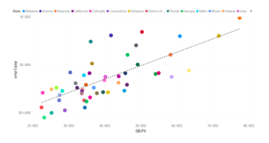
An example of a co-correlation is the relation between the summer-2020 excess mortality normalized by population (smp1/pop) and the product of OB and PV (OB.PV), state-by-state (see article for details):
A similar large excess of deaths occurred in the summer 2021, which is also strongly co‑correlated with poverty, obesity and regional climate. In addition, we showed that these 2020 and 2021 summer mortalities and massive fall-winter-2020-2021 mortality, unlike with viral respiratory disease deaths, occur in younger people, over broad age categories.
In the correlations that we identified, the 2020 and 2021 summer excess (above-SB) mortalities extend to zero values for sufficiently small values of poverty, obesity or summer temperatures, or their combinations, such as the product of poverty and obesity.
We also found, for example, that the onset of the COVID-era is associated with an increase in deaths of 15-34 year olds to a new plateau in ACM/w (approximately 400 more deaths per week), which does not return to normal over the period studied.
The behaviour of all-cause mortality in the COVID-era is irreconcilable with a pandemic caused by a new virus for which there is no prior natural immunity in the population.
On the contrary, we concluded that the COVID-era deaths are of two types:
- A large narrow peak (in ACM/w) occurring immediately after the WHO declaration of a pandemic apparently caused by the aggressive novel government and medical responses that were applied in certain specific state jurisdictions, against sick elderly populations (34 states do not significantly exhibit this feature).
- Summer-2020, fall-winter-2020-2021, and summer-2021 peaks and excesses (in ACM/w), which co-correlate with poverty, obesity and regional climate, presumably caused by chronic psychological stress induced by the government and medical responses, which massively disrupted lives and society, and affected broad age groups, as young as 15 year olds.
Therefore, a pandemic did not occur; but an unprecedented systemic aggression against large pools of vulnerable and disadvantaged residents of the USA did occur. We interpret that the persistent chronic psychological stress induced by the societal and economic transformation of the COVID-era converted the existing societal (poverty), public-health (obesity) and hot-climate risk factors into deadly agents, largely acting together, with devastating population-level consequences, far beyond the deaths that would have occurred from the pre-COVID-era background of preexisting risk factors.
Scroll down for Introduction
List of figures
Figure 1. All-cause mortality by calendar-year in the USA from 1900 to 2020
Figure 2a. All-cause mortality by year in the USA for the 1-4, 5-14, 15-24 and 25-34 years age groups, from 1900 to 2016
Figure 2b. All-cause mortality by year in the USA for the 35-44 and 45-54 years age groups, from 1900 to 2016
Figure 2c. All-cause mortality by year in the USA for the 55-64, 65-74, 75-84 and 85+ years age groups, from 1900 to 2016
Figure 3a. Population of the USA from 1900 to 2020
Figure 3b. Population of the USA by age group from 1900 to 2016
Figure 4a. All-cause mortality by year normalized by population for the USA from 1900 to 2020
Figure 4b. All-cause mortality by year normalized by population for the USA for the 15-24 years age group, for each of both sexes, from 1900 to 1997
Figure 4c. All-cause mortality by year normalized by population for the USA for the 25-34 years age group, for each of both sexes, from 1900 to 1997
Figure 5. All-cause mortality by week in the USA from 2013 to 2021
Figure 6. Difference between all-cause mortality and summer baseline mortality for the USA from 2013 to 2021
Figure 7. Difference between all-cause mortality and summer baseline mortality for the USA from 2018 to 2021
Figure 8. Map of COVID-era features pattern in the USA
Figure 9a. Difference between all-cause mortality and summer baseline mortality by week normalized by population for Connecticut, Maryland, Massachusetts, New Jersey and New York from 2013 to 2021
Figure 9b(i). Difference between all-cause mortality and summer baseline mortality by week normalized by population for Colorado, Illinois, Indiana, Michigan and Pennsylvania from 2013 to 2021
Figure 9b(ii). Difference between all-cause mortality and summer baseline mortality by week normalized by population for Colorado, Illinois, Indiana, Michigan and Pennsylvania from 2019 to 2021
Figure 9c. Difference between all-cause mortality and summer baseline mortality by week normalized by population for Iowa, Kansas, Missouri, Montana, Nebraska, North Dakota, Oklahoma and South Dakota from 2013 to 2021
Figure 9d. Difference between all-cause mortality and summer baseline mortality by week normalized by population for Idaho, Nevada, New Mexico, Utah and Wyoming from 2013 to 2021
Figure 9e. Difference between all-cause mortality and summer baseline mortality by week normalized by population for Oregon and Washington from 2013 to 2021
Figure 9f. Difference between all-cause mortality and summer baseline mortality by week normalized by population for California and Georgia from 2013 to 2021
Figure 9g. Difference between all-cause mortality and summer baseline mortality by week normalized by population for Arizona, Florida, Mississippi, South Carolina and Texas from 2013 to 2021
Figure 9h(i). Difference between all-cause mortality and summer baseline mortality by week normalized by population for Louisiana and Michigan from 2013 to 2021
Figure 9h(ii). Difference between all-cause mortality and summer baseline mortality by week normalized by population for Louisiana and Michigan from 2019 to 2021
Figure 10a. Difference between all-cause mortality and summer baseline mortality by week normalized by population for California, Florida, Michigan, Nevada, New York and South Dakota from 2013 to 2021
Figure 10b. Difference between all-cause mortality and summer baseline mortality by week normalized by population for California, Florida, Michigan, Nevada, New York and South Dakota from 2013 to 2019
Figure 10c. Difference between all-cause mortality and summer baseline mortality by week normalized by population for California, Florida, Michigan, Nevada, New York and South Dakota from 2019 to 2021
Figure 11a. Difference between all-cause mortality and summer baseline mortality by week normalized by population for Colorado, Connecticut, Illinois, Louisiana, New Jersey and New York from 2013 to 2021
Figure 11b. Difference between all-cause mortality and summer baseline mortality by week normalized by population for Colorado, Connecticut, Illinois, Louisiana, New Jersey and New York from 2013 to 2019
Figure 11c. Difference between all-cause mortality and summer baseline mortality by week normalized by population for Colorado, Connecticut, Illinois, Louisiana, New Jersey and New York from 2019 to 2021
Figure 12a. Winter burden normalized by population in the USA for cycle-years 2014 to 2021
Figure 12b. Winter burden normalized by population for each of the continental states of the USA for cycle-years 2014 to 2021
Figure 12c. Winter burden normalized by population in Alabama, Arizona, Florida, Louisiana, Mississippi, South Carolina and Texas for cycle-years 2014 to 2021
Figure 12d. Winter burden normalized by population in Connecticut, Maryland, Massachusetts, New Jersey and New York for cycle-years 2014 to 2021
Figure 13. Frequency distributions of state-to-state values of WB/pop for each cycle-year, 2014-2021
Figure 14. Statistical parameters of the WB/pop distributions of the 49 continental states of the USA for cycle-years 2014 to 2021
Figure 15. Map of the intensity of the cvp1 mortality normalized by population for the continental USA
Figure 16. Map of the intensity of the smp1 mortality normalized by population for the continental USA
Figure 17a. smp1/pop versus cvp1/pop
Figure 17b. cvp2/pop versus cvp1/pop
Figure 17c. cvp2/pop versus smp1/pop
Figure 17d. smp2/pop versus smp1/pop
Figure 18. cvp2/pop versus smp1/pop, with the radius size determined by cvp1/pop
Figure 19a. cvp1/pop versus obesity
Figure 19b. smp1/pop versus obesity
Figure 19c. cvp2/pop versus obesity
Figure 19d. WB/pop for cycle-year 2019 versus obesity
Figure 19e. WB/pop for COVID-era cycle-year 2020 versus obesity
Figure 19f. WB/pop for COVID-era cycle-year 2021 versus obesity
Figure 20a. cvp1/pop versus poverty
Figure 20b. smp1/pop versus poverty
Figure 20c. cvp2/pop versus poverty
Figure 20d. WB/pop for cycle-year 2019 versus poverty
Figure 20e. WB/pop for COVID-era cycle-year 2020 versus poverty
Figure 20f. WB/pop for COVID-era cycle-year 2021 versus poverty
Figure 21. Mean daily average temperature: Mean of daily minimum and maximum, averaged over the year, and for three decades (1970-2000)
Figure 22. Average temperature, per state of the continental USA, for August 2020
Figure 23. smp1/pop versus average daily maximum temperature over July and August 2020, Tmax Jul-Aug 2020
Figure 24. Obesity versus poverty
Figure 25. smp1/pop versus the product of obesity and poverty, with the radius size determined by Tmax Jul-Aug 2020
Figure 26. Tav 2020 versus the product of obesity and poverty, with the radius size determined by smp1/pop
Figure 27a. WB/pop versus 85+/pop for cycle-year 2014
Figure 27b. WB/pop versus 85+/pop for cycle-year 2015
Figure 27c. WB/pop versus 85+/pop for cycle-year 2016
Figure 27d. WB/pop versus 85+/pop for cycle-year 2017
Figure 27e. WB/pop versus 85+/pop for cycle-year 2018
Figure 27f. WB/pop versus 85+/pop for cycle-year 2019
Figure 28a. cvp1/pop versus 85+/pop
Figure 28b. smp1/pop versus 85+/pop
Figure 28c. cvp2/pop versus 85+/pop
Figure 28d. WB/pop versus 85+/pop for cycle-year 2020
Figure 28e. WB/pop versus 85+/pop for cycle-year 2021
Figure 29a. WB/pop for cycle-year 2014 versus population density
Figure 29b. WB/pop for cycle-year 2015 versus population density
Figure 29c. WB/pop for cycle-year 2016 versus population density
Figure 29d. WB/pop for cycle-year 2017 versus population density
Figure 29e. WB/pop for cycle-year 2018 versus population density
Figure 29f. WB/pop for cycle-year 2019 versus population density
Figure 30a. cvp1/pop versus population density
Figure 30b. smp1/pop versus population density
Figure 30c. cvp2/pop versus population density
Figure 30d. WB/pop for cycle-year 2020 versus population density
Figure 30e. WB/pop for cycle-year 2021 versus population density
Figure 31. All-cause mortality by week, fully vaccinated individuals by day and COVID vaccine doses administered by day, in the USA, from 2020 to 2021
Figure 32a. All-cause mortality by week in the USA for the 18-64 and 65+ years age groups, from 2014 to 2021
Figure 32b. Difference in all-cause mortality by week in the USA between the 65+ years and the rescaled 18-64 years age groups, from 2014 to 2021
Figure 33a. All-cause mortality by week normalized by population for the USA for the 14 years and less age group, for each of both sexes, from 2020 to 2021
Figure 33b. All-cause mortality by week for the USA for the 15-34 years age group, both sexes, from 2020 to 2021
Figure 33c. All-cause mortality by week normalized by population for the USA for females of the 15-34 years age group, from 2020 to 2021
Figure 33d. All-cause mortality by week for the USA for the 35-54 years age group, both sexes, from 2020 to 2021
Figure 33e. All-cause mortality by week normalized by population for the USA for females of the 35-54 years age group, from 2020 to 2021
Figure 33f. All-cause mortality by week normalized by population for the USA for the 55-64 years age group, for each of both sexes, from 2020 to 2021
Figure 33g. All-cause mortality by week normalized by population for the USA for the 65-74 years age group, for each of both sexes, from 2020 to 2021
Figure 33h. All-cause mortality by week normalized by population for the USA for the 75-84 years age group, for each of both sexes, from 2020 to 2021
Figure 33i. All-cause mortality by week normalized by population for the USA for the age group 85 years and older, for each of both sexes, from 2020 to 2021
Figures 34a. All-cause, COVID-19, influenza, pneumonia and PIC mortality by week for the USA from 2014 to 2021
Figure 34b. All-cause, COVID-19, influenza, pneumonia and PIC mortality by week for the USA from 2019 to 2021
Figure 34c. All-cause above-SB, COVID-19, influenza, pneumonia and PIC mortality by week for the USA from 2014 to 2021
Figure 34d. All-cause above-SB, COVID-19, influenza, pneumonia and PIC mortality by week for the USA from 2019 to 2021
Figure 34e. All-cause above-SB, COVID-19, influenza, pneumonia‑pSB and PIC-pSB mortality by week for the USA from 2014 to 2021
Figure 34f. All-cause above-SB, COVID-19, influenza, pneumonia‑pSB and PIC-pSB mortality by week for the USA from 2019 to 2021
Figure 34g. All-cause above-SB, COVID-19, influenza, pneumonia‑pSB and ACM-SB minus PIC-pSB mortality by week for the USA from 2014 to 2021
Figure 34h. All-cause above-SB, COVID-19, influenza, pneumonia‑pSB and ACM-SB minus PIC-pSB mortality by week for the USA from 2019 to 2021
Figure 34i. All-cause above-SB, COVID-19, influenza and pneumonia‑pSB mortality by week, and the ratio of COVID-19 deaths with pneumonia to all COVID-19 deaths by week, for the USA in the COVID-era (March-2020 into 2021)
Figure 35. All-cause mortality by week in Canada from 2010 to 2021
Figure 36a. All-cause mortality by cycle-year for Canada, cycle-years 2011 to 2021
Figure 36b. Winter burden for Canada for cycle-years 2011 to 2021
Figure 37. All-cause mortality by calendar-year, calendar-years 2010 to 2020, shown with all-cause mortality by cycle-year, cycle-years 2011 to 2021, for Canada
Figure 38a. Map of life expectancy at birth for USA states, from census tracts 2010-2015
Figure 38b. Antibiotic prescriptions per 1,000 persons by state (sextiles) for all ages, United States, 2019
Figure 39. Estimated number of outpatients with dispensed antibiotic prescriptions, USA, 2019-2020
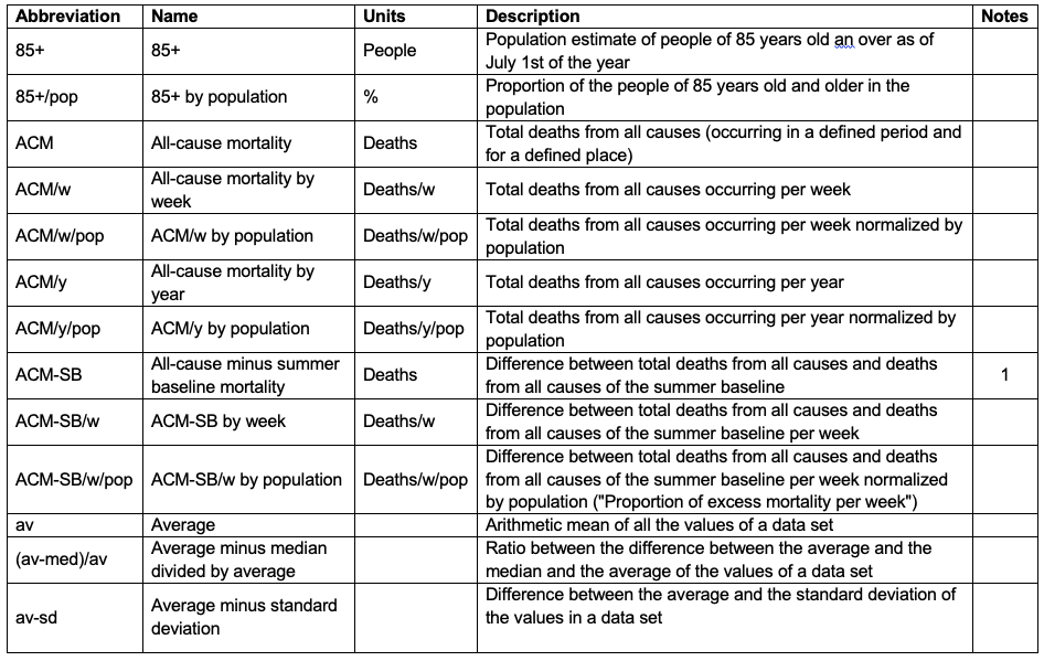
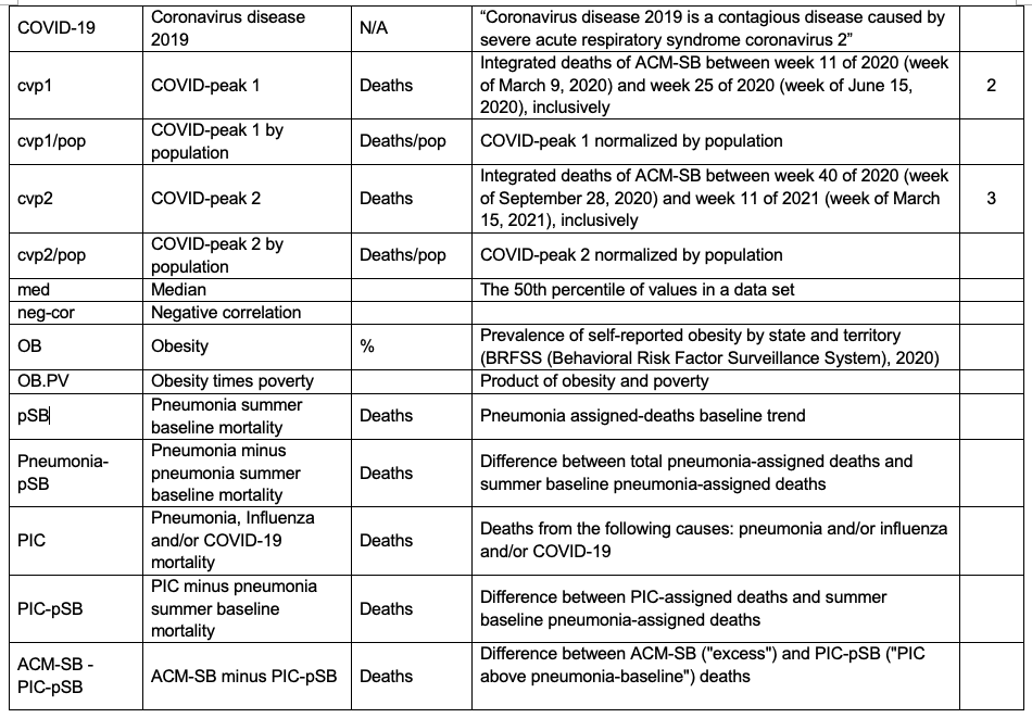
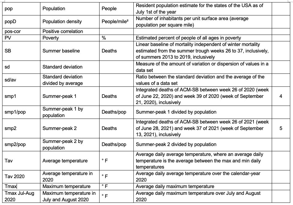
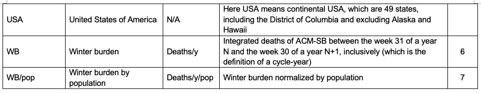
Table of abbreviations and definitions
1 Also called “all-cause above-SB” or “excess” deaths in the text
2 Also called “March-June 2020 peak” or “covid peak” or “spring-2020 peak” or “spring-2020 excess mortality” in the text
3 Also called “fall-winter-2020-2021 excess mortality” in the text
4 Also called “summer-2020 excess mortality” in the text
5 Also called “summer-2021 excess mortality” in the text
6 If a year is placed in front, it means it’s the WB of this cycle-year
7 If a year is placed in front, it means it’s the WB/pop of this cycle-year
N/A stands for not applicable
1. Introduction
A small but growing number of researchers are recognizing that it is essential to examine all-cause mortality (ACM), and excess deaths from all causes compared with projections from historic trends, to make sense of the events surrounding COVID-19 (Jacobson and Jokela, 2021) (Kontopantelis et al., 2021) (Rancourt, 2020) (Rancourt et al., 2020) (Rancourt et al., 2021) (Woolf et al., 2021).
In our prior analyses of ACM by time (by day, week, month, year) for many countries (and by province, state, region or county), we showed that the data in the COVID-era (March 2020 to present) is inconsistent with a viral respiratory disease pandemic, in that the mortality is highly heterogeneous between jurisdictions, with no anomalies in most places, and hot spots or hot regions with deaths that are synchronous with aggressive local or regional responses, both medical and governmental (Rancourt, 2020) (Rancourt et al., 2020) (Rancourt et al., 2021).
The surges in all-cause deaths are highly localized geographically (by jurisdiction) and in time, which is contrary to pandemic behaviour; but is consistent with the surges being caused by the known government and medical responses (Rancourt, 2020) (Rancourt et al., 2020) (Rancourt et al., 2021).
In particular, Canada shows no evidence of a pandemic, since ACM by year (ACM/y) in the COVID-era is squarely on the linear trend of the previous decade. In addition, the ACM by week (ACM/w) data for Canada shows large province-level heterogeneity of temporal and seasonal changes in ACM, by sex and by age group, that must be ascribed to the impacts of medical and governmental measures (Rancourt et al., 2021).
We have also extensively studied ACM by time (day, month, year) for France, at many jurisdictional levels (regions, departments, communes), in comparison to high-resolution data for institutional occupancies and drug use (Rancourt et al., 2020) (and unpublished), and examined data for European countries, to various degrees of detail.
We reported on the USA in our prior articles about ACM, concentrating on the spectacular hot-spot anomalies that occurred in March through May 2020 (Rancourt, 2020) (Rancourt et al., 2020). Here, we extend our analysis for the USA, up to presently available data, and include socio-geo-economic and climatic data.
The ACM data for the USA in the COVID-era has shocking features, unlike anything else in the world. The USA is unique in this regard. Above-decadal-trend deaths in the COVID-era are massive. Nothing like this occurs in neighbouring Canada. Nothing like this occurs in Western European countries. Similar surges occur in Eastern European countries, but are not of the same large magnitudes as in the USA.
Our goal was to describe the most that can be rigorously inferred from ACM by time, jurisdiction, age group, and sex, in order to elucidate the nature of the massive excess mortality that occurred in the USA in the COVID-era, and delimit its likely causes, with an eye to known mechanisms of disease vulnerability (psychoneuroimmunology, and stress-immune-survival relationships for humans). Therefore, we examined socio-geo-economic data, including:
- Age structure of the population
- Population density
- Racial considerations
- Obesity
- Poverty (also median household income)
- Climatic temperatures
- Vaccination status (COVID-19 and flu vaccines)
- Antibiotic prescription rates
2. Data and methods
Table 1 describes data used in this work and the sources of the data.
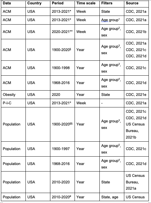
Table 1. Data retrieved. USA means continental USA, composed of 49 states, including the District of Columbia and excluding Alaska and Hawaii, unless otherwise stated in the text.
*At the date of access, data were available from week-40 of 2013 to week-40 of 2021. Usable data are until week-37 of 2021, due to insufficient data in later weeks, which gives a large artifact (anomalous drop in mortality, see Appendix). For the work on USA at the state level, we could add the missing weeks of 2013 (week-1 of 2013 to week-39 of 2020) thanks to a previously downloaded file (downloaded on June 24, 2020) from the same website (CDC, 2021a), which was including those weeks back then.
**At the date of access, data were available from week-1 of 2020 (week ending on January 4, 2020) to week-40 of 2021 (week ending on October 9, 2021). Usable data are until week-37 of 2021 (week ending on September 18, 2021), due to insufficient data in later weeks, which gives a large artifact (anomalous drop in mortality).
***At the date of access, data were available until August 2021.
- These data are a combination of the data found in CDC 2021a, CDC 2021c and CDC 2021d.
- § These data are a combination of the data found in CDC 2021c, CDC 2021d and US Census Bureau 2021b.
#In our work, we use the population data of the year 2020 (census estimate).
##In our work, we use the population density data of the year 2020.
+At the date of access, data were available from December 14, 2020 (week-51 of 2020) to September 27, 2021 (week-39 of 2021).
++At the date of access, data were available from week-1 of 2010 (week ending on January 9, 2010) to week-30 of 2021 (week ending on July 31, 2021). Usable data are until week-20 of 2021 (week ending on May 22, 2021) due to not consolidated data in later weeks, which gives a large artifact (anomalous drop in mortality).
13 age groups: <18, 18-64, 65+
211 age groups: <1, 1-4, 5-14, 15-24, 25-34, 35-44, 45-54, 55-64, 65-74, 75-84, 85+
312 age groups: <1, 1-4, 5-14, 15-24, 25-34, 35-44, 45-54, 55-64, 65-74, 75-84, 85+, unknown
414 age groups: <1, 1-4, 5-9, 10-14, 15-19, 20-24, 25-34, 35-44, 45-54, 55-64, 65-74, 75-84, 85+, not stated
519 age groups: <1, 1-4, 5-9, 10-14, 15-19, 20-24, 25-29, 30-34, 35-39, 40-44, 45-49, 50-54, 55-59, 60-64, 65-69, 70-74, 75-79, 80-84, 85+
686 age groups: by 1 year age group, from 0 to 85+
7Temperatures are not available for the District of Columbia.
StatCan (2021) defines a death as “the permanent disappearance of all evidence of life at any time after a live birth has taken place” and excludes stillbirths. StatCan specifies that the ACM for 2020 and 2021 is provisional and subject to change, and that the counts of deaths “have been rounded to a neighbouring multiple of 5 to meet the confidentiality requirements of the Statistics Act”.
According to CDC (CDC, 2021a):
- “[…] pneumonia, influenza and/or COVID-19 (PIC) deaths are identified based on ICD-10 multiple cause of death codes.”
- “NCHS Mortality Surveillance System data are presented by the week the death occurred at the national, state, and HHS Region levels, based on the state of residence of the decedent.”
- “Not all deaths are reported within a week of death therefore data for earlier weeks are continually revised and the proportion of deaths due to P&I or PIC may increase or decrease as new and updated death certificate data are received by NCHS.”
- “The COVID-19 death counts reported by NCHS and presented here are provisional and will not match counts in other sources, such as media reports or numbers from county health departments. COVID-19 deaths may be classified or defined differently in various reporting and surveillance systems. Death counts reported by NCHS include deaths that have COVID-19 listed as a cause of death and may include laboratory confirmed COVID-19 deaths and clinically confirmed COVID-19 deaths. Provisional death counts reported by NCHS track approximately 1-2 weeks behind other published data sources on the number of COVID-19 deaths in the U.S. These reasons may partly account for differences between NCHS reported death counts and death counts reported in other sources.”
- “In previous seasons, the NCHS surveillance data were used to calculate the percent of all deaths occurring each week that had pneumonia and/or influenza (P&I) listed as a cause of death. Because of the ongoing COVID-19 pandemic, COVID-19 coded deaths were added to P&I to create the PIC (pneumonia, influenza, and/or COVID-19) classification. PIC includes all deaths with pneumonia, influenza, and/or COVID-19 listed on the death certificate. Because many influenza deaths and many COVID-19 deaths have pneumonia included on the death certificate, P&I no longer measures the impact of influenza in the same way that it has in the past. This is because the proportion of pneumonia deaths associated with influenza is now influenced by COVID-19-related pneumonia. The PIC percentage and the number of influenza and number of COVID-19 deaths will be presented in order to help better understand the impact of these viruses on mortality and the relative contribution of each virus to PIC mortality.”
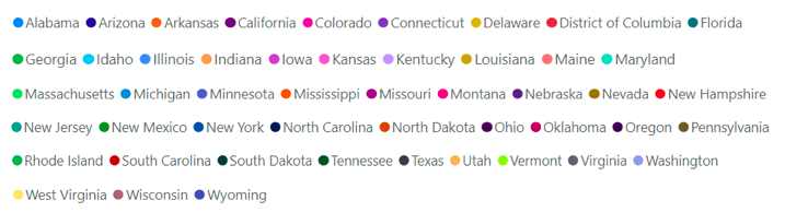
For all the scatter plots presented in this article, the following colour-code is applied for the 49 continental states of the USA (including District of Columbia, excluding Alaska and Hawaii).
The main points of our methodology are as follows.
We work with all-cause mortality (ACM), deaths from all causes, in order to avoid the uncertainty and bias in attributing a cause of death, in this context of COVID-19 in which cause of death is not simple nor obvious. ACM data is available by jurisdiction (state, country, county), by age group, by race, by sex, and by time (day, week, year). We can normalize group-specific ACM totals by the respective populations of the relevant groups, in order to allow comparisons between jurisdictions or different groups, on a per-population basis.
Generally, in jurisdictions that exhibit seasonal winter maximums of mortality, the bottom-values of mortality in the summer troughs follow a straight-line trend on a decadal or shorter timescale. We call this trend-line the “summer baseline” (SB), and we use it to count above-SB deaths, when we wish to thus quantify “excess deaths”.
In other words, we are following our previous methodology in which we argued that mortality by time (day, week, month) is best analyzed using a SB, and winter burden (WB) deaths above the SB, over a (natural) cycle-year from summer to following summer, rather than use assumed underlying sinusoidal seasonal variations of any presumed component(s), since such sinusoidal theoretical curves fail to represent the data or any of its inferred principle components (e.g., Simonsen et al., 1997). Although the summer trough mortality values follow a linear local trend by time (in normal, pre-COVID-era, circumstances), above-SB features have significant randomness in their season to season variations, suggesting that summer baseline mortality is representative of “stable” mortality not influenced by the many different and seasonally variable winter-time life-threatening health challenges (Rancourt, 2020) (Rancourt et al., 2020) (Rancourt et al., 2021).
SB estimation at the state level
The linear summer baseline (SB) is a least-squares fit to the summer troughs for summer-2013 through summer-2019, using the summer trough weeks 27 to 36, included, for all the states of the continental USA, except for Alabama and Wisconsin for summer-2014 and summer-2015, respectively, and corrected by 1 % (see below). For Alabama, only the weeks [30-32] were used for summer-2014 as drops in data are seen for weeks [27-29] and weeks [33-36] of 2014 (see Appendix). For Wisconsin, only the weeks [27-29] and [33-36] were used for summer-2015 as a drop in data is seen for weeks [30-32] of 2015 (see Appendix). We corrected the SB by 1 % so as to lower the SB and make it match the bottoms of the summer troughs. We also estimated the SB taking different summer periods, from the shortest to the largest: weeks [30-32], weeks [29-33], weeks [28-35] and weeks [27-36], to determine our 1 % correction. We found that the larger the period, the better the estimate of the SB slope, but also the higher the estimate of the SB intercept, as the last weeks towards the previous winter season and the first weeks towards the next winter season are included. We thus decided to estimate the SB with the largest summer period (weeks [26-37]) and lower the intercept by 1 % (no correction leading to a too high intercept and a correction factor of 2 % leading to a too low intercept). The SB is so estimated between the weeks 26 and 37 (inclusively) of each summer of the pre-COVID-era (summers 2013 to 2019), which corresponds to the weeks laying from the beginning of July to the beginning of September.
SB estimation at the national level
- For work involving the states, the SB estimate of the USA is a sum of the SB estimates of each individual state.
- For work not involving the states, the SB is a least-squares fit to the summer troughs for summer-2014 through summer-2019, using the summer trough weeks 27 to 36, included, for the whole USA (including Alaska and Hawaii) with no correction, since none was needed.
In the same way that we thus quantify a winter burden of deaths in a given cycle-year, we can also quantify an excess (above-SB) of deaths over any period of time, such as over a period that captures any prominent features in ACM by time. We defined such periods of interest occurring in the COVID-era: a spring-2020 peak (cvp1), summer‑2020 (smp1), the fall-winter-2020-2021 maximum (cvp2), and summer-2021 (smp2), as specified in the text.
3. Results, analysis and discussion
3.1. All-cause mortality per year, USA, 1900-2020
We start by examining ACM/y (per calendar-year) in the USA, for the years 1900 through 2020. This is shown in Figure 1.
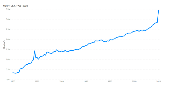
Figure 1. All-cause mortality by calendar-year in the USA from 1900 to 2020. Data were retrieved as described in Table 1.
The ACM/y 1900-2020 has the following main features. First, it has a generally increasing trend over the entire period, with a slope of approximately 16K deaths per year per year (16K/y/y) in the region 1920-2010. The overall increasing trend is due to population growth. One needs to normalize by population to remove this dominant effect (see below). Second, there is a large increase in 1918, which corresponds to the so-called “1918 Flu Pandemic”. Third, there is a large increase in 2020, which corresponds to the first year of the COVID-era. Fourth, there are notable increases in the late-1920s and mid-1930s, which correspond to the hardships associated with The Great Depression and the accompanying decade-long Dust Bowl droughts of the Midwest. Fifth (by omission), there are no detected increases that would correspond to any of the major 20th-21st century influenza pandemics that are described to have occurred in 1957-58, 1968, and 2009 (Doshi, 2008) (Doshi, 2011).
These main features in ACM/y are clarified and enhanced on examining ACM/y by age group (available for 1900-2016). This is shown for all the ages, excluding <1 year, divided into 10 age groups in Figure 2.
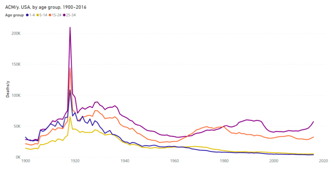
Figure 2a. All-cause mortality by year in the USA for the 1-4, 5-14, 15-24 and 25-34 years age groups, from 1900 to 2016. Data are displayed per calendar-year. Data were retrieved as described in Table 1.
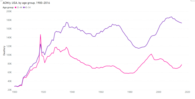
Figure 2b. All-cause mortality by year in the USA for the 35-44 and 45-54 years age groups, from 1900 to 2016.Data are displayed per calendar-year. Data were retrieved as described in Table 1.
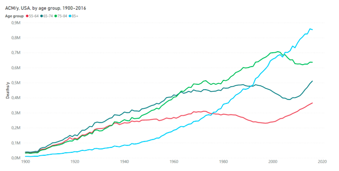
Figure 2c. All-cause mortality by year in the USA for the 55-64, 65-74, 75-84 and 85+ years age groups, from 1900 to 2016. Data are displayed per calendar-year. Data were retrieved as described in Table 1.
The ACM/y 1900-2016 by age-group data allows the following observations to be made.
Regarding 1918, the event was devastating for the age groups 15-24 years and 25-34 years, much less so for the age groups 35-44 years and 45-54 years, and virtually undetected for those 55 years and older, which would be very surprising for influenza. In fact, we know that most of the deaths were associated with massive bacterial lung infections (Morens et al., 2008) (Chien et al., 2009) (Sheng et al., 2011), in an era predating antibiotics, in a period massively perturbed by a world war, and that the event was concomitant with typhoid epidemics in Europe and Russia.
Regarding The Great Depression and the Dust Bowl devastation, the late-1920s and mid-1930s increases in ACM/y are prominent for the 15-24, 25-34, 35-44 and 45-54 years age groups, but are not detected for 55 year olds and older.
Regarding 20th-21st century purported influenza pandemics, there is no trace of increased mortality for 1957-58, 1968, and 2009, in any age group, including the older age groups of 55-64, 65-74, 75-84, and 85+ years. Clearly, these 20th century declared pandemics had negligible impacts on all-cause mortality; not comparable to the large impacts of the events of 1918, late-1920s-mid-1930s, <1945, and 2020, which are associated with major socio-economic upheavals (the First World War, The Great Depression and Dust Bowl, the Second World War, and the medical and government response to the declared COVID-19 pandemic, respectively).
The ACM/y by age group has long-period (decadal) variations with notable broad minima occurring at approximately:
~1975-1980: 35-44 years age group
~1985-1990: 45-54 years age group
~1995-2000: 55-64 years age group
~2005-2010: 65-74 years age group
~2010-2015: 75-84 years age group
These variations are due to the post Second World War baby boom effects on population.
The population of the USA varied from 1900 to 2020 as shown in Figure 3 (and from 1900 to 2016 for the age groups).
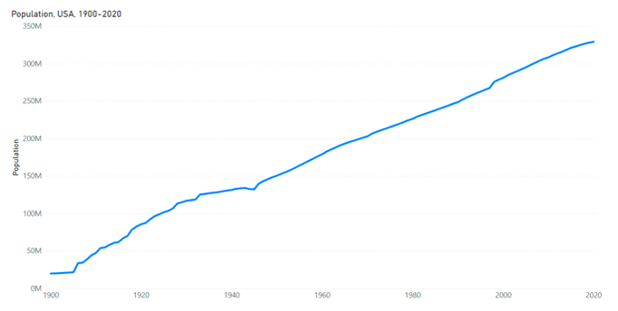
Figure 3a. Population of the USA from 1900 to 2020. Data are displayed per calendar-year. Data were retrieved as described in Table 1.
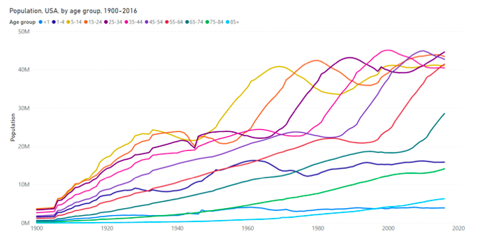
Figure 3b. Population of the USA by age group from 1900 to 2016. Data are displayed per calendar-year. Data were retrieved as described in Table 1.
Here (Figure 3a), we see a large dip in population at 1943-1945, related to the Second World War. The slope to population versus time also changes dramatically at 1943-1945, increasing after the war, in accordance with the known baby boom. The population by age group (Figure 3b) confirms that the dip at 1943-1945 is solely from the 15-24 and 25-34 years age groups, especially 15-24 years. This figure (Figure 3b) also shows the dramatic consequences of the baby boom, showing itself, age group after age group, as the baby boomers age. The monotonic increase in the 85+ years population (Figure 3b) is directly the cause of the monotonic increase in 85+ years deaths (Figure 2c).
Next, we normalize ACM/y (Figure 1) by population (Figure 3a), 1900-2020, to obtain ACM/y/pop shown in Figure 4a.
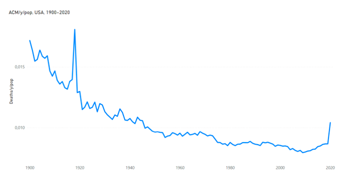
Figure 4a. All-cause mortality by year normalized by population for the USA from 1900 to 2020. Data are displayed per calendar-year. Data were retrieved as described in Table 1.
This allows us to see ACM/y expressed as a fraction of population. We again see the gigantic catastrophe that was the 1918 event (pneumonia/typhoid, wartime upheaval), peaks in the late-1920s and mid-1930s (Great Depression, Dust Bowl), a peak in the Second World War period (young men, 15-24 and 25-34 years age groups, as per Figure 3b), relatively uneventful mortality after 1945 (no public health catastrophes detected), no sign of the announced pandemics of 1957-58, 1968, and 2009, and the COVID-era increase of 2020 (a subject of this article).
The mortality events of the late 1920s, mid-1930s and <1945, and the >1945 uneventful period, are elucidated further by examining ACM/y/pop resolved by age group and by sex, as per the following.
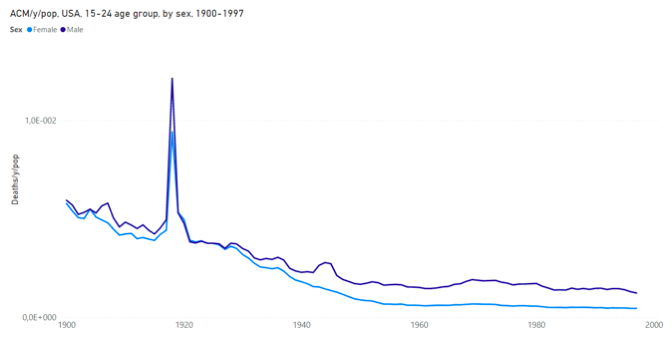
Figure 4b. All-cause mortality by year normalized by population for the USA for the 15-24 years age group, for each of both sexes, from 1900 to 1997. The population of the specific age group and sex is used for each normalization. Data are displayed per calendar-year. Data were retrieved as described in Table 1.
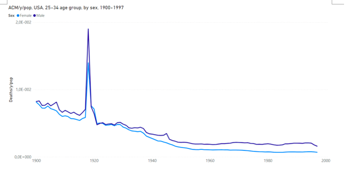
Figure 4c. All-cause mortality by year normalized by population for the USA for the 25-34 years age group, for each of both sexes, from 1900 to 1997. The population of the specific age group and sex is used for each normalization. Data are displayed per calendar-year. Data were retrieved as described in Table 1.
Figures 4b and 4c show that both young men and women were impacted by the hardships of the late-1920s and mid-1930s, but that only young men were impacted to death by the Second World War. Interestingly, 15-24 year old men had relatively high mortality between the mid-1960s and the early-1980s.
The 2020 value of ACM/y/pop brings us back to a mortality equal to the mortality by population that prevailed in 1945 (Figure 4a), which suggests that the socio-economic upheavals from COVID-19 response are comparable to the upheavals from the last major war period, with an albeit much older population presently, and possibly greater class disparity, since The New Deal had already been implemented in 1945, in response to the hardships of the 1930s.
3.2. ACM by week (ACM/w), USA, 2013-2021
The ACM/w for the USA from 2013 to 2021 is shown in Figure 5, with a straight-line trend for the bottoms of the summer troughs for 2013 through 2019 (of the pre-COVID-era). We call this trend-line the “summer baseline” (SB), and we use it to count above-SB deaths (“excess” deaths).
We are following our previous methodology in which we argued that mortality by time (day, week, month) is best analyzed using a SB, and winter burden deaths (WB) above the SB, over a (natural) cycle-year from summer to following summer, rather than use assumed underlying sinusoidal seasonal variations of any presumed component(s), since such sinusoidal theoretical curves fail to represent the data or any of its inferred principle components (e.g., Simonsen et al., 1997). It is a general feature with seasonal mortality data that SB trends are typically linear on the timescale of one decade or so, whereas above-SB features have significant randomness in their season to season variations, suggesting that summer baseline mortality is representative of “stable” mortality not influenced by the many different and seasonally variable winter-time life-threatening health challenges (Rancourt, 2020) (Rancourt et al., 2020) (Rancourt et al., 2021).
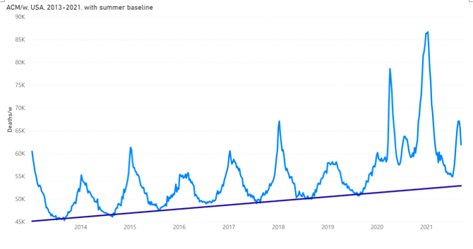
Figure 5. All-cause mortality by week in the USA from 2013 to 2021. Data are displayed from week-1 of 2013 to week-37 of 2021. The linear summer baseline (SB) is a least-squares fit to the summer troughs for summer-2013 through summer-2019, using the summer trough weeks 27 to 36, included, except for Alabama and Wisconsin for summer-2014 and summer-2015, respectively, and corrected by 1 % (see section 2). Data were retrieved from CDC (CDC, 2021a), as described in Table 1.
Next, for the sake of visualization, we can remove the SB from the ACM, week by week, to obtain ACM-SB/w. This is shown for the USA from 2013 to 2021, in Figure 6, where we have used different colours for the different cycle-years.
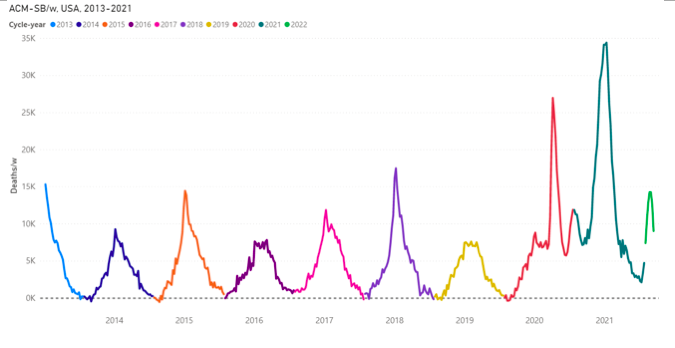
Figure 6. Difference between all-cause mortality and summer baseline mortality for the USA from 2013 to 2021. Data are displayed from week-1 of 2013 to week-37 of 2021. The different colours are for the different cycle-years. The cycle-year starts on week-31 of a calendar-year (beginning of August) and ends on week-30 of the next calendar-year (end of July). ACM data were retrieved from CDC (CDC, 2021a), as described in Table 1. SB was estimated as described in section 2.
Many striking features occur in ACM/w (or ACM-SB/w) in the COVID-era period for the USA (Figures 5 and 6):
- The WB (total above-SB deaths per cycle-year) is much greater in cycle-years 2020 (summer-2019 to summer-2020) and 2021 (summer-2020 to summer-2021) than in cycle years 2014 through 2019, which is consistent with ACM/y already discussed above (Figures 1 and 4).
- The 2020 cycle-year exhibits a sharp and intense feature spanning weeks 11 through 25 of 2020, starting when the pandemic was declared by the World Health Organization (WHO) on 11 March 2020, lasting three months, and which we have called “the COVID peak” and amply described in our previous articles (Rancourt, 2020) (Rancourt et al., 2020) (Rancourt et al., 2021). In this article, we refer to this feature and its integrated intensity as “cvp1”.
- There is “no summer”, in terms of lower mortality, in the summer-2020. The ACM/w does not descend down to the SB. In fact, the summer of 2020 exhibits a broad mid-summer peak in ACM/w, spanning weeks 26 through 39 of 2020 (approximately mid-June to mid-September), which is unprecedented in any ACM by time data that we have examined, for data since 1900 for dozens of countries and hundreds of jurisdictions. In this article, we refer to this feature and its integrated intensity as “smp1”.
- The 2021 cycle-year exhibits a massive peak, spanning from week-40 of 2020 through to week-11 of 2021 (approximately late-September 2020 to mid-March 2021). The peak extends to 35K deaths per week above SB. It is anticipated that the ACM/y for 2021 will be larger than for 2020, which in turn brought us back to mortality of the magnitude that was occurring just after the Second World War, on a per population basis (Figure 4a). In this article, we refer to this winter 2020-2021 feature and its integrated intensity as “cvp2”.
- Finally, there is a summer-2021 upsurge of mortality (ACM/w) in the last weeks of the usable data set, starting in mid-July 2021. This upsurge in ACM/w is particularly large for Florida, for example. We refer to this feature as “smp2”, which is interrupted by the end of the data set (week-37 of 2021 for consolidated data, as described in section 2).
To be clear, the three uninterrupted prominent features in the USA ACM/w for the COVID-era (cvp1, smp1, and cvp2) are shown, according to their operational definitions in Figure 7. For each feature, its quantification is achieved by summation of ACM-SB/w over the weeks spanned by the feature. The late-summer-2021 feature “smp2” is also indicated.

Figure 7. Difference between all-cause mortality and summer baseline mortality for the USA from 2018 to 2021. Data are displayed from week-1 of 2018 to week-37 of 2021. The cvp1, smp1, cvp2 and smp2 features discussed in the text are indicated. The light-blue vertical lines represent the weeks 11, 25, 40 of 2020 and 11 of 2021, emphasizing the delimiting weeks of the cvp1, smp1 and cvp2 features. The constant zero line is in black. ACM data were retrieved from CDC (CDC, 2021a), as described in Table 1. SB was estimated as described in section 2.
Although these features in USA ACM (cvp1, smp1, cvp2, smp2; highlighted in Figure 7) are unprecedented in recent decades and are shocking in themselves; an equally striking aspect is only seen on examining ACM/w (or ACM-SB/w) by state, for individual states. The later examination shows (below) that the said features in the COVID-era, unlike anything previously observed in epidemiology, are often dramatically different, in both relative and absolute magnitudes, and in shape and position, in going from state to state. The next section is devoted to illustrating this remarkable state-to-state variability in COVID‑era ACM by time.
3.3. ACM by week (ACM/w), USA, 2013-2021, by state
Graphs of ACM/w, from 2013 to 2021, with colour-differentiated cycle-years, for all the individual states of continental USA (excluding Alaska and Hawaii) are shown in Appendix (attached below).
In these graphs (Appendix), note that the pre‑COVID-era seasonal pattern (2013-2019) is essentially identical from state to state (more on this further below), whereas there are large state to state changes in the COVID-era patterns. This concurs with our previous findings that COVID-era behaviour in ACM by time is abnormally heterogeneous on a jurisdictional basis, which is the opposite of past seasonal epidemiological behaviour (Rancourt, 2020) (Rancourt et al., 2020) (Rancourt et al., 2021). Woolf et al. (2021) also report large USA regional differences in all-cause excess mortality by time patterns during the COVID-era.
Some comparative and systematic features in these curves (Appendix) are as follows.
- L0M / North-Easterly coastal states: Several of the North-Easterly coastal states exhibit a pattern in cvp1‑smp1‑cvp2 (an “L0M” pattern) in which cvp1 is very large, smp1 is essentially zero (ACM/w comes down to the SB values) and cvp2 is of medium magnitude: New York, New Jersey, Connecticut, Massachusetts and Rhode Island, and Maryland and District of Columbia to some degree.
- LSL / North-Central-Easterly non-coastal states: A group of neighbouring North-Central-Easterly non-coastal states exhibit a pattern in cvp1‑smp1‑cvp2 (an “LSL” pattern) in which cvp1 is large, smp1 is small (near-zero) and cvp2 is large: Colorado, Delaware, Illinois, Indiana, Michigan, and Pennsylvania, although Michigan has a unique extra peak in ACM/w.
- LSLx / Michigan: Michigan has an LSL pattern and belongs to the latter group, however its LSL pattern is followed by a unique late peak occurring in March through May 2021, centered in mid-April. Therefore, we refer to Michigan’s pattern as “LSLx”.
- 00L / prairie states: Seven of the ten prairie or Great Plains states, states that experienced the Dust Bowl drought of the 1930s, saw no anomalous mortality whatsoever until late into the COVID-era, until the fall of 2021. Here, cvp1 and smp1 are essentially zero or near-zero, and the only large feature is cvp2 (“00L” pattern). Easterly neighbouring states of Iowa, Missouri and Wisconsin also have this 00L pattern: Iowa, Kansas, Missouri, Montana, Nebraska, North Dakota, Oklahoma, South Dakota, and Wisconsin. The prairie states of New Mexico and Wyoming have a similar pattern, 0SL; whereas Texas has 0LL, and Colorado has LSL.
- 0SL / Central-Westerly and Central-Easterly states: The cluster of adjacent states of Arkansas, Idaho, Kentucky, North Carolina, Tennessee, West Virginia, Wyoming, Nevada and Utah, and the prairie state of New Mexico, exhibit a “0SL” pattern. The 00L and 0SL patterns are similar: in 00L we characterize smp1 as “near-zero”, whereas in 0SL we characterize smp1 as “small”.
- 0SL / North-Westerly coastal states: The North-Westerly coastal states of Oregon and Washington also have the 0SL pattern; and a sharp (one-week) heatwave signal discussed below (section 3.4).
- SBL / North-Easterly states: Minnesota, New Hampshire, Ohio, and Virginia exhibit an “SBL” pattern, intermediate between SSL and S0L.
- SSL / California and Georgia: California and Georgia exhibit similar patterns to each other, in which both cvp1 and smp1 are distinct but small or medium, and cvp2 is very large. We refer to this as an “SSL” pattern. The SSL pattern occurs in populous states but is otherwise similar to the 00L and 0SL patterns, in that relatively small or near-zero excess mortality occurs until late into the COVID‑era, until the fall of 2021 when cvp2 starts and becomes a large feature in ACM/w.
- 0LL / Southern states: Both Florida and Texas exhibit a “0LL” pattern in cvp1-smp1-cvp2 in which cvp1 is essentially zero, whereas smp1 and cvp2 are both large. Most of the most southerly states exhibit this pattern: Alabama, Arizona, Florida, Mississippi, South Carolina, and Texas; whereas Louisiana exhibits a pattern in which all three features are large, an “LLL” pattern. Thus, the Southern states are generally characterized and distinguished by large mortalities in the summer of 2020, which is exceptional for these states, followed by large mortalities in the fall and winter of 2020-2021.
- LLL / Louisiana: Louisiana is the only state that has all three main features in ACM/w (cvp1, smp1, cvp2) being comparable and large. It is the only Southern state that experienced a large cvp1 mortality at the start of the COVID-era.
- The remaining states, Vermont and Maine, have borderline patterns to those described above, which could be characterized as 00S and 0SS, respectively.
- The summer-2021 feature “smp2” occurs in virtually all the states (see Appendix).
This distribution of cvp1-smp1-cvp2 pattern type is shown, colour coded, on a map of the USA, in Figure 8.
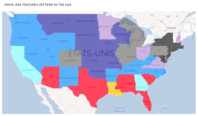
Figure 8. Map of COVID-era features pattern in the USA. The different colours represent the different pattern groups discussed in the text: black = L0M, gray = LSL, dark blue = 00L, blue = 0SL, light blue = SSL, purple = SBL, red = 0LL, yellow = LLL, white = 00S and 0SS. The first character of the pattern characterizes the cvp1 feature, the second the smp1 feature and the last the cvp2 feature. L stands for large, M for medium, S for small, B for borderline and 0 for zero / near-zero.
3.4. Late-June 2021 heatwave event in ACM/w for Oregon and Washington
There are sharp peaks (a single week or so) in the ACM/w data for Oregon and Washington, occurring at week-26 of 2021, which is the week of 28 June 2021 (Appendix).
The increased deaths coincide with an extraordinary weather event: The two states and British Columbia (Canada) experienced a short but record-breaking summer heatwave. NASA Earth Observatory (2021) described the heatwave as follows:
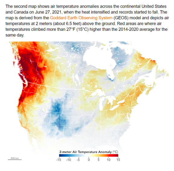
Taking peak-to-local-baseline values, we estimate excess deaths from the heatwave to have been 246 and 475 deaths, respectively for Oregon and Washington.
This is a reminder of the deadliness of stress from atmospheric heat, which is relevant to our discussion about the COVID-era anomalies in the USA (below). We previously quantified such a heat-wave mortality event that occurred in France in 2003 (Rancourt et al., 2020).
3.5. ACM-SB/w normalized by population (ACM-SB/w/pop), by state
The different state-wise patterns of mortality in the USA during the COVID-era are best examined using ACM-SB/w normalized by population, ACM-SB/w/pop, and by reference to the cvp1-smp1-cvp2 patterns identified above. Normalization by population allows direct comparisons of the data for states with different populations.
In the following figures, normalization was done as follows:
Normalization of a cycle-year N was done with the population estimated just before the start of the cycle-year. Population estimates are each year on July 1st. The cycle-year starts on week-31 of a calendar-year (beginning of August). At the date of access, population estimates were from 2010 to 2020, so the cycle-year 2022 (last weeks of the data set) was normalized by the last available population estimate, the one for 2020.
When at the state level, the population used for normalization is the population of the specific state.
ACM-SB/w/pop curves are shown by groups of similar behaviours in Figure 9, as:
- L0M / North-Easterly coastal states: Connecticut, Maryland, Massachusetts, New Jersey, and New York.
- LSL / North-Central-Easterly non-coastal states: Colorado, Illinois, Indiana, Michigan (LSLx), and Pennsylvania.
- 00L / prairie states: Iowa, Kansas, Missouri, Montana, Nebraska, North Dakota, Oklahoma, and South Dakota. (Wisconsin is excluded because of bad data points for 2015, see Appendix.)
- 0SL / Central-Westerly non-coastal states: Idaho, Nevada, New Mexico, Utah, Wyoming.
- 0SL / North-Westerly coastal states: Oregon and Washington. (With June-2021 heatwave peak.)
- SSL / California and Georgia: California and Georgia.
- 0LL / Southern states: Arizona, Florida, Mississippi, South Carolina, and Texas (Alabama is excluded because of bad data points for 2014, see Appendix).
- LLL / Louisiana: Louisiana, shown with Michigan.
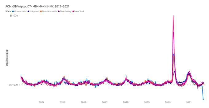
Figure 9a. Difference between all-cause mortality and summer baseline mortality by week normalized by population for Connecticut, Maryland, Massachusetts, New Jersey and New York from 2013 to 2021. Data are displayed from week-1 of 2013 to week-37 of 2021. The dashed line emphasizes the zero. ACM data were retrieved from the CDC (CDC, 2021a) and population data were retrieved from the US Census Bureau (US Census Bureau, 2021a), as described in Table 1. SB was estimated as described in section 2.
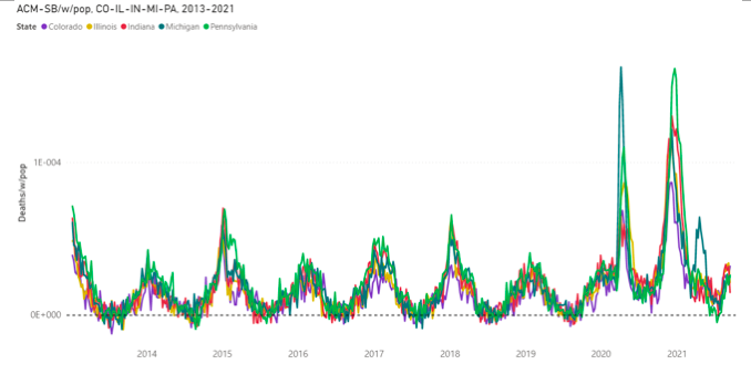
Figure 9b(i). Difference between all-cause mortality and summer baseline mortality by week normalized by population for Colorado, Illinois, Indiana, Michigan and Pennsylvania from 2013 to 2021. Data are displayed from week-1 of 2013 to week-37 of 2021. The dashed line emphasizes the zero. ACM data were retrieved from the CDC (CDC, 2021a) and population data were retrieved from the US Census Bureau (US Census Bureau, 2021a), as described in Table 1. SB was estimated as described in section 2.
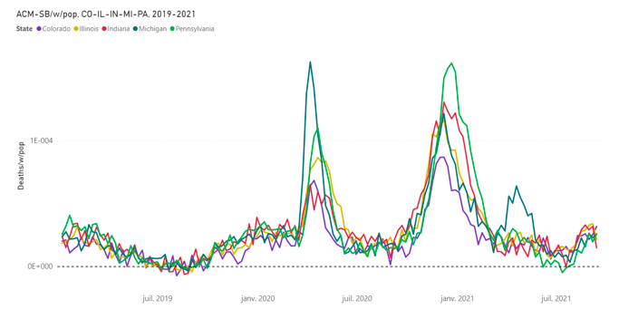
Figure 9b(ii). Difference between all-cause mortality and summer baseline mortality by week normalized by population for Colorado, Illinois, Indiana, Michigan and Pennsylvania from 2019 to 2021. Data are displayed from week-1 of 2019 to week-37 of 2021. The dashed line emphasizes the zero. ACM data were retrieved from the CDC (CDC, 2021a) and population data were retrieved from the US Census Bureau (US Census Bureau, 2021a), as described in Table 1. SB was estimated as described in section 2.
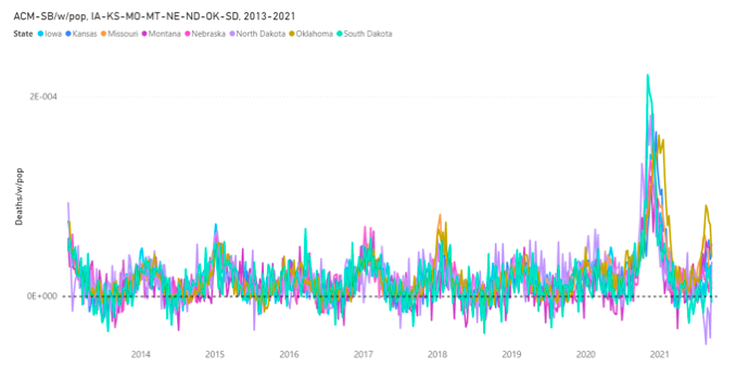
Figure 9c. Difference between all-cause mortality and summer baseline mortality by week normalized by population for Iowa, Kansas, Missouri, Montana, Nebraska, North Dakota, Oklahoma and South Dakota from 2013 to 2021. Data are displayed from week-1 of 2013 to week-37 of 2021. The dashed line emphasizes the zero. ACM data were retrieved from the CDC (CDC, 2021a) and population data were retrieved from the US Census Bureau (US Census Bureau, 2021a), as described in Table 1. SB was estimated as described in section 2.
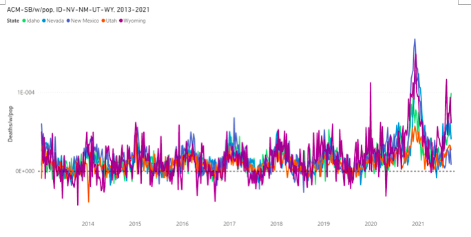
Figure 9d. Difference between all-cause mortality and summer baseline mortality by week normalized by population for Idaho, Nevada, New Mexico, Utah and Wyoming from 2013 to 2021. Data are displayed from week-1 of 2013 to week-37 of 2021. The dashed line emphasizes the zero. ACM data were retrieved from the CDC (CDC, 2021a) and population data were retrieved from the US Census Bureau (US Census Bureau, 2021a), as described in Table 1. SB was estimated as described in section 2.
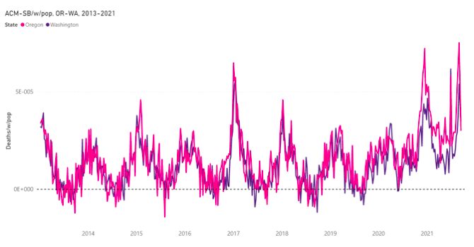
Figure 9e. Difference between all-cause mortality and summer baseline mortality by week normalized by population for Oregon and Washington from 2013 to 2021. Data are displayed from week-1 of 2013 to week-37 of 2021. The dashed line emphasizes the zero. ACM data were retrieved from the CDC (CDC, 2021a) and population data were retrieved from the US Census Bureau (US Census Bureau, 2021a), as described in Table 1. SB was estimated as described in section 2.
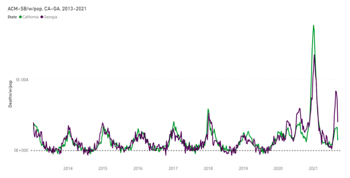
Figure 9f. Difference between all-cause mortality and summer baseline mortality by week normalized by population for California and Georgia from 2013 to 2021. Data are displayed from week-1 of 2013 to week-37 of 2021. The dashed line emphasizes the zero. ACM data were retrieved from the CDC (CDC, 2021a) and population data were retrieved from the US Census Bureau (US Census Bureau, 2021a), as described in Table 1. SB was estimated as described in section 2.
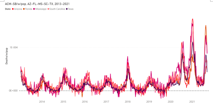
Figure 9g. Difference between all-cause mortality and summer baseline mortality by week normalized by population for Arizona, Florida, Mississippi, South Carolina and Texas from 2013 to 2021. Data are displayed from week-1 of 2013 to week-37 of 2021. The dashed line emphasizes the zero. ACM data were retrieved from the CDC (CDC, 2021a) and population data were retrieved from the US Census Bureau (US Census Bureau, 2021a), as described in Table 1. SB was estimated as described in section 2.
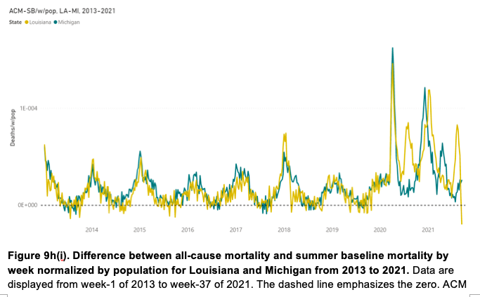
Figure 9h(i). Difference between all-cause mortality and summer baseline mortality by week normalized by population for Louisiana and Michigan from 2013 to 2021. Data are displayed from week-1 of 2013 to week-37 of 2021. The dashed line emphasizes the zero. ACM data were retrieved from the CDC (CDC, 2021a) and population data were retrieved from the US Census Bureau (US Census Bureau, 2021a), as described in Table 1. SB was estimated as described in section 2.
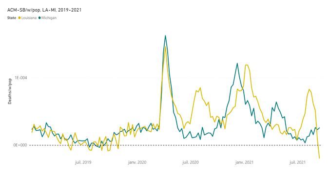
Figure 9h(ii). Difference between all-cause mortality and summer baseline mortality by week normalized by population for Louisiana and Michigan from 2019 to 2021. Data are displayed from week-1 of 2019 to week-37 of 2021. The dashed line emphasizes the zero. ACM data were retrieved from the CDC (CDC, 2021a) and population data were retrieved from the US Census Bureau (US Census Bureau, 2021a), as described in Table 1. SB was estimated as described in section 2.
Figures 8 and 9 show that there are large state-to-state differences in COVID-era mortality by time, and that these differences approximately group into four (4) types, by geographical region, as:
- L0M : North-East coastal states
- LSL : North-East non-coastal states
- 00L / 0SL / SSL / SBL : Central and Western-Eastern states
- 0LL : Southern states
Louisiana is unique, with an LLL pattern, and large mortality in all three periods (cvp1, smp1, cvp2). Michigan (LSLx) has a unique late peak, occurring in March through May 2021, centered on mid-April 2021. Oregon and Washington have unique June-2021 single-week heatwave peaks.
This description is “coarse grain” and is simplified. For example, California has a distinct cvp1 feature even though it is much smaller than that occurring in the North-East states. Also, what happened in New York City is literally off-the-charts regarding cvp1 (Rancourt, 2020).
A most striking aspect of mortality during the COVID-era is precisely the state-wise heterogeneity in ACM by time, which we have described and illustrated above, and in the Appendix. This is striking because the seasonal cycle of all-cause deaths is usually remarkably uniform from state to state, from country to country, from province to province, from county to county… through all the inferred and declared epidemics and pandemics of viral respiratory diseases. Although the shapes of ACM by time change from season to season, the shapes for a given year are nonetheless synchronous and essentially the same across regions, over a global hemisphere, since good data has been available, since the end of the Second World War in most Western countries (Rancourt, 2020) (Rancourt et al., 2020) (Rancourt et al., 2021).
Indeed, as an aside, we consider that this empirical fact (geographic homogeneity of synchronous mortality by time curves) represents a hard challenge against the theory that viral respiratory diseases spread person-to-person by proximity or “contact” and that such spread drives epidemics and pandemics, at the population level.
We quantify the said geographical heterogeneity of the COVID-era mortality by time below, but first we illustrate it further with direct comparisons of the ACM-SB/w/pop curves for states in different regions, with different cvp1-smp1-cvp2 patterns.
Figure 10 shows ACM-SB/w/pop for one state from each of the following cvp1‑smp1‑cvp2 patterns: California (SSL), Florida (0LL), Michigan (LSLx), Nevada (0SL), New York (L0M), South Dakoda (00L).
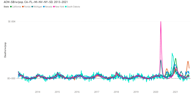
Figure 10a. Difference between all-cause mortality and summer baseline mortality by week normalized by population for California, Florida, Michigan, Nevada, New York and South Dakota from 2013 to 2021. Data are displayed from week-1 of 2013 to week-37 of 2021. The dashed line emphasizes the zero. ACM data were retrieved from the CDC (CDC, 2021a) and population data were retrieved from the US Census Bureau (US Census Bureau, 2021a), as described in Table 1. SB was estimated as described in section 2.
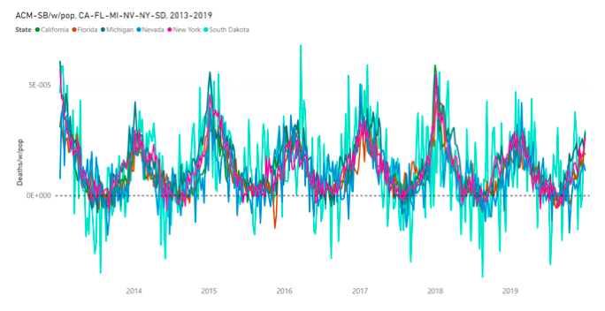
Figure 10b. Difference between all-cause mortality and summer baseline mortality by week normalized by population for California, Florida, Michigan, Nevada, New York and South Dakota from 2013 to 2019. Data are displayed from week-1 of 2013 to week-52 of 2019. The dashed line emphasizes the zero. ACM data were retrieved from the CDC (CDC, 2021a) and population data were retrieved from the US Census Bureau (US Census Bureau, 2021a), as described in Table 1. SB was estimated as described in section 2.
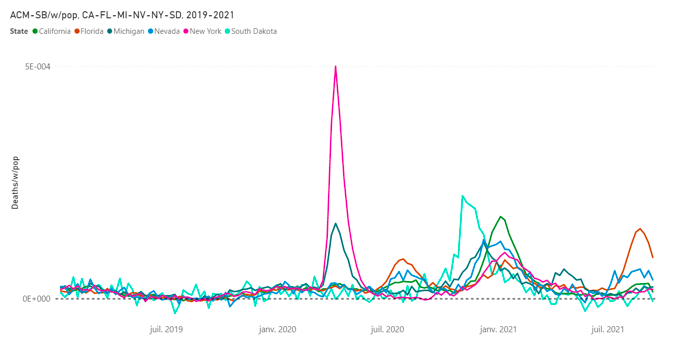
Figure 10c. Difference between all-cause mortality and summer baseline mortality by week normalized by population for California, Florida, Michigan, Nevada, New York and South Dakota from 2019 to 2021. Data are displayed from week-1 of 2019 to week-37 of 2021. The dashed line emphasizes the zero. ACM data were retrieved from the CDC (CDC, 2021a) and population data were retrieved from the US Census Bureau (US Census Bureau, 2021a), as described in Table 1. SB was estimated as described in section 2.
Figure 11 makes the same kind of comparison for states that have large cvp1 features: Colorado (LSL), Connecticut (L0M), Illinois (LSL), Louisiana (LLL), New Jersey (L0M), New York (L0M).
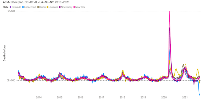
Figure 11a. Difference between all-cause mortality and summer baseline mortality by week normalized by population for Colorado, Connecticut, Illinois, Louisiana, New Jersey and New York from 2013 to 2021. Data are displayed from week-1 of 2013 to week-37 of 2021. The dashed line emphasizes the zero. ACM data were retrieved from the CDC (CDC, 2021a) and population data were retrieved from the US Census Bureau (US Census Bureau, 2021a), as described in Table 1. SB was estimated as described in section 2.
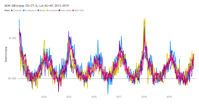
Figure 11b. Difference between all-cause mortality and summer baseline mortality by week normalized by population for Colorado, Connecticut, Illinois, Louisiana, New Jersey and New York from 2013 to 2019. Data are displayed from week-1 of 2013 to week-52 of 2019. The dashed line emphasizes the zero. ACM data were retrieved from the CDC (CDC, 2021a) and population data were retrieved from the US Census Bureau (US Census Bureau, 2021a), as described in Table 1. SB was estimated as described in section 2.
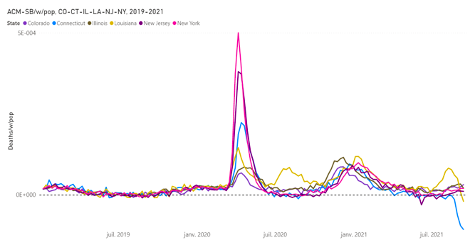
Figure 11c. Difference between all-cause mortality and summer baseline mortality by week normalized by population for Colorado, Connecticut, Illinois, Louisiana, New Jersey and New York from 2019 to 2021. Data are displayed from week-1 of 2019 to week-37 of 2021. The dashed line emphasizes the zero. ACM data were retrieved from the CDC (CDC, 2021a) and population data were retrieved from the US Census Bureau (US Census Bureau, 2021a), as described in Table 1. SB was estimated as described in section 2.
3.6. ACM-SB by cycle-year (winter burden, WB) by population (WB/pop), USA and state-to-state variations
Next, we analyse ACM-SB/w in terms of integrated intensities over cycle-years. By definition, the said integrated intensity is the “winter burden”, WB, for the given cycle-year. WB is the excess (above-SB) mortality per cycle-year. We normalize WB by population, WB/pop, in order to make state-to-state and state-to-nation comparisons.
Figure 12a shows the WB/pop, for cycle-years 2014 to 2021 (cycle-year 2021 contains and is approximately centered on January 2021, and so on), for the entire continental USA (49 states). We see the seasonal (year to year) variations 2014-2019, followed by the large COVID-era increase 2020-2021, which echoes the large 2020 calendar-year increase shown in Figures 1 and 4.
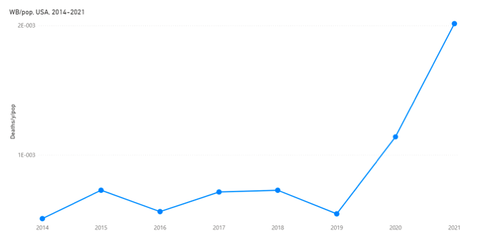
Figure 12a. Winter burden normalized by population in the USA for cycle-years 2014 to 2021. The cycle-year starts on week-31 of a calendar-year (beginning of August) and ends on week-30 of the next calendar-year (end of July). ACM data were retrieved from the CDC (CDC, 2021a) and population data were retrieved from the US Census Bureau (US Census Bureau, 2021a), as described in Table 1. SB was estimated and WB calculated as described in section 2.
Figure 12b shows WB/pop versus cycle-year (2014-2021), for all the continental USA states on the same graph.
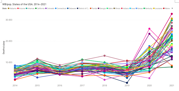
Figure 12b. Winter burden normalized by population for each of the continental states of the USA for cycle-years 2014 to 2021. The cycle-year starts on week-31 of a calendar-year (beginning of August) and ends on week-30 of the next calendar-year (end of July). The 49 continental states include the District of Columbia and exclude Alaska and Hawaii. ACM data were retrieved from the CDC (CDC, 2021a) and population data were retrieved from the US Census Bureau (US Census Bureau, 2021a), as described in Table 1. SB was estimated and WB calculated as described in section 2.
Figure 12c shows WB/pop versus cycle-year (2014-2021) for the “0LL” group of Southern states (having a cvp1-smp1-cvp2 0LL pattern), and for Louisiana, which has the cvp1-smp1-cvp2 “LLL” pattern, on the same graph. We note a larger 2020 WB/pop value for Louisiana, than would be expected for a Southern state, because its large LLL‑pattern cvp1 feature increases its 2020 WB/pop value.
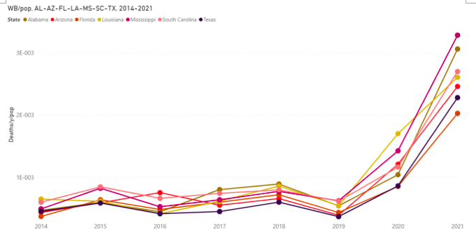
Figure 12c. Winter burden normalized by population in Alabama, Arizona, Florida, Louisiana, Mississippi, South Carolina and Texas for cycle-years 2014 to 2021. The cycle-year starts on week-31 of a calendar-year (beginning of August) and ends on week-30 of the next calendar-year (end of July). ACM data were retrieved from the CDC (CDC, 2021a) and population data were retrieved from the US Census Bureau (US Census Bureau, 2021a), as described in Table 1. SB was estimated and WB calculated as described in section 2.
Figure 12d shows WB/pop versus cycle-year (2014-2021) for the “L0M” group of North-East coastal states (having a cvp1-smp1-cvp2 L0M pattern), including Maryland, which has a limit behaviour to be included in this group. Since this group has exceptionally large cvp1 features, we see that generally the WB-2020 is larger than the WB-2021.Official Figures: COVID-19 Yet to Impact Europe’s Overall Mortality
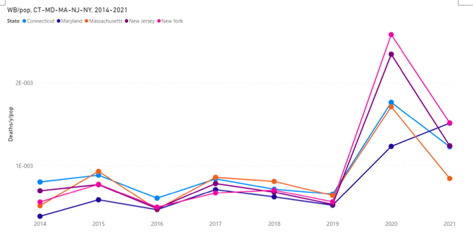
Figure 12d. Winter burden normalized by population in Connecticut, Maryland, Massachusetts, New Jersey and New York for cycle-years 2014 to 2021. The cycle-year starts on week-31 of a calendar-year (beginning of August) and ends on week-30 of the next calendar-year (end of July). ACM data were retrieved from the CDC (CDC, 2021a) and population data were retrieved from the US Census Bureau (US Census Bureau, 2021a), as described in Table 1. SB was estimated and WB calculated as described in section 2.
Figure 12b shows that, like the ACM-SB/w/pop curves themselves would suggest (Figures 10 and 11), the state-to-state spread in WB/pop values is much larger in the COVID-era than in the previous decade or so. We can illustrate this pre-COVID/COVID-era difference by plotting the frequency distribution of state-to-state values of WB/pop for each cycle-year. These distributions are shown together in Figure 13.
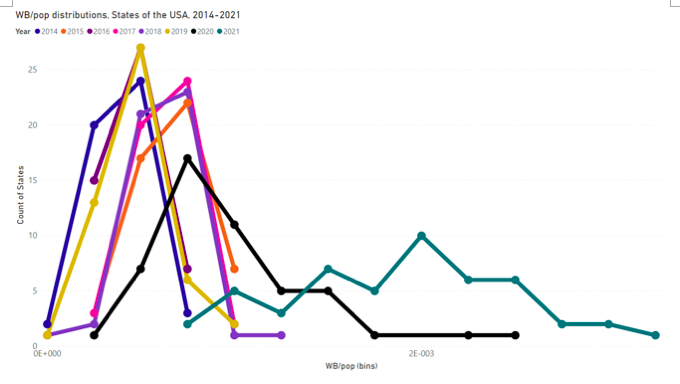
Figure 13. Frequency distributions of state-to-state values of WB/pop for each cycle-year, 2014-2021, as indicated by the colour scheme. Each distribution is normalized to 49, the number of continental USA states (including District of Columbia, excluding Alaska and Hawaii). A bin-width of 2.5E−4 deaths/pop was used. The cycle-year starts on week-31 of a calendar-year (beginning of August) and ends on week-30 of the next calendar-year (end of July). ACM data were retrieved from the CDC (CDC, 2021a) and population data were retrieved from the US Census Bureau (US Census Bureau, 2021a), as described in Table 1. SB was estimated and WB calculated as described in section 2.
Here (Figure 13), it is interesting to note that the six pre-COVID-era cycle-years (2014-2019) fall into two distinct distribution types, with the same widths but positions differing by a set amount, corresponding to “light” (2014, 2016, 2019; less deadly winter) and “heavy” (2015, 2017, 2018; deadlier winter) years that are also recognized in the ACM/w or ACM-SB/w patterns themselves (e.g., Figures 5 and 6).
By comparison, the distribution for cycle-year 2020 has larger WB/pop values and a tail that extends far towards even larger values. The distribution for cycle-year 2021 is exceedingly wide and extends to extremely large values.
Properties of the frequency distributions (Figure 13) can be quantified as follows. For each distribution (for a given cycle-year) we calculate: the average (“av”), the median (“med”), the standard deviation (“sd”), and the difference “av-med”. The latter difference av-med is related to the magnitude of the asymmetry of the distribution, and its sign indicates whether any extended tail extends toward small (negative) or large (positive) WB/pop values. These four parameters (av, med, sd, av-med) are shown versus cycle-year in Figure 14.
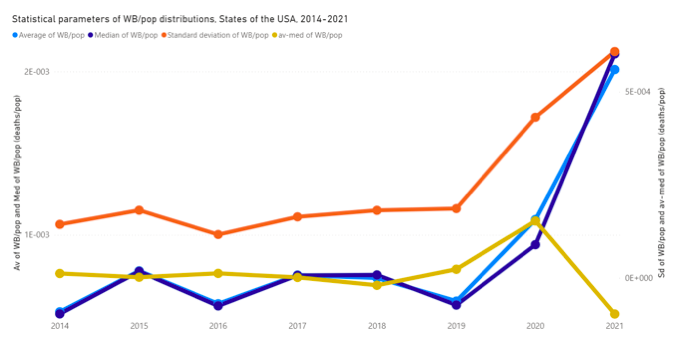
Figure 14. Statistical parameters of the WB/pop distributions of the 49 continental states of the USA for cycle-years 2014 to 2021. The 49 continental states include the District of Columbia and exclude Alaska and Hawaii. The cycle-year starts on week-31 of a calendar-year (beginning of August) and ends on week-30 of the next calendar-year (end of July). ACM data were retrieved from the CDC (CDC, 2021a) and population data were retrieved from the US Census Bureau (US Census Bureau, 2021a), as described in Table 1. SB was estimated and WB calculated as described in section 2.
Here (Figure 14), the variations of “av” and “med” are generally those expected, given the behaviour of WB/pop versus cycle-year for the entire continental USA (Figure 12a).
The “sd” (Figure 14) has a remarkably constant pre-COVID-era (prior to 2020) value of approximately 1.6(1.2—1.9 range)E−4 deaths/pop, and then shoots up to 4.3E−4 (2020) and 6.1E−4 (2021) deaths/pop. In other words, the COVID-era is characterized by an anomalously large state-to-state heterogeneity in WB/pop values, an approximately 4-fold increase in absolute magnitude.
In fact, using WB/pop masks the actual state-wise heterogeneity, since the COVID-era features cvp1 and smp1 have a much larger intrinsic (relative) heterogeneity than WB. The said large heterogeneity is evident in the ACM-SB/w/pop data itself (Figures 10 and 11), but let us quantify it, and let us examine “asymmetry” (presence of tails) as well. We use the dimensionless parameters sd/av and (av-med)/av, which are as follows.
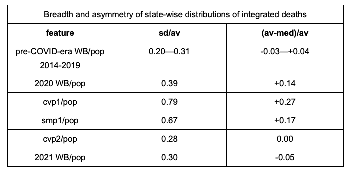
Table 2. Breadth and asymmetry of state-wise distributions of integrated deaths for the pre-COVID-era WB/pop, and for features in the COVID-era. Features in the COVID-era include 2020 WB/pop, cvp1/pop, smp1/pop, cvp2/pop and 2021 WB/pop.
The state-wise heterogeneity of cvp1 is massive (sd/av: 0.79 compared to ~0.25) ((av‑med)/av: +0.27 compared to ~+0.01), since cvp1 consists of essentially one extreme region in the North-East coastal states. The state-wise heterogeneity of smp1 is large (sd/av: 0.67 compared to ~0.25) ((av‑med)/av: +0.17 compared to ~+0.01), since smp1 consists of essentially an extreme region in the Southern states.
We have observed such COVID-era jurisdictional heterogeneity in many countries, and country-wise in Europe, and we have argued that it is contrary to pandemic behaviour, and contrary to any (1945-2021) season of viral respiratory disease burden in the Northern hemisphere, and arises mainly from jurisdictional differences in applied medical and government responses to the pronouncement of a pandemic (Rancourt, 2020) (Rancourt et al., 2020) (Rancourt et al., 2021).
In contrast, cvp2, which is entirely within the 2021 cycle-year and is the cycle-year’s main (winter) feature, has normal pre-COVID-era state-wise homogeneity (sd/av: 0.28 compared to 0.20—0.31) ((av‑med)/av: 0.00 compared to -0.03—+0.04). This suggests that cvp2 is not affected by any widely different state-to-state applied responses, but rather is the result of a broad, sustained, and state-wise homogenous stress on the USA population.
3.7. Geographical distribution and correlations between COVID-era above-SB seasonal deaths: cvp1 (spring-2020), smp1 (summer-2020) and cvp2 (fall-winter-2020-2021)
Recall that Figure 7 shows how we integrate to obtain the total above-SB deaths in each of the operationally defined features cvp1, smp1 and cvp2. Since the peak positions are operationally the same for all states (barring the extra peak for Michigan), we use the same delimiting weeks throughout, those shown in Figure 7. We normalize the state-wise deaths by state-wise population, in order to allow state-to-state comparisons.
Figure 15 shows a map of cvp1/pop for the continental states of the USA.
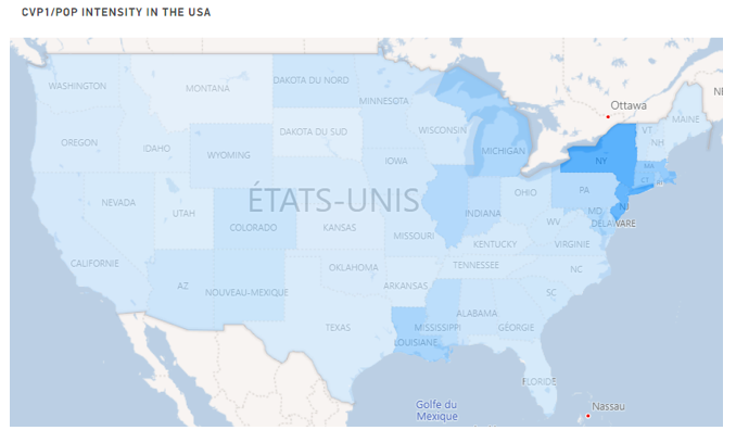
Figure 15. Map of the intensity of the cvp1 mortality normalized by population for the continental USA. Continental USA includes the District of Columbia and excludes Alaska and Hawaii. The cvp1 feature is the integrated deaths of ACM-SB between week-11 of 2020 and week-25 of 2020, inclusively. The darker the blue, the more intense the cvp1/pop. ACM data were retrieved from the CDC (CDC, 2021a) and population data were retrieved from the US Census Bureau (US Census Bureau, 2021a), as described in Table 1. SB was estimated as described in section 2.
Here, we see that a cluster of North-East coastal states were essentially the only intense hot spot; and notable other states, including Louisiana, Illinois and Michigan, to a lesser degree. In fact, some 34 of the USA states do not have a resolved or detectable or significant cvp1 feature. We have described this previously (Rancourt, 2020) (Rancourt et al., 2020). We have argued that the cvp1 feature (the “covid peak”) is highly jurisdictionally heterogeneous, has a start synchronous with the 11 March 2020 WHO declaration of a pandemic, and is present throughout the mid-latitude Northern hemisphere, because it is caused by the medical and government responses to the declaration of a pandemic, especially in hospitals and care homes (Rancourt, 2020) (Rancourt et al., 2020) (Rancourt et al., 2021). One can say with certainty that there was no detectable or significant “first wave” in most of the USA, a phenomenon which is contrary to the very concept of a pandemic (Rancourt et al., 2021).
Figure 16 shows a map of smp1/pop for the continental states of the USA.
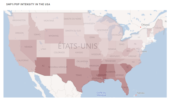
Figure 16. Map of the intensity of the smp1 mortality normalized by population for the continental USA. Continental USA includes the District of Columbia and excludes Alaska and Hawaii. The smp1 feature is the integrated deaths of ACM-SB between week-26 of 2020 and week-39 of 2020, inclusively. The darker the red, the more intense the smp1/pop. ACM data were retrieved from the CDC (CDC, 2021a) and population data were retrieved from the US Census Bureau (US Census Bureau, 2021a), as described in Table 1. SB was estimated as described in section 2.
This is a remarkable map, which shows that the above-SB deaths in the summer of 2020 were concentrated in the Southern states of Arizona, Texas, Louisiana, Mississippi, Alabama, Florida and South Carolina. These results can be understood in terms of climatic, socio-economic and population health effects, as shown below. The results (Figure 16) are inconsistent with the theoretical concept of a viral respiratory disease pandemic. Furthermore, no previous large anomalous burden of all-cause mortality has ever been concentrated in the Southern states, in one season, in the modern history of epidemiology for the USA.
There is no point showing a map of cvp2/pop for the continental states of the USA, because we showed above that the state-wise distribution of cvp2/pop is essentially homogeneous (Table 2). A map of cvp2/pop does not show any recognizable pattern.
Next, we examine whether there are any correlations or anti-correlations between the outcomes cvp1, smp1 and cvp2; and also smp2. Plots of one versus the other are as follows, in Figure 17.
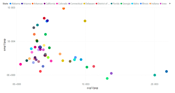
Figure 17a. smp1/pop versus cvp1/pop. Each point is for one continental USA state. The colour-code of the 49 continental states is shown in section 2. Data were retrieved and calculations made as described in section 2.
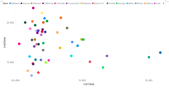
Figure 17b. cvp2/pop versus cvp1/pop. Each point is for one continental USA state. The colour-code of the 49 continental states is shown in section 2. Data were retrieved and calculations made as described in section 2.
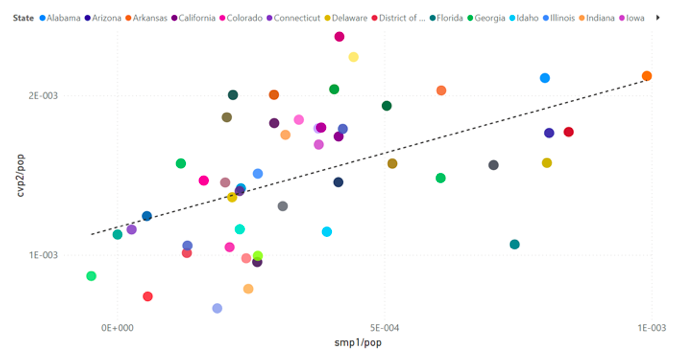
Figure 17c. cvp2/pop versus smp1/pop. Each point is for one continental USA state. The trend line is meant merely to illustrate the correlation discussed in the text. It results from the usual least squares fit, using all the points in the graph. The colour-code of the 49 continental states is shown in section 2. Data were retrieved and calculations made as described in section 2.
Figure 17a shows that near-zero values of smp1/pop occur for the largest values of cvp1/pop, and that most large values of smp1/pop occur for small values of cvp1/pop. Similarly, Figure 17b shows that near-zero values of cvp2/pop occur for the largest values of cvp1/pop, and that most large values of cvp2/pop occur for small values of cvp1/pop.
This shows that the states with extremely large values of cvp1/pop (New York, New Jersey, Connecticut, Massachusetts… mainly the L0M pattern) had small (cvp2) or near-zero (smp1) values of mortality in the seasons that followed (summer-2020, fall-winter-2020-2021). Possible explanations include: the so-called “dry tinder” effect, in which those likely to die would have already died in the first “wave”, or socio-geo-economic and climatic factors that give large smp1 and cvp2 are absent in those states that have the largest cvp1 peaks. Our analysis shows that the latter explanation is more likely. Indeed, different age groups, social classes (poverty, obesity) and state jurisdictions predominantly contribute to cvp1 versus smp1 and cvp2. A dry tinder effect interpretation for cvp1/smp1-cvp2 is not compatible with the many observed correlations.
A notable exception (outlier) in the smp1-cvp1 relation (Figure 17a) is Louisiana, which has both large cvp1 and large smp1. We have interpreted large values of cvp1 (“covid peak”), occurring heterogeneously and synchronously around the world, as being due to local-jurisdictional aggressive immediate medical and government responses to the 11 March 2020 WHO pronouncement of a pandemic (Rancourt, 2020) (Rancourt et al., 2020) (Rancourt et al., 2021). New York City and New York state directives are the defining examples of such aggression. There is circumstantial evidence that Louisiana has a medico-government culture approaching that of New York: “Louisiana’s largest hospital system will impose fee on employees if their spouse is unvaccinated”, Blaze media, 01 October 2021, https://archive.ph/sDfL2.
Figure 17c shows that there is a correlation between cvp2/pop and smp1/pop. Such a correlation, as opposed to an anti-correlation, is contrary to a “dry tinder” effect occurring between summer-2020 and fall-winter-2020-2021. Rather, it suggests that some or all of the same socio-geo-economic and climatic effects impact the mortality in both seasons.
The summer-2021 feature smp2 behaves similarly to smp1 (summer-2020) in many regards, although it starts later in the summer, and smp2/pop is correlated to smp1/pop, as shown in Figure 17d.
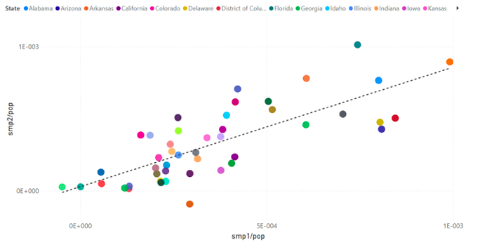
Figure 17d. smp2/pop versus smp1/pop. Each point is for one continental USA state. Connecticut, North Carolina and West Virginia are removed from the graph as there are not enough consolidated data points in ACM/w for smp2 for those states (see Appendix). The trend line is meant merely to illustrate the correlation discussed in the text. It results from the usual least squares fit, using all the points in the graph. The colour-code of the 49 continental states is shown in section 2. Data were retrieved and calculations made as described in section 2.
Figure 18 shows the same data as in Figure 17c, but with added circle-symbol-size (radius) determined by cvp1/pop.
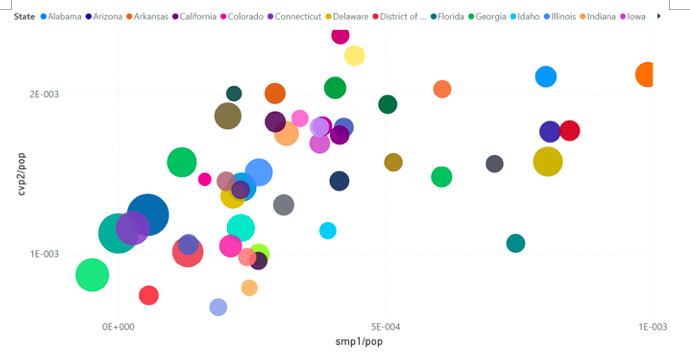
Figure 18. cvp2/pop versus smp1/pop, with the radius size determined by cvp1/pop. Each point is for one continental USA state. The colour-code of the 49 continental states is shown in section 2. Data were retrieved and calculations made as described in section 2.
We note that the largest values of cvp1/pop (by state) are clustered at small values of both smp1/pop and cvp2/pop, with Louisiana as the main exception, followed by Mississippi.
3.8. Associations of COVID-era mortality outcomes with socio-geo-economic and climatic variables
The data, in which quantitative mortality outcomes (cvp1, smp1, cvp2, WB) are known by state, can be compared with state-wise or state-specific socio-geo-economic and climatic variables, in a search for correlations or relations, since all 49 diverse continental USA states can be used. This is a unique opportunity to identify factors which may cause or contribute to the excess (above-SB) USA mortality during the COVID-era.
We found three variables that appear to be determinative of COVID-era summer‑2020 (smp1) and fall-winter-2020-2021 (cvp2) excess (above-SB) mortality in the USA. These are:
- Climatic temperature (summer-period heatwave effect) (smp1)
- Poverty (smp1 and cvp2)
- Obesity (smp1 and cvp2)
The variables are somewhat correlated to each other, but have a significant degree of independence (one can be obese and rich, etc.). We found that using the product “OB.PV” of obesity (OB) and poverty (PV) gives a stronger correlation than either variable alone (being both obese and poor is deadlier than being either obese or poor).
We found that climatic temperature — evaluated using either maximum temperature (Tmax) or average temperature (Tav), either averaged in July-August-2020 or averaged over a calendar-year — is highly predictive of the geographical location of smp1 mortality (the hottest states were the most deadly in summer-2020, and dramatically so).
None of the variables (OB, PV, Tmax) that correlate with smp1 and cvp2 correlate with cvp1, which shows distinctly different death-causing phenomena in the two periods (cvp1 versus smp1-cvp2) in the COVID-era. We interpret cvp1 as being due to the immediate aggressive medical and government measures, whereas later deaths are apparently due to accumulated social and psychological chronic stress, combined with climatic stress, and affect younger individuals in broader age groups.
The latter age-dependence was shown by examining correlations between mortality outcomes and population age structure, by state. The smp1 feature (above-SB deaths in summer-2020) is uniquely anti-correlated with age of the state-wise population, which is contrary to WB mortality behaviour in all studied pre-COVID-era cycle-years, 2014-2019, and contrary to viral respiratory disease epidemiology.
Throughout this study, we compare our COVID-era results with a similar search for correlations in WB/pop mortality outcome in given cycle-years occurring prior to the COVID-era. Contrary to deaths in the COVID-era, normal epidemiology of the unperturbed society shows no state-to-state correlations of winter burdens with obesity, poverty or climatic temperature, whatsoever, in any of the six specific cycle-years 2014-2019. The only “normal era” correlation we find is with age structure, and it is persistent from year to year. The same is true for many more cycle-years for France, and so on. It seems clear to us that the variables obesity, poverty and climatic temperature become determinative, and have a disproportionate and immediate deadly impact, only in the significantly socio-economically perturbed and stressed population of the COVID-era measures.
Here are the details, as follows.
Obesity
Figure 19 shows the scatter plots for obesity (OB), defined as the prevalence of self-reported obesity among U.S. adults (CDC, 2021e).
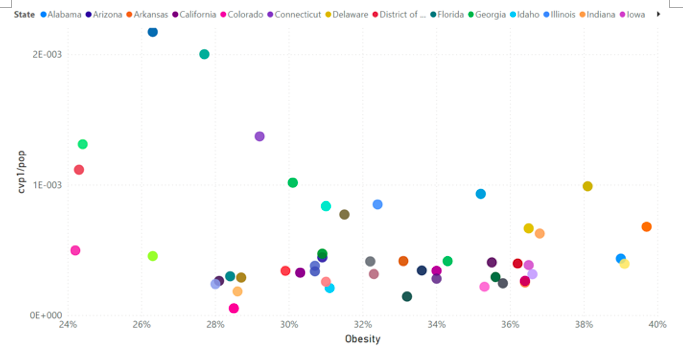
Figure 19a. cvp1/pop versus obesity. Each point is for one continental USA state. The colour-code of the 49 continental states is shown in section 2. Data were retrieved and calculations made as described in section 2.
There is no discernable trend between cvp1/pop and OB.
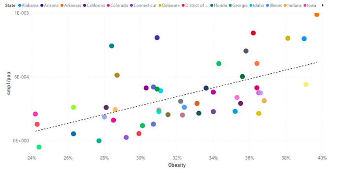
Figure 19b. smp1/pop versus obesity. Each point is for one continental USA state. The trend line is meant merely to illustrate the correlation discussed in the text. It results from the usual least squares fit, using all the points in the graph. The colour-code of the 49 continental states is shown in section 2. Data were retrieved and calculations made as described in section 2.
There is a positive trend between smp1/pop and OB.
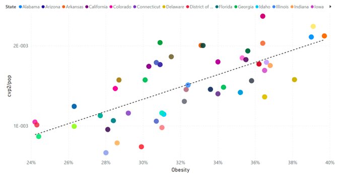
Figure 19c. cvp2/pop versus obesity. Each point is for one continental USA state. The trend line is meant merely to illustrate the correlation discussed in the text. It results from the usual least squares fit, using all the points in the graph. The colour-code of the 49 continental states is shown in section 2. Data were retrieved and calculations made as described in section 2.
There is a positive trend between cvp2/pop and OB.
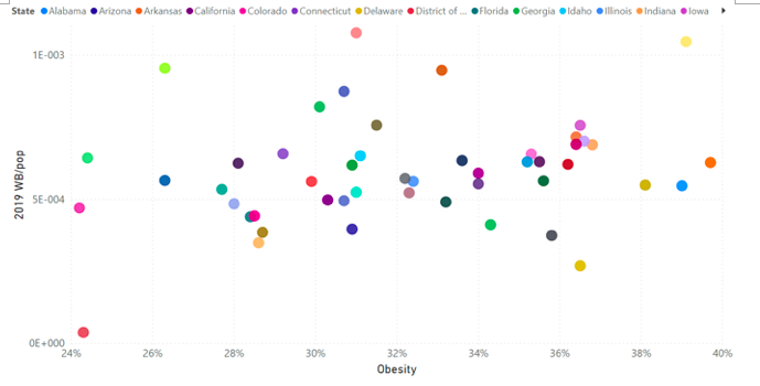
Figure 19d. WB/pop for cycle-year 2019 versus obesity. Each point is for one continental USA state. The colour-code of the 49 continental states is shown in section 2. Data were retrieved and calculations made as described in section 2.
There is no correlation whatsoever. This is true for all pre-COVID-era cycle-years, 2014-2019 (data not shown). “Normal-era” winter burden deaths above-SB have no relation to obesity, on a state-wise basis.
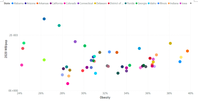
Figure 19e. WB/pop for COVID-era cycle-year 2020 versus obesity. Each point is for one continental USA state. The colour-code of the 49 continental states is shown in section 2. Data were retrieved and calculations made as described in section 2.
Excluding the six states with highest 2020 WB/pop values and OB < 31 % (Connecticut, District of Columbia, Massachusetts, New Jersey, New York, Rhode Island), there is a positive trend for the remaining states. This is consistent with the fact that 2020 cycle-year includes both cvp1 and approximately half of smp1, and that the excluded states have extremely large cvp1/pop values in mostly wealthy states.
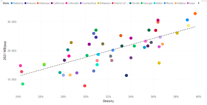
Figure 19f. WB/pop for COVID-era cycle-year 2021 versus obesity. Each point is for one continental USA state. The trend line is meant merely to illustrate the correlation discussed in the text. It results from the usual least squares fit, using all the points in the graph. The colour-code of the 49 continental states is shown in section 2. Data were retrieved and calculations made as described in section 2.
There is a positive trend between WB/pop for COVID-era cycle-year 2021 and OB.
Poverty
Figure 20 shows the scatter plots for poverty (PV), defined as the estimated percent of people of all ages in poverty (US Census Bureau, 2021d).
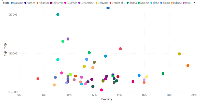
Figure 20a. cvp1/pop versus poverty. Each point is for one continental USA state. The colour-code of the 49 continental states is shown in section 2. Data were retrieved and calculations made as described in section 2.
There is no discernable trend between cvp1/pop and PV.
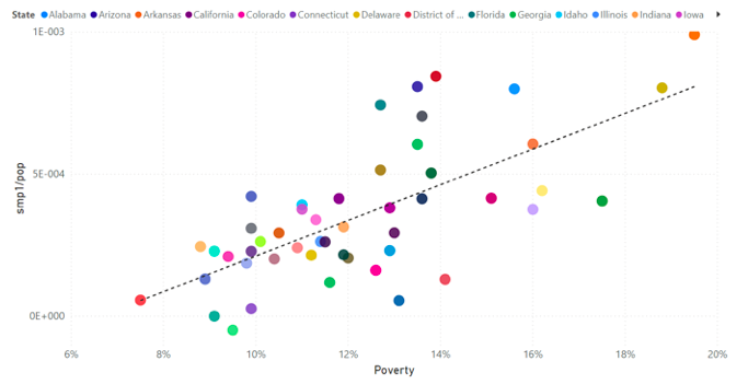
Figure 20b. smp1/pop versus poverty. Each point is for one continental USA state. The trend line is meant merely to illustrate the correlation discussed in the text. It results from the usual least squares fit, using all the points in the graph. The colour-code of the 49 continental states is shown in section 2. Data were retrieved and calculations made as described in section 2.
There is a positive trend between smp1/pop and PV.
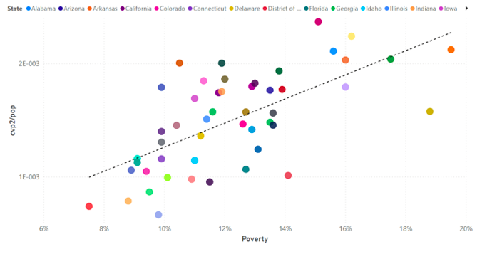
Figure 20c. cvp2/pop versus poverty. Each point is for one continental USA state. The trend line is meant merely to illustrate the correlation discussed in the text. It results from the usual least squares fit, using all the points in the graph. The colour-code of the 49 continental states is shown in section 2. Data were retrieved and calculations made as described in section 2.
There is a positive trend between cvp2/pop and PV.
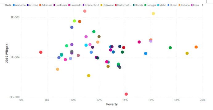
Figure 20d. WB/pop for cycle-year 2019 versus poverty. Each point is for one continental USA state. The colour-code of the 49 continental states is shown in section 2. Data were retrieved and calculations made as described in section 2.
There is no correlation whatsoever. This is true for all pre-COVID-era cycle-years, 2014-2019 (data not shown). “Normal-era” winter burden deaths above-SB have no relation to poverty, on a state-wise basis.

Figure 20e. WB/pop for COVID-era cycle-year 2020 versus poverty. Each point is for one continental USA state. The colour-code of the 49 continental states is shown in section 2. Data were retrieved and calculations made as described in section 2.
Excluding the four states with highest 2020 WB/pop values (Connecticut, Massachusetts, New Jersey, New York), there is a positive trend for the remaining states. This is consistent with the fact that 2020 cycle-year includes both cvp1 and approximately half of smp1, and that the excluded states have extremely large cvp1/pop values in mostly wealthy states.
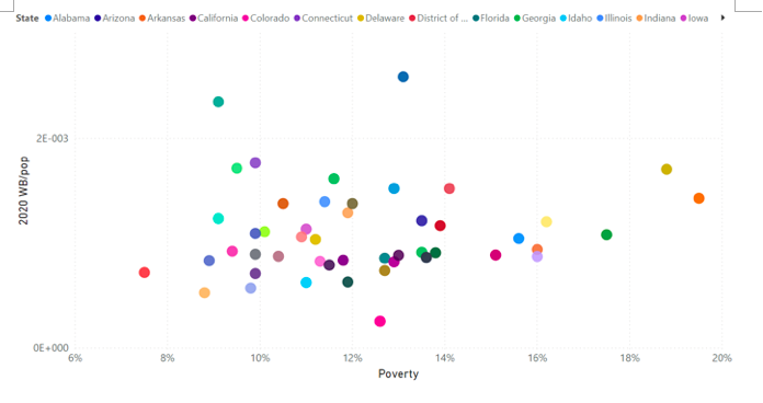
Figure 20f. WB/pop for COVID-era cycle-year 2021 versus poverty. Each point is for one continental USA state. The trend line is meant merely to illustrate the correlation discussed in the text. It results from the usual least squares fit, using all the points in the graph. The colour-code of the 49 continental states is shown in section 2. Data were retrieved and calculations made as described in section 2.
There is a positive trend between WB/pop for COVID-era cycle-year 2021 and PV. The outlier at 13.6 % poverty is North Carolina, which is an artifact of incomplete data for the final weeks for this state (see Appendix).
Climatic temperature
One of the most striking results of our study is that the summer-2020 excess (above‑SB) mortality is concentrated in Southern states (Figure 16). Excess summer mortality is striking in itself because viral respiratory diseases barely transmit in humid summer climates (aerosol particles are not stable in high absolute humidity: Harper, 1961; Shaman et al., 2010), and summers “always” exhibit seasonal lows of mortality in mid-latitude regions, seasonally inverted in the Southern hemisphere. Yet, here in the USA, there was an actual peaked maximum in ACM/w in the summer-2020 (Figures 5, 6, 7, 9, 10, and Appendix).
The geographical pattern of summer-2020 excess (above-SB) mortality, on a map of the USA (Figure 16), is remarkably well predicted by climatic temperature, shown in Figure 21.
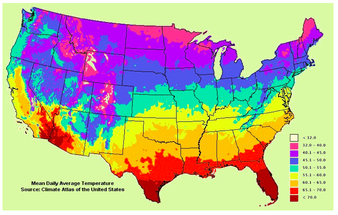
Figure 21. Mean daily average temperature: Mean of daily minimum and maximum, averaged over the year, and for three decades (1970-2000). This represents “climatic mean temperature” for the continental USA (spatial average is achieved using weighted cells, with the available surface air weather stations). Source: Climate Atlas of the United States, developed by NOAA’s National Climatic Data Center in Asheville, NC., Version 2.0, CD-ROM, released September 2002. Figure accessed at http://www.virginiaplaces.org/climate/ on 26 September 2021. (Typo: “< 70.0” should be “> 70.0”).
We illustrate this on a state-by-state basis, using the state-wise average August-2020 temperature, shown in Figure 22.
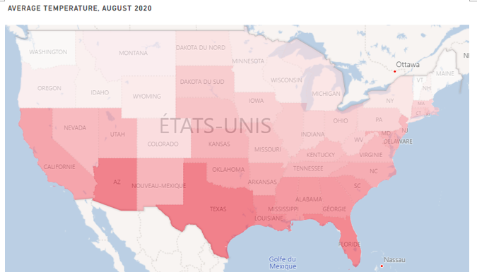
Figure 22. Average temperature, per state of the continental USA, for August 2020. Continental USA excludes Alaska and Hawaii. The darker the red, the higher the average temperature. Climatic temperature data were retrieved from the NOAA (NOAA, 2021), as described in Table 1. (The reader is asked to compare this map with the map shown in Figure 16.)
Essentially the same pattern occurs for July 2020, or for any month, or for yearly averages, or using daily maximum temperatures rather than daily average temperatures. Basically, all the average temperatures (averages of daily averages, or averages of daily maxima; on July or August, or on July and August, or on any calendar-year or cycle-year) chosen to represent climatic temperature are highly correlated to each other. For our purpose, these different averages are interchangeable.
The correlation between climatic temperature and summer-2020 excess (above-SB) mortality (smp1/pop, by state) is illustrated in Figure 23, using the July-August 2020 average daily maximum temperature (averaged by state and over the two-month period).
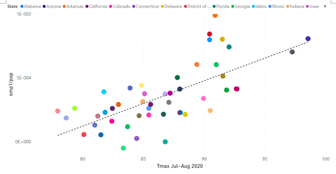
Figure 23. smp1/pop versus average daily maximum temperature over July and August 2020, Tmax Jul-Aug 2020. Each point is for one continental USA state, excluding District of Columbia, for which no temperature data were available (NOAA, 2021). The trend line is meant merely to illustrate the correlation discussed in the text. It results from the usual least squares fit, using all the points in the graph. The colour-code of the other 48 continental states is shown in section 2. Data were retrieved and calculations made as described in section 2.
There is a clear positive trend. Here (Figure 23), the four main high-smp1/pop-value outliers are Mississippi, South Carolina, Alabama and Louisiana; whereas the three main low-smp1/pop-value outliers are Massachusetts, Connecticut and New Jersey.
Such a trend between an excess (above-SB) mortality and mean temperature, per state, does not exist, whatsoever, in the winter burden mortality (WB/pop) for any of the pre-COVID-era cycle-years, 2014-2019 (data not shown).
Obesity, poverty, and climatic temperature
Next, we examine the above correlations further. Figure 24 shows that obesity (OB) and poverty (PV) are somewhat correlated to each other.
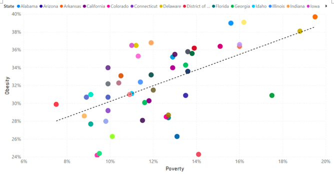
Figure 24. Obesity versus poverty. Each point is for one continental USA state. The trend line is meant merely to illustrate the correlation discussed in the text. It results from the usual least squares fit, using all the points in the graph. The colour-code of the 49 continental states is shown in section 2. Data were retrieved as described in section 2.
Given the above, we decided to try using the product of obesity and poverty (OB.PV) as a variable. Figure 25 shows smp1/pop versus OB.PV, with added circle-symbol-size (radius) determined by the July-August 2020 average daily maximum temperature (averaged by state and over the two-month period).
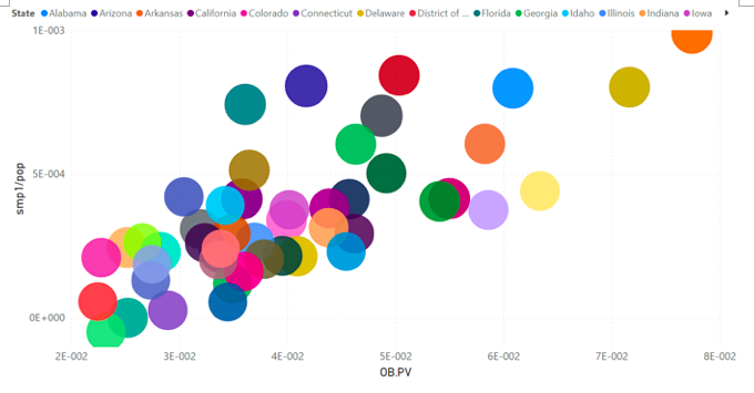
Figure 25. smp1/pop versus the product of obesity and poverty (OB.PV), with the radius size determined by Tmax Jul-Aug 2020. Each point is for one continental USA state, excluding District of Columbia, for which no temperature data were available (NOAA, 2021). The colour-code of the other 48 continental states is shown in section 2. Data were retrieved and calculations made as described in section 2.
The correlation is excellent. Climatic temperature (circle size) also appears to be correlated to OB.PV (Figure 25). Figure 26 shows the average of daily average temperatures over the calendar-year 2020 (Tav 2020) versus OB.PV, with added circle-symbol-size (radius) determined by the outcome smp1/pop.
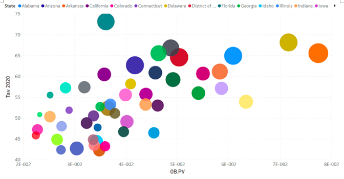
Figure 26. Tav 2020 versus the product of obesity and poverty (OB.PV), with the radius size determined by smp1/pop. Each point is for one continental USA state, excluding District of Columbia, for which no temperature data were available (NOAA, 2021). The colour-code of the other 48 continental states is shown in section 2. Data were retrieved as described in section 2.
Figure 26 shows two things.
First, climatic temperature is correlated to the product OB.PV.
Second, a diagram of climatic temperature versus OB.PV provides a strong predictor of whether there will be large summer mortality following an extended period of chronic psychological stress applied to the population.
Age structure of the population
More than 60 % of COVID-assigned deaths in the USA occur in the 85+ years age group (Kostoff et al., 2021; their Figure 1). The same is generally true of all viral respiratory diseases in Western nations.
Figure 27 shows WB/pop versus percent of population consisting of 85+ year olds (“85+/pop”), for each pre-COVID-era cycle-year, 2014-2019. The latter percentage more than doubles across all states, from approximately 1.2 % to approximately 2.6 %. Whereas the illustrated correlation is weak, it is persistently positive, having similar slope magnitudes, across all cycle-years, except for cycle-year 2016 (Figure 27c) where the nominally positive correlation (not shown) is not statistically meaningful.
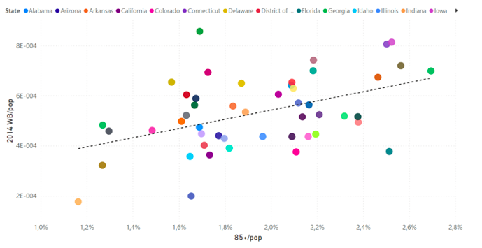
Figure 27a. WB/pop versus 85+/pop for cycle-year 2014. Each point is for one continental USA state. The trend line is meant merely to illustrate the correlation discussed in the text. It results from the usual least squares fit, using all the points in the graph. The colour-code of the 49 continental states is shown in section 2. Data were retrieved and calculations made as described in section 2. Outliers: Utah (bad data point in 2014), Wyoming (less populous state, poor statistics, underestimation of SB).
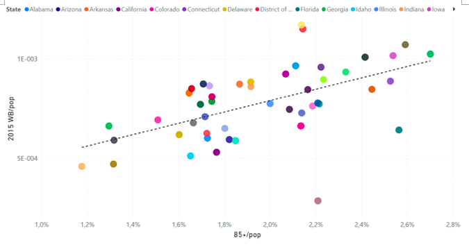
Figure 27b. WB/pop versus 85+/pop for cycle-year 2015. Each point is for one continental USA state. The trend line is meant merely to illustrate the correlation discussed in the text. It results from the usual least squares fit, using all the points in the graph. The colour-code of the 49 continental states is shown in section 2. Data were retrieved and calculations made as described in section 2. The outlier Wisconsin is due to bad data points in 2015 for this state (see Appendix).
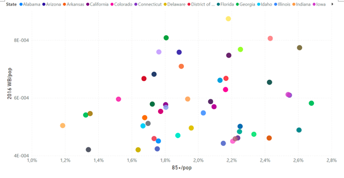
Figure 27c. WB/pop versus 85+/pop for cycle-year 2016. Each point is for one continental USA state. The colour-code of the 49 continental states is shown in section 2. Data were retrieved and calculations made as described in section 2.
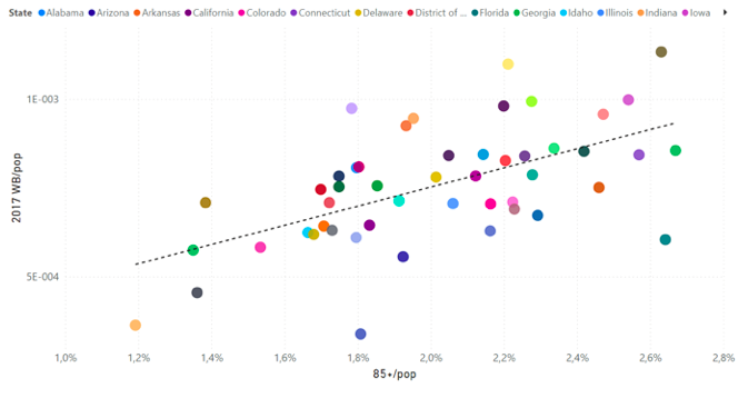
Figure 27d. WB/pop versus 85+/pop for cycle-year 2017. Each point is for one continental USA state. The trend line is meant merely to illustrate the correlation discussed in the text. It results from the usual least squares fit, using all the points in the graph. The colour-code of the 49 continental states is shown in section 2. Data were retrieved and calculations made as described in section 2. Outlier: Wyoming (less populous state, poor statistics).
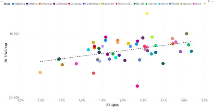
Figure 27e. WB/pop versus 85+/pop for cycle-year 2018. Each point is for one continental USA state. The trend line is meant merely to illustrate the correlation discussed in the text. It results from the usual least squares fit, using all the points in the graph. The colour-code of the 49 continental states is shown in section 2. Data were retrieved and calculations made as described in section 2. Outliers: West Virginia (underestimation of SB, overestimation of WB), Montana (reverse).
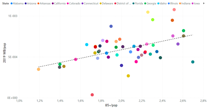
Figure 27f. WB/pop versus 85+/pop for cycle-year 2019. Each point is for one continental USA state. Outlier: District of Columbia (small state, poor statistics).
The same phenomenon (positive correlation of WB/pop with population fraction of the age group, in the pre-COVID-era cycle-years) occurs for all the older age groups: 45-54, 55-64, 65-74, 75-84, and 85+ ages. The correlation is then negative (anti-correlation) for 35-44 years, and not discernable for younger age groups (data not shown).
This age-dependence of winter burden mortality was expected, and is well known. Young people do not generally die of viral respiratory diseases that are prevalent in the winter.
In the COVID-era, cvp1/pop does not have a statistically meaningful correlation with 85+/pop, as shown in Figure 28a. It might best be described as no correlation whatsoever for states having essentially zero-magnitude cvp1/pop values, and several randomly placed outliers above the group having near-zero values of cvp1/pop. This is consistent with the idea that the cvp1 feature is predominantly due to the jurisdiction-specific response to the declaration of a pandemic.
Surprisingly, however, the summer‑2020 excess (above-SB) mortality (smp1/pop) has an anti-correlation (“neg‑cor”) with 85+/pop, again with significant outliers, as shown in Figure 28b; and the fall-winter-2020-2021 mortality (cvp2/pop) has no discernable correlation with 85+/pop, as shown in Figure 28c. Correspondingly, the WB/pop versus 85+/pop has a positive correlation for cycle-year 2020 (Figure 28d), and a uniquely strong negative (anti‑)correlation for cycle-year 2021 (Figure 28e).
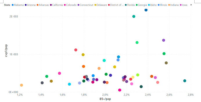
Figure 28a. cvp1/pop versus 85+/pop. Each point is for one continental USA state. The colour-code of the 49 continental states is shown in section 2. Data were retrieved and calculations made as described in section 2.
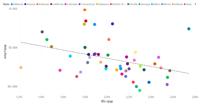
Figure 28b. smp1/pop versus 85+/pop. Each point is for one continental USA state. The trend line is meant merely to illustrate the correlation discussed in the text. It results from the usual least squares fit, using all the points in the graph. The colour-code of the 49 continental states is shown in section 2. Data were retrieved and calculations made as described in section 2.
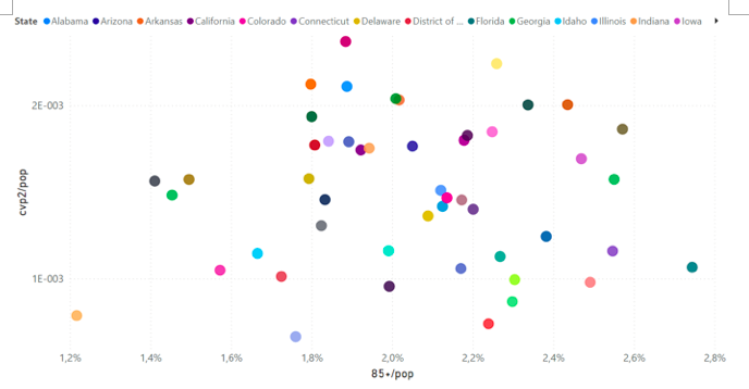
Figure 28c. cvp2/pop versus 85+/pop. Each point is for one continental USA state. The colour-code of the 49 continental states is shown in section 2. Data were retrieved and calculations made as described in section 2.
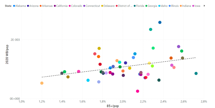
Figure 28d. WB/pop versus 85+/pop for cycle-year 2020. Each point is for one continental USA state. The trend line is meant merely to illustrate the correlation discussed in the text. It results from the usual least squares fit, using all the points in the graph. The colour-code of the 49 continental states is shown in section 2. Data were retrieved and calculations made as described in section 2.
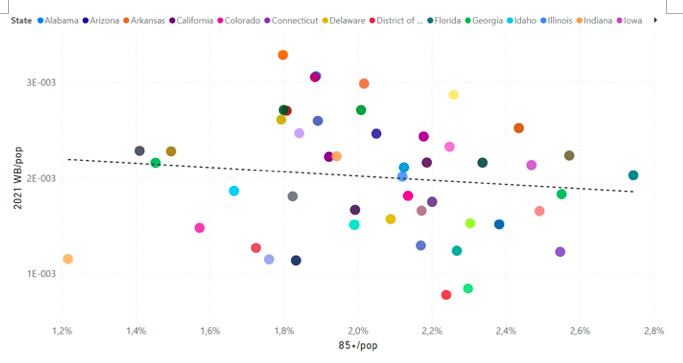
Figure 28e. WB/pop versus 85+/pop for cycle-year 2021. Each point is for one continental USA state. The trend line is meant merely to illustrate the correlation discussed in the text. It results from the usual least squares fit, using all the points in the graph. The colour-code of the 49 continental states is shown in section 2. Data were retrieved and calculations made as described in section 2.
The same types of state-wise correlations for smp1 and cvp2 occur for other age groups also (data not shown). In summary, as follows.
- smp1/pop: pos-cor with -18/pop, neg-cor with 55-64/pop, neg-cor with 85+/pop
- cvp2/pop: pos-cor with -18/pop, neg-cor with 45-54/pop, neg-cor with 55-64/pop
Population density
The USA state-wise data offers a unique opportunity to examine the relation between population density (“popD”) (number of inhabitants per unit surface area) and excess (above-SB) mortality, since popD varies by more than two orders of magnitude, from Wyoming to New Jersey.
Figure 29 shows WB/pop versus popD, for each pre-COVID-era cycle-year, 2014-2019. Here (Figure 29), there is no detectable, statistically significant, correlation between winter burden mortality (WB/pop) and popD, in any of the years studied.
Given the synchronous mortality patterns, state-to-state (Figures 10 and 11, for the pre-COVID-era cycle-years), and given present theoretical understanding of contagious disease transmission (Hethcote, 2000) (McCallum et al., 2001), our results (Figure 29) impose constraints on models of the phenomenon of seasonal mortality, and strongly suggest that the seasonal preponderance of viral respiratory diseases is not the result of transmission and spread by person-to-person “contact”.
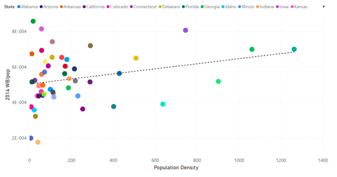
Figure 29a. WB/pop for cycle-year 2014 versus population density. Each point is for one continental USA state, excluding District of Columbia, which has an extreme density. The colour-code of the other 48 continental states is shown in section 2. Data were retrieved and calculations made as described in section 2.
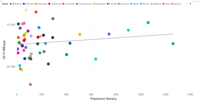
Figure 29b. WB/pop for cycle-year 2015 versus population density. Each point is for one continental USA state, excluding District of Columbia, which has an extreme density. The colour-code of the other 48 continental states is shown in section 2. Data were retrieved and calculations made as described in section 2.
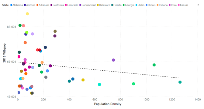
Figure 29c. WB/pop for cycle-year 2016 versus population density. Each point is for one continental USA state, excluding District of Columbia, which has an extreme density. The colour-code of the other 48 continental states is shown in section 2. Data were retrieved and calculations made as described in section 2.

Figure 29d. WB/pop for cycle-year 2017 versus population density. Each point is for one continental USA state, excluding District of Columbia, which has an extreme density. The colour-code of the other 48 continental states is shown in section 2. Data were retrieved and calculations made as described in section 2.
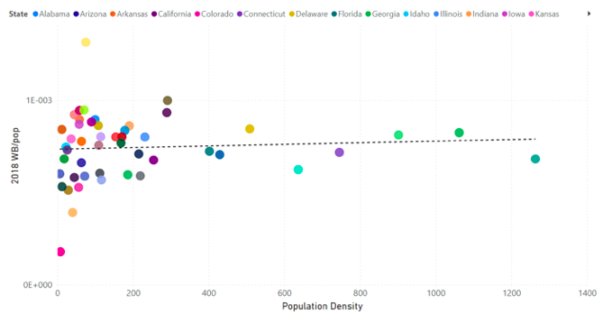
Figure 29e. WB/pop for cycle-year 2018 versus population density. Each point is for one continental USA state, excluding District of Columbia, which has an extreme density. The colour-code of the other 48 continental states is shown in section 2. Data were retrieved and calculations made as described in section 2.
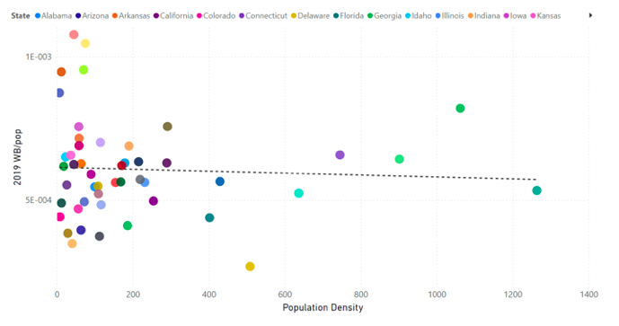
Figure 29f. WB/pop for cycle-year 2019 versus population density. Each point is for one continental USA state, excluding District of Columbia, which has an extreme density. The colour-code of the other 48 continental states is shown in section 2. Data were retrieved and calculations made as described in section 2.
This result (Figure 29) is in contrast to correlations observed for the COVID-era, where mortality has strong correlations and anti-correlations with popD. In the COVID-era, cvp1/pop has a large positive correlation with popD, although the New York outlier is significant, as shown in Figure 30a. While, on the other hand, both the summer‑2020 excess (above-SB) mortality (smp1/pop) and the fall-winter-2020-2021 mortality (cvp2/pop) have anti-correlations with popD (Figures 30b and 30c, respectively). Correspondingly, the WB/pop versus popD has a large positive correlation for cycle-year 2020, with New York outlier (Figure 30d), and a strong negative (anti-)correlation for cycle-year 2021 (Figure 30e).
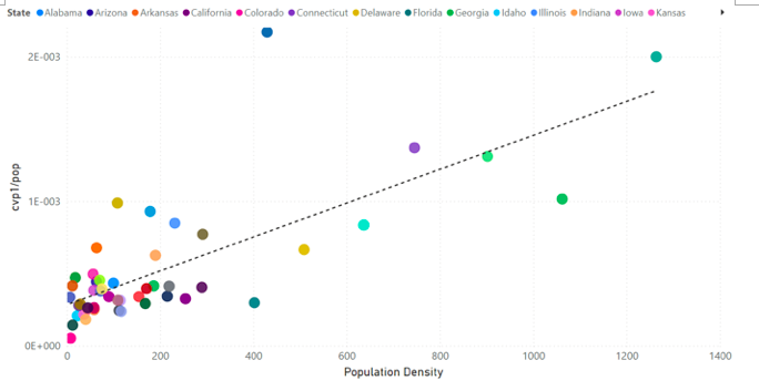
Figure 30a. cvp1/pop versus population density. Each point is for one continental USA state, excluding District of Columbia, which has an extreme density. The colour-code of the other 48 continental states is shown in section 2. Data were retrieved and calculations made as described in section 2.
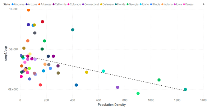
Figure 30b. smp1/pop versus population density. Each point is for one continental USA state, excluding District of Columbia, which has an extreme density. The colour-code of the other 48 continental states is shown in section 2. Data were retrieved and calculations made as described in section 2.
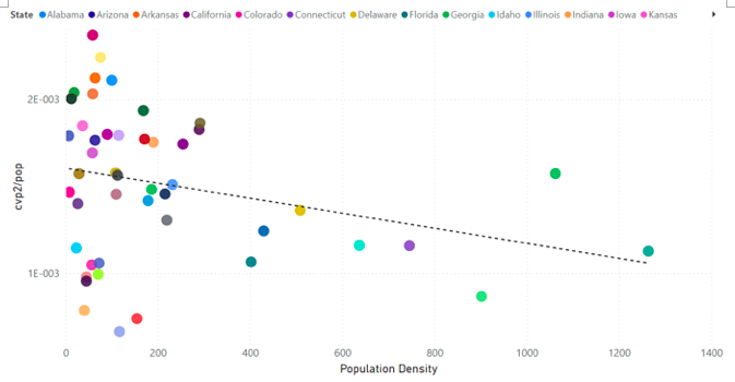
Figure 30c. cvp2/pop versus population density. Each point is for one continental USA state, excluding District of Columbia, which has an extreme density. The colour-code of the other 48 continental states is shown in section 2. Data were retrieved and calculations made as described in section 2.
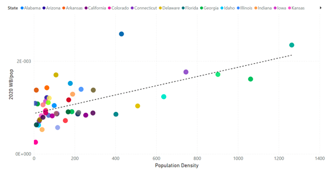
Figure 30d. WB/pop for cycle-year 2020 versus population density. Each point is for one continental USA state, excluding District of Columbia, which has an extreme density. The colour-code of the other 48 continental states is shown in section 2. Data were retrieved and calculations made as described in section 2.
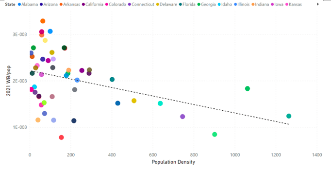
Figure 30e. WB/pop for cycle-year 2021 versus population density. Each point is for one continental USA state, excluding District of Columbia, which has an extreme density. The colour-code of the other 48 continental states is shown in section 2. Data were retrieved and calculations made as described in section 2.
We do not believe that a new virus causes the unprecedented correlations of mortality with popD, in the COVID-era. Rather, we interpret the results to mean that high-population-density states, with large urban centers would have had similar institutional structures and policy responses, generally different from those in low-population-density states. Also, the Southern states with large smp1 mortality due to climatic temperature, poverty and obesity are lower population-density states.
One pair of states, New York and Florida, strikingly demonstrates that population density in itself is not a controlling factor. Whereas these two states have essentially identical values of popD, they have diametrically opposed values of cvp1 mortality (Figure 30a), and, in the opposite order, of summer-2020 (smp1) mortality (Figure 30b).
Indeed, the correlations with popD in the COVID-era are an indication that the mortality is not the result of viral respiratory diseases, and rather that the mortality is tied to institutional, governmental, socio-economic and climatological differences.
All-cause mortality by week (ACM/w) by age group
The age dependencies of mortality in the pre-COVID and COVID-eras are shown more directly than only examining state-wise correlations, by examining ACM/w itself for the USA (no state-wise resolution is available) by age group, as follows.
We represent the ACM/w for the USA (Figure 5) by age group, for the two age groups 18-64 and 65+ ages, in Figure 32a. Here (Figure 32a), we have multiplied the ACM/w for the 18-64 years age group by a factor sufficient to make the ACM/w equal to that for the 65+ years age group, in the summer-2014 trough. This is equivalent to multiplying the population of the 18-64 years age group until the deaths per week are equal to the deaths per week in the 65+ years age group, in the summer-2014 trough. This is done to better visualize and compare the relative seasonal changes in mortality between the two age groups.

Figure 32a. All-cause mortality by week in the USA for the 18-64 and 65+ years age groups (light blue and dark blue lines, respectively), from 2014 to 2021. The ACM/w for the 18-64 years age group is rescaled (multiplied), as explained in the text, to make the number of deaths per week of both age groups equal in the summer-2014 trough, for comparison purposes. Data are displayed from week-40 of 2013 to week-37 of 2021 for the whole continental USA, including Alaska and Hawaii. Data were retrieved from CDC (CDC, 2021a), as described in Table 1.
Figure 32a shows that, in the pre-COVID-era, the elderly group (65+ years) is always approximately 2-3 times more susceptible to the additional challenges and stress of winter than the younger group (18-64 years). This rule is not followed in the COVID-era. In the COVID-era, the relative summer-2020 and summer-2021 mortalities are greater for the younger age group than for the elderly group (Figure 32a), which is reversed compared to known age-dependent vulnerability to dying from viral respiratory diseases.
This reversal in the COVID-era is more explicitly illustrated in Figure 32b, which shows the difference by week of the two curves depicted in Figure 32a.
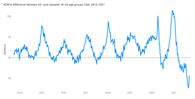
Figure 32b. Difference in all-cause mortality by week in the USA between the 65+ years and the rescaled 18-64 years age groups, from 2014 to 2021. The ACM/w for the 18-64 years age group was rescaled (multiplied), as explained in the text, to make the number of deaths per week of both age groups equal in the summer-2014 trough, for comparison purposes. Data are displayed from week-40 of 2013 to week-37 of 2021 for the whole continental USA, including Alaska and Hawaii. The dashed line emphasizes the zero. Data were retrieved from CDC (CDC, 2021a), as described in Table 1.
Here (Figure 32b), we see that the younger age group (18-64 years) has moderately more (rescaled) deaths in summer-2020, and significantly more (rescaled) deaths in summer-2021. Two possible interpretations come to mind: either the integrated cumulative long-term stress from the government measures takes longer to affect more tolerant younger individuals than older individuals, or the massive vaccination campaign administered between the two summers (Figure 31, below) has had a disproportionate negative impact on the younger age group.
A more detailed examination of the COVID-era is possible thanks to more age-group resolution being publicly available for that time period (CDC, 2021b), at the national level (not state-resolved), as follows. A selection of these data is shown in Figure 33.
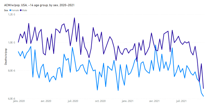
Figure 33a. All-cause mortality by week normalized by population for the USA for the 14 years and less (“-14 years”) age group, for each of both sexes, from 2020 to 2021. Data are displayed from week-1 of 2020 to week-37 of 2021 for the whole continental USA, including Alaska and Hawaii. The population used for normalization is the population of the specific age group and sex. ACM data were retrieved from the CDC (CDC, 2021b) and population data were retrieved from the US Census Bureau (US Census Bureau, 2021b), as described in Table 1.
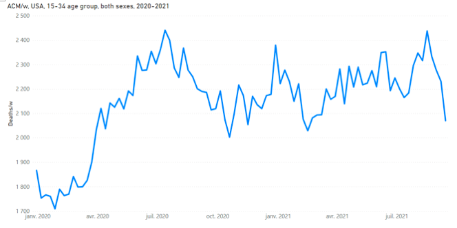
Figure 33b. All-cause mortality by week for the USA for the 15-34 years age group, both sexes, from 2020 to 2021. Data are displayed from week-1 of 2020 to week-37 of 2021 for the whole continental USA, including Alaska and Hawaii. The population used for normalization is the population of the specific age group. ACM data were retrieved from the CDC (CDC, 2021b) and population data were retrieved from the US Census Bureau (US Census Bureau, 2021b), as described in Table 1.
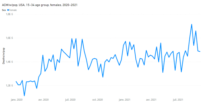
Figure 33c. All-cause mortality by week normalized by population for the USA for females of the 15-34 years age group, from 2020 to 2021. Data are displayed from week-1 of 2020 to week-37 of 2021 for the whole continental USA, including Alaska and Hawaii. The population used for normalization is the population of the specific age group and sex. ACM data were retrieved from the CDC (CDC, 2021b) and population data were retrieved from the US Census Bureau (US Census Bureau, 2021b), as described in Table 1.
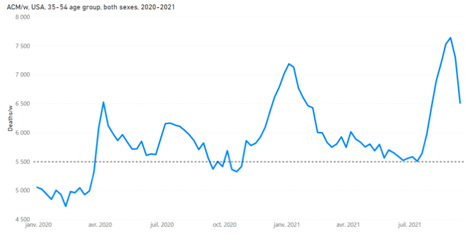
Figure 33d. All-cause mortality by week for the USA for the 35-54 years age group, both sexes, from 2020 to 2021. Data are displayed from week-1 of 2020 to week-37 of 2021 for the whole continental USA, including Alaska and Hawaii. The population used for normalization is the population of the specific age group. ACM data were retrieved from the CDC (CDC, 2021b) and population data were retrieved from the US Census Bureau (US Census Bureau, 2021b), as described in Table 1. The horizontal line at “5 500” is a visual aide of the plateau of mortality discussed in the text.
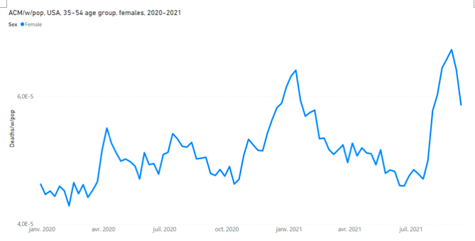
Figure 33e. All-cause mortality by week normalized by population for the USA for females of the 35-54 years age group, from 2020 to 2021. Data are displayed from week-1 of 2020 to week-37 of 2021 for the whole continental USA, including Alaska and Hawaii. The population used for normalization is the population of the specific age group and sex. ACM data were retrieved from the CDC (CDC, 2021b) and population data were retrieved from the US Census Bureau (US Census Bureau, 2021b), as described in Table 1.
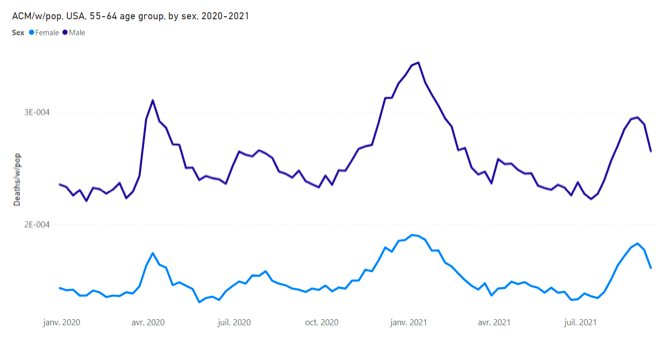
Figure 33f. All-cause mortality by week normalized by population for the USA for the 55-64 years age group, for each of both sexes, from 2020 to 2021. Data are displayed from week-1 of 2020 to week-37 of 2021 for the whole continental USA, including Alaska and Hawaii. The population used for normalization is the population of the specific age group and sex. ACM data were retrieved from the CDC (CDC, 2021b) and population data were retrieved from the US Census Bureau (US Census Bureau, 2021b), as described in Table 1.
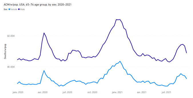
Figure 33g. All-cause mortality by week normalized by population for the USA for the 65-74 years age group, for each of both sexes, from 2020 to 2021. Data are displayed from week-1 of 2020 to week-37 of 2021 for the whole continental USA, including Alaska and Hawaii. The population used for normalization is the population of the specific age group and sex. ACM data were retrieved from the CDC (CDC, 2021b) and population data were retrieved from the US Census Bureau (US Census Bureau, 2021b), as described in Table 1.
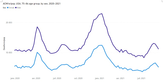
Figure 33h. All-cause mortality by week normalized by population for the USA for the 75-84 years age group, for each of both sexes, from 2020 to 2021. Data are displayed from week-1 of 2020 to week-37 of 2021 for the whole continental USA, including Alaska and Hawaii. The population used for normalization is the population of the specific age group and sex. ACM data were retrieved from the CDC (CDC, 2021b) and population data were retrieved from the US Census Bureau (US Census Bureau, 2021b), as described in Table 1.
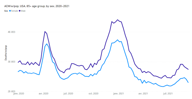
Figure 33i. All-cause mortality by week normalized by population for the USA for the age group 85 years and older (“85+ years”), for each of both sexes, from 2020 to 2021. Data are displayed from week-1 of 2020 to week-37 of 2021 for the whole continental USA, including Alaska and Hawaii. The population used for normalization is the population of the specific age group and sex. ACM data were retrieved from the CDC (CDC, 2021b) and population data were retrieved from the US Census Bureau (US Census Bureau, 2021b), as described in Table 1.
Figure 33 shows the following:
- (Figure 33a) In the -14 years age group there is no evidence for any summer/winter seasonality, or any COVID-era anomalies. The ACM/w/pop is essentially flat over the time period. Young (-14 years) residents of the USA are essentially not killed by viral respiratory diseases or COVID-19 or any cause of death having a strong seasonal variation in its effect.
- (Figures 33b and 33c) Figure 33b shows that the onset of the COVID-era (March 2020) is associated with an increase in deaths of 15-34 year olds to a new plateau in ACM/w (approximately 400 more deaths per week), which does not return to normal over the period studied. The rise to a COVID-era plateau of increased mortality occurs for both males and females (Figure 33c).
- (Figures 33d and 33e) The 35-54 years age group, like the 15-34 years age group, also experiences a high essentially uniform baseline plateau of mortality, which does not return to normal values over the period studied, but the ACM/w for this age group (35-54 years) also shows distinct cvp1, smp1, cvp2 and smp2 features superposed on the said plateau. This age group (35-54 years) has a disproportionately large smp2 feature (summer-2021 mortality), compared to the other features, and using the smp1 and cvp2 features as references, which holds for both males and females (Figure 33e).
- (Figures 33f, 33g, 33h and 33i) The age groups 55-64, 65-74, 75-84 and 85+ years do not exhibit the COVID-era increased baseline plateau mortalities seen in the 15-34 and 35-54 years age groups. Summer mortality for both 2020 (smp1) and 2021 (smp2) monotonically decrease in relative magnitude, compared to the cvp1 and cvp2 features, as age increases in the sequence 55-64, 65-74, 75-84 and 85+ years.
The results regarding dependence of mortality on state-to-state age structure of the population (Figures 27 and 28) show that the summer-2020 excess (above-SB) deaths were not predominantly due to viral respiratory diseases, and impacted younger people. Likewise, we deduce that the excess (above-SB) deaths in fall-winter-2020-2021 must predominantly be due to causes other than viral respiratory diseases, and impacted younger people. The inferred impacts on younger residents are corroborated by the age-group-specific mortalities at the national level (Figures 32 and 33).
Comparing all-cause excess mortality and COVID-assigned mortality
COVID-19-assigned deaths cannot be trusted to be deaths actually caused by COVID‑19 (Borger et al., 2021). Furthermore, it is likely that the COVID-19 assignation of cause of death captures far too many deaths (Elsoukkary et al., 2021). Nonetheless, we can compare the total number of COVID-19-assigned deaths in the USA to excess (above-SB) all-cause mortality.
For the two cycle-years 2020 and 2021 (July 2019 to July 2021), the total WB is 1.071 M deaths, compared to total CDC-reported COVID-assigned deaths up to July 2021 (up to the last week of the 2021 cycle-year, week-30 of 2021, which is the week of 26 July 2021) equal to 613 K deaths (CDC, 2021a, as described in the Table 1). Both numbers include Alaska and Hawaii. This leaves some 458 K above-SB deaths, up to July 2021, which are not accounted for by COVID-19 according to the relevant CDC statistics.
The difference of 458 K deaths, if the COVID-19-assignations could be trusted (they cannot), would be consistent with a large number of deaths (458 K) of younger residents whose deaths are not assigned to COVID-19 (Kostoff et al., 2021; their Figure 1). In addition to our results, above, Jacobson and Jokela (2021) also found that large numbers of individuals, too young to have died from COVID-19, died in the COVID-era.
To examine this difference (458 K deaths) more closely, we compare the all-cause mortality by week to assigned-cause deaths by week for pneumonia (P), influenza (I) and COVID-19 (C), reported by the CDC (2021a), in Figure 34; for 2014-2021 (Figure 34a) and on the expanded scale 2019-2021 (Figure 34b). PIC by week is also shown, which is the deaths assigned by the CDC as “pneumonia, influenza, and/or COVID-19”, which means that the death certificate includes pneumonia and/or influenza and/or COVID-19 listed as cause(s) of death.
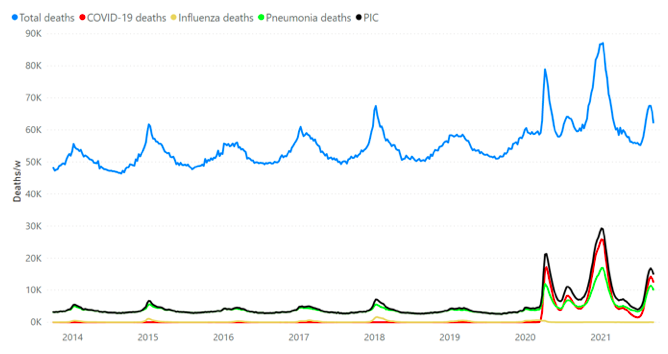
Figures 34a. All-cause (blue), COVID-19 (red), influenza (yellow), pneumonia (green) and PIC (black) mortality by week for the USA from 2014 to 2021. Data are displayed from week-40 of 2013 to week-37 of 2021 for the whole continental USA, including Alaska and Hawaii. PIC is the deaths assigned to pneumonia and/or influenza and/or COVID-19. ACM and cause-assigned deaths data were retrieved from CDC (CDC, 2021a) as described in Table 1.
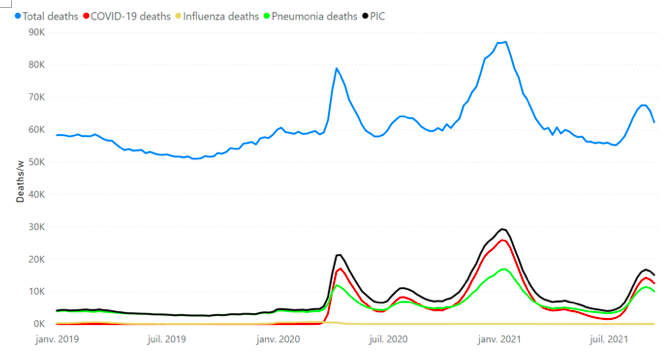
Figure 34b. All-cause (blue), COVID-19 (red), influenza (yellow), pneumonia (green) and PIC (black) mortality by week for the USA from 2019 to 2021. Data are displayed from week‑1 of 2019 to week-37 of 2021 for the whole continental USA, including Alaska and Hawaii. PIC is the deaths assigned to pneumonia and/or influenza and/or COVID-19. ACM and cause-assigned deaths data were retrieved from CDC (CDC, 2021a) as described in Table 1.
We interpret the similarity in patterns of temporal variation between CDC-reported weekly COVID-19-assigned or PIC deaths and the all-cause mortality (ACM/w) as arising because many or most of the COVID-19-assigned deaths are drawn from our above-SB deaths; that is, are drawn from deaths induced by the government measures, via the combined poverty, obesity and climatic factors, made potent by sustained chronic psychological stress, and from the deaths resulting from the direct assault against the elderly in March-June 2020 (cvp1) (Rancourt, 2020).
Let us examine these relations further. Figure 34c shows the P, I, C and PIC by week CDC data with our ACM-SB/w, 2014-2021, while Figure 34d shows the same data for the period 2019-2021.
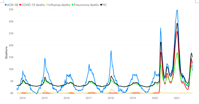
Figure 34c. All-cause above-SB (ACM-SB) (blue), COVID-19 (red), influenza (yellow), pneumonia (green) and PIC (black) mortality by week for the USA from 2014 to 2021. Data are displayed from week-40 of 2013 to week-37 of 2021 for the whole continental USA, including Alaska and Hawaii. PIC is the deaths assigned to pneumonia and/or influenza and/or COVID-19. ACM and cause-assigned deaths data were retrieved from CDC (CDC, 2021a) as described in Table 1. SB was estimated as described in section 2.
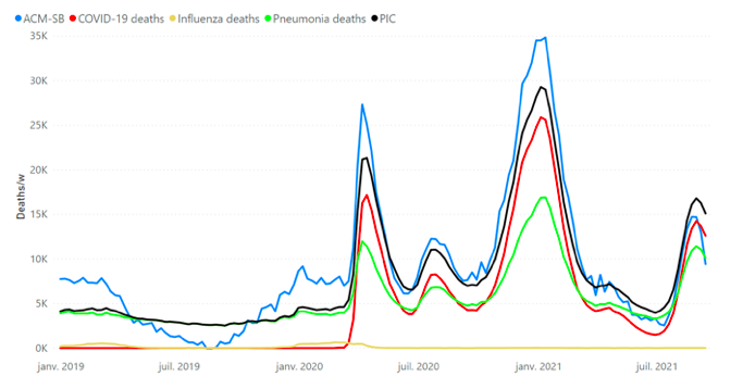
Figure 34d. All-cause above-SB (ACM-SB) (blue), COVID-19 (red), influenza (yellow), pneumonia (green) and PIC (black) mortality by week for the USA from 2019 to 2021. Data are displayed from week-1 of 2019 to week-37 of 2021 for the whole continental USA, including Alaska and Hawaii. PIC is the deaths assigned to pneumonia and/or influenza and/or COVID-19. ACM and cause-assigned deaths data were retrieved from CDC (CDC, 2021a) as described in Table 1. SB was estimated as described in section 2.
We note (Figures 34c and 34d) that pneumonia contributes significantly to summer deaths and that its summer-trough values are on a linear trend that is essentially horizontal for the years shown (approximately 2,680 pneumonia deaths per week, baseline). The same is true for PIC. Next, we therefore remove the “pneumonia‑SB” (“pSB”) from the pneumonia data, and from the PIC data, in order to visualize solely deaths above summer-normal mortality.
The result is shown in Figure 34e (2014-2021) and Figure 34f (2019-2021).
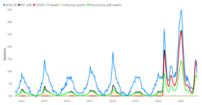
Figure 34e. All-cause above-SB (ACM-SB) (blue), COVID-19 (red), influenza (yellow), pneumonia‑pSB (green) and PIC-pSB (black) mortality by week for the USA from 2014 to 2021. Data are displayed from week-40 of 2013 to week-37 of 2021 for the whole continental USA, including Alaska and Hawaii. The dashed line emphasizes the zero. pSB, the summer-trough pneumonia mortality, is removed from each week of pneumonia, and of PIC deaths. PIC is the deaths assigned to pneumonia and/or influenza and/or COVID-19. ACM and cause-assigned deaths data were retrieved from CDC (CDC, 2021a) as described in Table 1. SB was estimated as described in section 2.
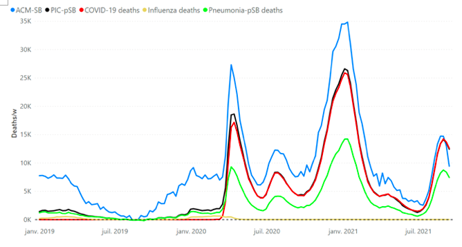
Figure 34f. All-cause above-SB (ACM-SB) (blue), COVID-19 (red), influenza (yellow), pneumonia‑pSB (green) and PIC-pSB (black) mortality by week for the USA from 2019 to 2021. Data are displayed from week-1 of 2019 to week-37 of 2021 for the whole continental USA, including Alaska and Hawaii. The dashed line emphasizes the zero.pSB, the summer-trough pneumonia mortality, is removed from each week of pneumonia, and of PIC deaths. PIC is the deaths assigned to pneumonia and/or influenza and/or COVID-19. ACM and cause-assigned deaths data were retrieved from CDC (CDC, 2021a) as described in Table 1. SB was estimated as described in section 2.
Figures 34g and 34h show some of the same data as above but also the difference (residual) “ACM-SB” minus “PIC-pSB”, by week (black curve), for the USA. This difference (ACM-SB minus PIC-pSB) shows deaths that are not assigned to a respiratory disease (viral or any pneumonia) as a contributing cause of death.
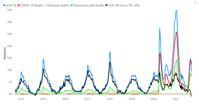
Figure 34g. All-cause above-SB (ACM-SB) (blue), COVID-19 (red), influenza (yellow), pneumonia‑pSB (green) and ACM-SB minus PIC-pSB (black) mortality by week for the USA from 2014 to 2021. Data are displayed from week-40 of 2013 to week-37 of 2021 for the whole continental USA, including Alaska and Hawaii. The dashed line emphasizes the zero. pSB, the summer-trough pneumonia mortality, is removed from each week of pneumonia, and of PIC deaths. PIC is the deaths assigned to pneumonia and/or influenza and/or COVID-19. ACM and cause-assigned deaths data were retrieved from CDC (CDC, 2021a) as described in Table 1. SB was estimated as described in section 2.
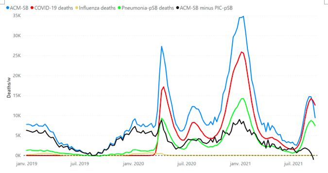
Figure 34h. All-cause above-SB (ACM-SB) (blue), COVID-19 (red), influenza (yellow), pneumonia‑pSB (green) and ACM-SB minus PIC-pSB (black) mortality by week for the USA from 2019 to 2021. Data are displayed from week-1 of 2019 to week-37 of 2021 for the whole continental USA, including Alaska and Hawaii. The dashed line emphasizes the zero. pSB, the summer-trough pneumonia mortality, is removed from each week of pneumonia, and of PIC deaths. PIC is the deaths assigned to pneumonia and/or influenza and/or COVID-19. ACM and cause-assigned deaths data were retrieved from CDC (CDC, 2021a) as described in Table 1. SB was estimated as described in section 2.
Figures 34a through 34h show that, in addition to COVID-19-associated deaths, there was a massive increase in pneumonia-associated deaths in the COVID-era in the USA, which had the same temporal pattern as both ACM and COVID-19-assigned deaths.
Figure 34i shows that COVID-19-assigned deaths were consistently associated with pneumonia as a contributing cause of death, some 40 to 60 % of the cases, throughout the COVID-era. Also, virtually all the above-pSB pneumonia assignations had COVID-19 co-assignations. That is, in number, all the excess pneumonia assignations in the COVID-era had COVID-19 co-assignations.
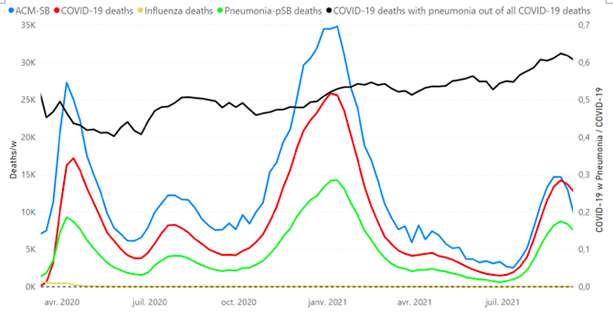
Figure 34i. All-cause above-SB (ACM-SB) (blue), COVID-19 (red), influenza (yellow) and pneumonia‑pSB (green) mortality by week, and the ratio of COVID-19 deaths with pneumonia to all COVID-19 deaths (black, right Y-scale) by week, for the USA in the COVID-era (March-2020 into 2021). Data are displayed from week-11 of 2020 (week of March 11 2020, date of the WHO pronouncement of the pandemic) to week-37 of 2021 for the whole continental USA, including Alaska and Hawaii. The dashed line emphasizes the zero. pSB, the summer-trough pneumonia mortality, is removed from each week of pneumonia deaths. ACM and cause-assigned deaths data were retrieved from CDC (CDC, 2021a) as described in Table 1. SB was estimated as described in section 2.
The difference (ACM-SB minus PIC-pSB) shown in Figures 34g and 34h shows that excess (above-SB) deaths not assigned to a respiratory disease (viral or any pneumonia) as a contributing cause of death are approximately the same in number during the COVID-era as in previous years. Known causes of death for excess (above‑SB, winter burden) deaths include heart disease, Alzheimer disease/dementia, and diabetes (Woolf et al., 2021). However, the difference (ACM-SB minus PIC-pSB) does show anomalies in the COVID-era: a sharp peak in March-May 2020, and a consistently large value in the summer-2020 period. A striking feature is that, unlike summer-2020, the rise in ACM-SB in summer-2021 is entirely assigned as PIC, virtually without any non-respiratory assignation.
The result that there were essentially no excess deaths (in number) assigned to non-respiratory causes in the COVID-era in the USA (Figure 34g) is surprising in that, for England and Wales, Kontopantelis et al. (2021) found, looking at excess deaths above historical trends, that in the first 30 weeks of the declared pandemic there were 62,321 excess deaths: 46,221 (74 %) attributable to respiratory causes, and 16,100 (26 %) to other causes.
Some authors have argued that COVID-19 deaths may be vastly underestimated by failing to correctly assign respiratory deaths to COVID-19 (Stokes et al., 2021) (IHME, 2021). We find this highly implausible for the USA. Acknowledging similar numbers of non-respiratory excess (above-SB) deaths in the COVID-era as in the pre-COVID-era (Figure 34g), leads one to conclude that virtually all other excess (above-SB) deaths (in number) in the COVID-era have been assigned as COVID-19, consistently including pneumonia as a jointly assigned cause of death in approximately 40-60 % of the thus COVID-19-assigned cases (Figure 34i). There is no room for more COVID-19 deaths in the USA accounting of mortality. Indeed, how could COVID-19-assignations be undercounted in the middle of the most mediatized, tested and medical-protocol regulated declared pandemic in memory, in a country that has some of the best medical statistics gathering in the world?
Respiratory causes appear to have been the main agent of death, regarding excess (above-SB) deaths in the USA in the COVID-era; however COVID-19 assignment remains suspect (Borger et al., 2021).
Shockingly, there was a massive epidemic or co-epidemic of pneumonia in the USA in the COVID-era, according to CDC data (CDC, 2021a) (Figure 34), which is never mentioned in the media and essentially not on the radar in the medical research literature. To the extent that there is COVID-19 over-assignation, it may represent up to 100 % of the COVID-era excess deaths from respiratory causes. It would not be the first time that the actual cause of a large epidemic is bacterial infection rather than the presumed viral pathogen (Morens et al., 2008) (Chien et al., 2009) (Sheng et al., 2011). In the words of Ginsburg and Klugman (2020):
Data regarding bacterial superinfections in COVID-19 pneumonia are still emerging, but an association has been made between the detection of bacterial products in blood with disease severity in COVID-19 patients.[ref] Diagnosing coinfections is complex in the best of circumstances and because there is a desire to avoid diagnostic procedures and minimise the exposure of COVID-19 to health-care workers, diagnosing potential bacterial superinfections during COVID-19 has been challenging.
[…] Although many serum biomarkers lack specificity, increased procalcitonin concentrations have been investigated as a specific bacterial differentiation from viral response to bacterial respiratory tract infection.[refs] From accumulating data and reports, there appears to be a clear association between elevated concentrations of procalcitonin and increasing COVID-19 disease severity, despite a variety of cutoffs chosen.[refs]
Most bacterial pneumonias caught early enough can be safely and effectively treated with antibiotics […]
Vaccination
It is important to examine whether the large COVID vaccination campaign has had any influence on mortality and on the phenomena that we describe in this article. Figure 31 shows all-cause mortality by week (ACM/w), the number of total (all manufacturers) administered vaccines (doses/day) and the number of fully vaccinated individuals (vaccinated/day), on the same time axis, in the COVID-era (CDC, 2021a; CDC, 2021f).
An individual is considered fully vaccinated when second dose of a two-dose vaccine or one dose of a single-dose vaccine is completed (CDC, 2021f).
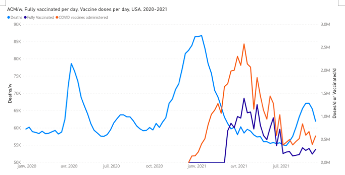
Figure 31. All-cause mortality by week (light blue), fully vaccinated individuals by day (dark blue) and COVID vaccine doses administered by day (orange), in the USA, from 2020 to 2021. Data are displayed from week-1 of 2020 to week-37 of 2021. For data by day, only one day a week is represented on the graph (Monday). An individual is considered fully vaccinated when second dose of a two-dose vaccine or one dose of a single-dose vaccine is completed. USA means 49 continental states, including the District of Columbia and excluding Alaska and Hawaii. Data were retrieved from CDC (CDC 2021a, CDC 2021f), as described in Table 1.
The total number of doses in the period illustrated is approximately 380 M and the total number of people being fully vaccinated is approximately 178 M. Therefore, the large hump in vaccinations per day constitutes the majority of the planned vaccination campaign (Figure 31).
Here (Figure 31), we note that our interpretations concerning cvp1 and smp1 mortality cannot be impacted whatsoever by vaccination because the vaccination injections and the fully vaccinated status started later, beyond the week of the inflection point on the rise of the cvp2 feature and towards the end of the cvp2 feature, respectively.
Readers who would be tempted to ascribe the downturn in the cvp2 peak to the vaccination campaign should note that the downturn coincides with the expected seasonal downturn of every seasonal winter maximum that has ever been observed by epidemiologists in the last century or more.
More importantly, the largely completed vaccination campaign did not prevent a second surge of summer deaths (2021, “smp2”) (Figure 31). The mortality in the said second surge appears to be comparable to or more than the mortality for summer-2020. Furthermore, the COVID-19-assigned deaths (CDC, 2021a) are significantly greater in number in summer-2021 than in summer-2020 (Figure 34), and, unlike at any other time in the COVID-era, account for virtually all the excess (above-SB) deaths, in the summer-2021 feature (smp2) (Figure 34), following the vaccination campaign.
There is no sign in the ACM/w that the vaccination campaign has had any positive effect. However, given that the vaccination campaign starts well after the 2020 summer and essentially ends mid-summer-2021 prior to the start of the smp2 feature, given that the 2021 excess (above-SB) summer deaths (smp2) occur in significantly younger individuals than the excess summer-2020 deaths, and given that the smp2 feature is significantly larger than the smp1 feature for the said younger individuals (35-54 years, Figures 33d and 33e; and 55-64 years, Figure 33f, to a lesser degree), it is possible that vaccination made 35-54 year olds and others more vulnerable to death, especially summer death in disadvantaged individuals in hot-climate states (Montgomery et al., 2021) (Simone et al., 2021).
4. Comparison with Canada, and implications
One of the most striking aspects about mortality in the USA is that total yearly mortality in Canada is completely normal in the COVID-era: it lies precisely on the decadal trend established since 2010. We elaborated this fact about Canada in our recent article (Rancourt et al., 2021). At the time of publication, there was only enough weekly data to complete cycle-year 2020 for Canada. More data is now available, such that we can now obtain cycle-year 2021, by implementing a short (10-week) reliable extrapolation to complete the needed summer-2021 trough section.
The latest Canadian data is shown in Figure 35.
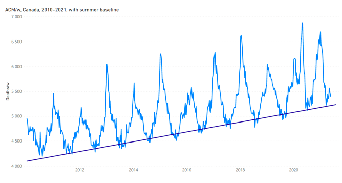
Figure 35. All-cause mortality by week in Canada from 2010 to 2021. The linear summer baseline (SB) is a least-squares fit to the summer troughs for summer-2013 through summer-2019, using the following summer trough weeks: 2013-weeks [24-37], 2014-weeks [28-33], 2015-weeks [27-37], 2016-weeks [24-34], 2017-weeks [25-34], 2018-weeks [28-35], 2019-weeks [26-38]. Data are displayed from week-1 of 2010 (week ending on January 9, 2010) to week-20 of 2021 (week ending on May 22, 2021) for the ACM and to week-30 of 2021 (week ending on July 31, 2021) for the SB. That way, the SB extends to the end of the 2021 cycle-year (week-30 of 2021), thereby showing the segment needing extrapolation discussed in the text. Data were retrieved from StatCan (StatCan, 2021), as described in Table 1.
The said extrapolation is performed as follows. We work with ACM-SB/w, average the values for 2021 weeks 10 through 20, which is a relatively flat region in ACM-SB/w, in the summer 2021 “trough” (week 20 is the last usable week in the data), and this average value is adopted for weeks 21 through 30 in ACM-SB/w (week 30 is the last week of the 2021 cycle-year). We then take this ACM-SB/w (including the thus extrapolated 10‑week segment) and transform back to an ACM/w by adding the SB. The total mortalities per cycle-year are then calculated from sums on this ACM/w data, which now is extended to complete the last (2021) cycle-year. The extrapolation is an accurate representation of the last 10 weeks in the 2021 cycle-year, unless something unexpected and significant occurs in those 10 weeks in mid-summer-2021, beyond the already higher summer-trough values occurring in the COVID-era for Canada (Figure 35).
The resulting ACM per cycle-year versus cycle-year for Canada is shown in Figure 36, with a best-line fit to illustrate the trend.
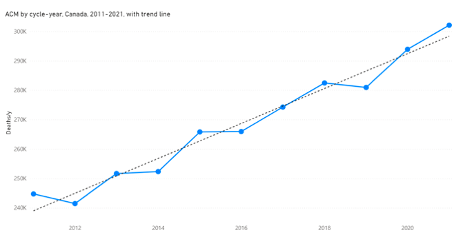
Figure 36a. All-cause mortality by cycle-year for Canada, cycle-years 2011 to 2021. The dashed line is a least-squares fitted straight line. The cycle-year starts on week-31 of a calendar-year (beginning of August) and ends on week-30 of the next calendar-year (end of July). The ACM over the weeks 21 to 30 of 2021 was extrapolated, as described in the text, in order to complete the 2021 cycle-year. Raw data were retrieved from StatCan (StatCan, 2021), as described in Table 1.
Figure 36a is the same as Figure 2 in our prior article (Rancourt et al., 2021), except for the addition of one more cycle-year (2021). This further confirms that “there was no pandemic in Canada” (Rancourt et al., 2021).
We also calculated the WB of deaths for cycle-years 2011 through 2021, which is shown in Figure 36b. A slight increase by year is expected because the population of those most vulnerable to winter-time deaths is increasing. Again, as with ACM itself, nothing in the values of WB deaths indicates any pandemic or any unusual additional cause of yearly mortality in cycle-years 2020 or 2021.
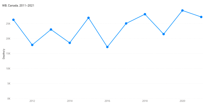
Figure 36b. Winter burden (WB) for Canada for cycle-years 2011 to 2021. The cycle-year starts on week-31 of a calendar-year (beginning of August) and ends on week-30 of the next calendar-year (end of July). The ACM-SB over the weeks 21 to 30 of 2021 was extrapolated, as described in the text, in order to complete the WB of the cycle-year 2021. Raw data were retrieved from StatCan (StatCan, 2021), as described in Table 1.
The ACM/w can also be used to calculate ACM by calendar-year, which is shown, compared to ACM by cycle-year, in Figure 37 for Canada.
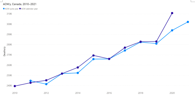
Figure 37. All-cause mortality by calendar-year (dark blue), calendar-years 2010 to 2020, shown with all-cause mortality by cycle-year (light blue), cycle-years 2011 to 2021, for Canada. Cycle-year N means the period from mid-summer of calendar-year N-1 to mid‑summer of calendar-year N. The ACM over the weeks 21 to 30 of 2021 was extrapolated, as described in the text, in order to complete the 2021 cycle-year. Raw data were retrieved from StatCan (StatCan, 2021), as described in Table 1.
In Figure 37 the ACM by calendar-year for 2020 is higher than the visible trend because of an accident in the positions of ACM/w peaks: there is a large late peak in cycle-year 2020 (the March-June 2020 so-called “covid” peak, or “cvp1”) and a large early rise in the winter peak of cycle-year 2021. In this figure, recall that cycle-year N means the period from mid-summer of calendar-year N-1 to mid‑summer of calendar-year N.
Clearly, there is no sign of a pandemic in Canada, or of a COVID-era anomaly, in terms purely of ACM by cycle-year and WB (Figure 36), which is at odds with the dramatic increase seen for the neighbouring USA: Figure 1, by calendar-year up to 2020; Figure 5, in the ACM/w data itself; Figure 12a, expressed as WB versus cycle-year.
If a new pathogen caused the havoc that we have described for the USA during the COVID-era, then how could such a virulent and contagious pathogen not have crossed the world’s longest international land border (8,890 km) between two major trading partners? Did Canada apply effective mitigation strategies, completely different from those applied in the major states of the USA, which reduced the mortality impact of the new pathogen to zero on the Canadian territory? The answers must be “that would be impossible” and “no”, respectively.
Viral respiratory diseases, in particular, are believed to be very contagious, and more so for presumed pandemic-causing new viruses for which there is no prior immunity in the world populations. Either the presumed new virus was not able to cross the USA-Canada border or Canadians of heterogeneous origins are genetically resilient to the new virus or the massive excess deaths in the USA during the COVID-era are not primarily due to any new respiratory virus. We think the latter must be concluded, and this is consistent with our findings of co-correlations with socio-geo-economic and climatic factors, which project to zero excess deaths for sufficiently small values of the correlated or co-correlated factors (e.g., Figure 25, for summer-2020 deaths).
5. Mechanistic causes for COVID-era deaths
To be clear, we have not shown that USA deaths are correlated to poverty, obesity and hot climatic regions, although that in itself is probably true to a significant degree, as can be inferred from a map of life expectancy at birth by state of the USA, such as the one shown in Figure 38a.
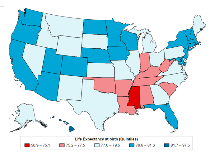
Figure 38a. Map of life expectancy at birth for USA states, from census tracts 2010-2015 (Tejada-Vera et al., 2020). Present interactive map location: https://www.cdc.gov/nchs/data-visualization/life-expectancy/index.html
This map of life expectancy at birth by state (Figure 38a) is in turn very similar to a map of antibiotic prescriptions by population by state, such as the one shown in Figure 38b.
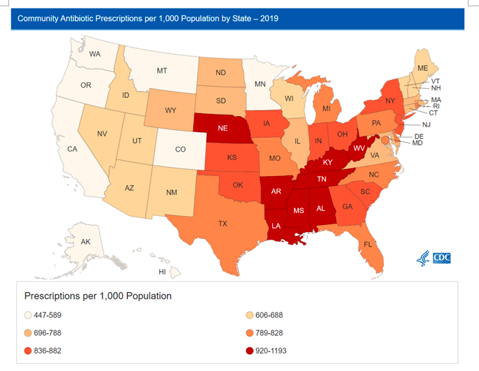
Figure 38b. Antibiotic prescriptions per 1,000 persons by state (sextiles) for all ages, United States, 2019.“Healthcare providers prescribed 251.1 million antibiotic prescriptions—equivalent to 765 antibiotic prescriptions per 1,000 persons”, in 2019 (CDC, 2021g).
Given the similarity in state-wise distributions of life expectancy at birth (Figure 38a) and antibiotic prescriptions (Figure 38b), it is not unreasonable to conclude that a dominant cause of death limiting life expectancy, in the USA in the pre-COVID-era, is bacterial infection, the most common fatal such infection being bacterial pneumonia.
However, what we have shown is that, in the COVID-era, during summer-2020 (smp1), fall-winter-2020-2021 (cvp2) and summer-2021 (smp2), combined factors including poverty, obesity and hot climate became deadly associations for excess (above-SB) deaths, beyond the deaths that would have occurred from the pre-COVID-era background of preexisting risk factors.
In addition, we have repeatedly concluded that the sharp peak in excess mortality occurring in March-June 2020 in some USA states (“covid” peak) (cvp1) must be a consequence of aggressive government and medical response to the WHO 11 March 2020 declaration of a pandemic, in those hot-spot jurisdictions, such as New York City in particular in the USA, and we have outlined likely mechanisms whereby this aggression would have caused a large surge of deaths in care homes and hospitals everywhere that it occurred (Rancourt, 2020) (Rancourt et al., 2020) (Rancourt et al., 2021).
The question now arises: By what mechanism(s) did the COVID-era government and medical disruptions induce excess deaths, at the population level, in the most vulnerable populations (elderly, and poverty + obesity + hot climate)? Alternatively (Figure 34), by what mechanism(s) did the COVID-era government and medical disruptions make respiratory diseases, including pneumonia, so much more fatal than usual, at the population level, in the most vulnerable populations (elderly, and poverty + obesity + hot climate)? What about the COVID-era so dramatically multiplied the deadliness of poverty + obesity + hot climate, in the USA?
We submit that the overly succinct three-word answer is: “chronic psychological stress”, plus deadly institutional aggression and neglect of the sick elderly regarding the March-June 2020 catastrophe (cvp1). “Chronic psychological stress” is a powerful determinant of individual health (see below), which is essentially ignored by all those who accept the promoted dominant view that the virulence and contagiousness of the viral respiratory pathogens are predominantly determined by viral genetics, with only secondary influence from host characteristics and social determinants of host characteristics. The dominant view is contradicted by more than a century of hard mortality data, as explained above (Figures 1 through 4), where the declared pandemics are undetected and all the detected major mortality excesses are tied to socio-economic periods and events.
Researchers considering mortality from diseases must make themselves aware that ordinary psychological stress significantly impacts immune response, and that psychoneuroimmunology is a large field of research (Ader and Cohen, 1993).
Social status, within a specific dominance hierarchy, is a major predictor of chronic stress, in social animals including humans (Cohen et al., 1997a) (Sapolsky, 2005), which, in turn, may be the dominant determinant of individual health, disease burden, and longevity (Cohen et al., 2007).
Ordinary psychological stress is known to be a dominant factor in making an individual susceptible to viral respiratory disease symptomatic infection, and to increase the severity of the infection (Cohen et al., 1991). Also, social isolation (paucity of social-network interactions), in addition to individual psychological stress, is known to have an added impact on the individual’s susceptibility to viral respiratory diseases (Cohen et al., 1997b).
Furthermore, there is a large age gradient for stress endurance: extended periods of psychological stress are known to have more deleterious health effects in elderly persons than in younger persons (Prenderville et al., 2015).
The stress-immune relationship, however, is not simply a monotonic function of integrated intensity. Frequency and duration are pivotal: chronic or long-term stress harms immune response, whereas short-term adaptive stress enhances immune response. The often-cited review by Dhabhar (2014) has:
Short-term (i.e., lasting for minutes to hours) stress experienced during immune activation enhances innate/primary and adaptive/secondary immune responses. Mechanisms of immuno-enhancement include changes in dendritic cell, neutrophil, macrophage, and lymphocyte trafficking, maturation, and function as well as local and systemic production of cytokines. In contrast, long-term stress suppresses or dysregulates innate and adaptive immune responses by altering the Type 1–Type 2 cytokine balance, inducing low-grade chronic inflammation, and suppressing numbers, trafficking, and function of immunoprotective cells.
Peters et al. (2021) have reviewed these concepts and the known science for the relevance to COVID-19. They pointed out that “the socioeconomic issues and various aspects of the Western type lifestyle that are closely associated with psychosocial stress have recently been reported to contribute to COVID-19”. Their ultimate aim is to “clarify whether psychosocial interventions have the potential to optimize neuroendocrine-immune responses against respiratory viral infections during and beyond the COVID-19 pandemic.”
Therefore, it is not difficult to imagine that the massive socio-economic disruptions of the COVID-era would have caused undue chronic psychological stress and amplified dominance-hierarchy stress predominantly against those who are already at the bottom of the societal dominance hierarchy, and have the least means to adjust to dramatically new circumstances. The new circumstances include: loss of sources of income, both legitimate and illegal, increased social isolation, increased hierarchical impositions, constant fear propaganda, severe mobility restrictions, closing of public and corporate-public spaces previously used, enforcement and intimidation against private or informal gatherings, mobbing against those who do not cheerfully accept the “new reality”, and increased aggressions from equally stressed individuals. The missing means to adjust would include: undisturbed salary and ability to work from home, means to stay connected by Zoom (by video conferencing applications), large comfortable air-conditioned homes, means to home-school children in an adapted environment, nearby facilities for outside exercise, private facilities for physical exercise, undisturbed shopping by home delivery, undisturbed self-medication, continued access to health care, and so on.
It follows, from the science reviewed above, that the “undue chronic psychological stress and amplified dominance-hierarchy stress”, generally applied to entire populations, would cause death in those most likely to experience the stress and already in higher risk categories. It appears, for example, that populations normally adapted to summer heatwaves in the Southern USA were either prevented from practicing their usual adaptations to the heat or became more vulnerable to this physiological stress, or both.
It is evident also that the type of weakening of the immune system caused by chronic psychological stress would lessen the body’s ability to fight bacterial pneumonia, and that the populations hardest hit during the COVID-era are already disproportionately susceptible to bacterial pneumonia (Figure 38).
At this stage (Figure 34, Figure 38), and given the state of science and practice in this regard (Ginsburg and Klugman, 2020), it is not unreasonable to ask whether the logic has not been inverted: Is COVID-19-assignment an incorrect cause-assignment for what is in fact bacterial pneumonia? From this perspective, it becomes relevant to point out that Ivermectin is probably an effective antibacterial agent against tuberculosis, for example (Crump, 2017) (Lim et al., 2013), which would have been prescribed where the mainstream protocols call for avoiding antibiotics (Beovic et al., 2020) (CDC, 2021h) (Karami et al., 2021).
Karami et al. (2021) put it this way:
Conclusions: On presentation to the hospital bacterial co-infections are rare, while empiric antibiotic use is abundant. This implies that in patients with COVID-19 empiric antibiotic should be withheld. This has the potential to dramatically reduce the current overuse of antibiotics in the COVID-19 pandemic.
Buehrle et al. (2020) pointed out that, at the same time, outpatient antibiotic prescriptions dropped significantly in the USA:
Abstract: In April 2020, there were significant reductions in prescription fills of each of the 10 most prescribed outpatient antibiotics in the United States. Monthly azithromycin, amoxicillin-clavulanate, and levofloxacin fills did not rebound significantly from April through July 2020. Coronavirus disease 2019 had an immediate and sustained impact on US outpatient antibiotic prescribing.
The CDC (2021h) shows this graph:
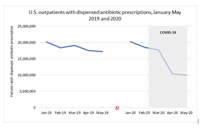
Figure 39. Estimated number of outpatients with dispensed antibiotic prescriptions, USA, 2019-2020. (CDC, 2021h).
If COVID-19 is largely misdiagnosed bacterial pneumonia (using a faulty PCR test: Borger et al., 2021; or not using any laboratory test), or if co-infection with bacterial pneumonia is not appropriately recognized (Ginsburg and Klugman, 2020), or if bacterial pneumonia itself goes otherwise untreated, while antibiotics (and Ivermectin) are withdrawn, in circumstances where large populations of vulnerable and susceptible residents have suppressed immune systems from chronic psychological stress induced by large-scale socio-economic disruption, then the state has recreated the conditions that produced the horrendous bacterial pneumonia epidemic of 1918 (Morens et al., 2008) (Chien et al., 2009) (Sheng et al., 2011), in COVID‑era USA.
6. Conclusion
By examining the socio-jurisdictional and temporal structure of the ACM/w data, and by comparing to socio-geo-economic and climatic data, we conclude that the massive above-trend COVID-era mortality in the USA is not the result of a pandemic, but instead is caused by the large-scale medical and government responses, which transformed the domestic economy and living conditions, and the associated long-term chronic psychological stress effects on the most vulnerable populations (regarding poverty and obesity), in a context of ordinary seasonal respiratory diseases and typical summer heat-wave climatic effects.
In light of the results presented herein, the view that a new respiratory disease virus caused the excess deaths in the COVID-era (March-2020 to present) in the USA has to be considered an extravagant theory, contrary to empirical data and viral respiratory disease phenomenology:
- No declared pandemic (1957-58, 1968, 2009) has ever caused a detectable increase in yearly all-cause mortality in the USA, since 1900, except 1918, which has been incorrectly assigned as an influenza pandemic.
- All the detected anomalies in yearly all-cause mortality in the USA, since 1900, have been associated with major socio-economic upheavals: the First World War, The Great Depression and Dust Bowl, the Second World War, and the medical and government response to the declared COVID-19 pandemic.
- None of the recently declared viral respiratory disease pandemics (1957-58, 1968, 2009), and none of the ubiquitous seasonal (winter) epidemics of the last century or more, in all Northern hemisphere countries having sufficiently good data, exhibit large jurisdictional heterogeneity (in both time and location) in all-cause mortality of the magnitude seen during the COVID-era.
- On the contrary, viral respiratory disease epidemics, never mind declared pandemics, never stop at jurisdictional boundaries or national or state or provincial or regional or county borders. Instead, seasonal (winter) all-cause mortality is always synchronous across mid-latitude Northern hemispheric jurisdictions, while showing similar to statistically identical patterns of temporal variation within any given year.
- The jurisdictional and temporal heterogeneity of all-cause mortality during the COVID-era in the USA (and other nations) is of unprecedented character and magnitude (Figures 5-11, 13-16, and Table 2), which can only be due to local and time-dependent forces and vulnerability to those forces, not viral respiratory diseases as the primary driver.
- The extraordinary mortality spike that occurred in New York City and some North-East coastal states in March-June 2020 (cvp1) and virtually nowhere else (some 34 USA states did not significantly exhibit this feature in all-cause mortality) is impossible for a virulent and contagious respiratory disease virus acting in a society free from local aggression or local environmental disaster. To our knowledge, no such intense feature, this late in the cycle-year, has ever occurred in the world epidemiological record.
- Viral respiratory diseases never give rise to all-cause mortality by time peaks (maxima) in the summer. The unprecedented summer peaks seen in the USA in the COVID-era are contrary to known viral respiratory disease epidemiology.
- Pre-COVID-era viral-respiratory-disease burden mortality (winter burden) does not correlate with obesity, whereas the state-wise heterogeneous summer-2020, fall-winter-2020-2021 and summer-2021 excess (above-SB) mortalities do correlate with obesity.
- Pre-COVID-era viral-respiratory-disease burden mortality (winter burden) does not correlate with poverty, whereas the state-wise heterogeneous summer-2020, fall-winter-2020-2021 and summer-2021 excess (above-SB) mortalities do correlate with poverty.
- Pre-COVID-era viral-respiratory-disease burden mortality (winter burden) does not correlate with climatic temperature, whereas the state-wise heterogeneous summer-2020, fall-winter-2020-2021 and summer-2021 excess (above-SB) mortalities do correlate with climatic temperature.
- In the correlations that we identified, the 2020 and 2021 summer excess (above-SB) mortalities extend to zero values for sufficiently small values of poverty, obesity or summer temperatures, or their combinations, such as the product of poverty and obesity, suggesting that the presumed new pathogen requires sufficiently high state-wise average poverty, obesity and/or temperatures in order to spread and be lethal in the summer.
- Pre-COVID-era viral-respiratory-disease burden mortality (winter burden) always correlates with the proportion of the population that is elderly, whereas the state-wise heterogeneous summer-2020, fall-winter-2020-2021 and summer-2021 excess (above-SB) mortalities anti-correlate with the proportion of the population that is elderly, strongly so for summer mortality.
- No known respiratory disease virus has ever caused a permanent (1.5 years and counting) step-wise time-independent increase in mortality of 15-34 year olds, which appears to have occurred in the COVID-era (Figures 33b to 33e).
- Pre-COVID-era viral-respiratory-disease burden mortality (winter burden) does not correlate with population density (Figure 29), whereas the state-wise heterogeneous March-June 2020 excess mortality (cvp1) strongly correlates with population density; and summer-2020, fall-winter-2020-2021 and summer-2021 excess (above-SB) mortalities anti-correlate with population density (Figure 30). (This is a consequence of the localities of the March-June 2020 anomaly, and that poor states tend to have low population density.)
- The largest high-tech vaccination campaign in history, targeted against the presumed pathogen, had no detectable benefit in all-cause mortality, given the post-vaccination-campaign summer-2021 surge that is observed.
- It is extremely unlikely that a virulent and contagious viral respiratory pathogen that would have caused the exceedingly large COVID-era excess mortality in the USA, could not have crossed the border into Canada, the world’s longest international land border (8,890 km) between two major trading partners; where both countries are normally (pre-COVID-era) continuously subject to seasonal (winter) viral respiratory disease epidemics having virtually identical mortality characteristics.
Finally, our examination of plausible mechanisms for the exceptionally large COVID‑era mortality in the USA, given all our empirical observations, leads us to postulate that COVID-19 may largely be misdiagnosed bacterial pneumonia (using a faulty PCR test: Borger et al., 2021; and see Ginsburg and Klugman, 2020), that correctly assigned bacterial pneumonia itself largely goes untreated, while antibiotics (and Ivermectin) are withdrawn, in circumstances where large populations of vulnerable and susceptible residents have suppressed immune systems from chronic psychological stress induced by (“COVID response”) large-scale socio-economic disruption, and that the USA has, in the COVID-era, thus recreated the conditions that produced the horrendous bacterial pneumonia epidemic of 1918 (Morens et al., 2008) (Chien et al., 2009) (Sheng et al., 2011).
Given the approximately 1 M excess deaths that have occurred in the most vulnerable and underprivileged residents of the USA in the COVID‑era, given the evidence from empirical and statistical data on the causes of the excess mortality, and in view of our research and general observations, we feel justified in making the following comment. We believe that genetic-sequencing-centered virologists and mathematical modellers (as opposed to other and broad disciplines connected to epidemiology, biology, psychology and health), pharmaceutical-industry lobbyists, politicized public health officials (WHO, national, and local), biased media, and approval-seeking politicians, have had far too much influence on public policy in the events surrounding the proclaimed pandemic, and in establishing the questionable dominant narrative, without regard for the hard data that is all-cause mortality by time, jurisdiction, age group, sex, and so forth; without regard for robust measures of population-level actual harm, while allowing tunnel-vision assignation of cause. The resulting practice has been mostly contrary to public health principles of objectively, scientifically, equally and independently assessing risks and benefits of any impactful policy, within a framework of transparency and accountability; and has caused great societal harm, beyond significant excess mortality itself, which is difficult to fully quantify.
*
Note to readers: Please click the share buttons above or below. Follow us on Instagram, @crg_globalresearch. Forward this article to your email lists. Crosspost on your blog site, internet forums. etc.
References
Ader and Cohen. (1993) “Psychoneuroimmunology: Conditioning and Stress”. Annual Review of Psychology 1993 44:1, 53-85. https://pubmed.ncbi.nlm.nih.gov/8434895/
Beović et al. (2020) “Antibiotic use in patients with COVID-19: a ‘snapshot’ Infectious Diseases International Research Initiative (ID-IRI) survey”. J Antimicrob Chemother. 2020 Nov 1;75(11):3386-3390. doi: 10.1093/jac/dkaa326. PMID: 32766706; PMCID: PMC7454563. https://academic.oup.com/jac/article/75/11/3386/5882116
Borger et al. (2021) “Addendum to the Corman-drosten Review Report.” OSF Preprints. 12 January 2021. doi:10.31219/osf.io/9mjy7. https://osf.io/9mjy7/
Buehrle et al. (2020) “Impact of the Coronavirus Disease 2019 Pandemic on Outpatient Antibiotic Prescriptions in the United States”, Open Forum Infectious Diseases, Volume 7, Issue 12, December 2020, ofaa575. https://doi.org/10.1093/ofid/ofaa575
CDC (2021a) “Pneumonia and Influenza Mortality Surveillance from the National Center for Health Statistics Mortality Surveillance System”. (accessed 18 October 2021). https://gis.cdc.gov/grasp/fluview/mortality.html
CDC (2021b) “Provisional COVID-19 Deaths by Week, Sex, and Age” | NCHS. Page last updated: October 13, 2021. (accessed 18 October 2021). https://data.cdc.gov/NCHS/Provisional-COVID-19-Deaths-by-Week-Sex-and-Age/vsak-wrfu
CDC (2021c) “National Vital Statistics System | Historical Data, 1900-1998”. Page last reviewed: November 6, 2015. (accessed on 28 July 2021). https://www.cdc.gov/nchs/nvss/mortality_historical_data.htm
CDC (2021d) “National Center for Health Statistics | CDC WONDER Online Database”. (accessed on 27 July 2021). https://wonder.cdc.gov/mortSQL.html
CDC (2021e) “Adult Obesity Prevalence Maps | Overall Obesity: Prevalence of Self-Reported Obesity Among U.S. Adults by State and Territory, BRFFS, 2020”. Page last reviewed: September 27, 2021 (accessed 24 September 2021). https://www.cdc.gov/obesity/data/prevalence-maps.html#states
CDC (2021f) “COVID-19 Vaccinations in the United States, Jurisdiction”. Page last updated: October 25, 2021. (accessed 28 September 2021). https://data.cdc.gov/Vaccinations/COVID-19-Vaccinations-in-the-United-States-Jurisdi/unsk-b7fc
CDC (2021g) “Outpatient Antibiotic Prescriptions — United States, 2019”. Page last reviewed: July 22, 2021. (accessed 17 October 2021). https://www.cdc.gov/antibiotic-use/data/report-2019.html
CDC (2021h) “Antibiotic Use in the United States, 2020 Update: Progress and Opportunities”. Atlanta, GA: US Department of Health and Human Services, CDC; 2021. Page last reviewed: June 22, 2021. (accessed 17 October 2021). https://www.cdc.gov/antibiotic-use/stewardship-report/current.html
Chien et al. (2009) “Bacterial pathogens and death during the 1918 influenza pandemic”. N Engl J Med. 2009 Dec 24;361(26):2582-3. doi: 10.1056/NEJMc0908216. PMID: 20032332. https://www.nejm.org/doi/10.1056/NEJMc0908216
Cohen et al. (2007) “Psychological Stress and Disease”. JAMA, 298(14), pp. 1685–1687. doi: 10.1001/jama.298.14.1685. https://pubmed.ncbi.nlm.nih.gov/17925521/
Cohen et al. (1997a) “Chronic Social Stress, Social Status, and Susceptibility to Upper Respiratory Infections in Nonhuman Primates”. Psychosomatic Medicine: May/June 1997 – Volume 59 – Issue 3 – p 213-221. https://kilthub.cmu.edu/articles/journal_contribution/Chronic_Social_Stress_Social_Status_and_Susceptibility_to_Upper_Respiratory_Infections_in_Nonhuman_Primates/6613937/files/12106595.pdf
Cohen et al. (1997b) “Social Ties and Susceptibility to the Common Cold”. JAMA, 277(24), pp. 1940–1944. doi: 10.1001/jama.1997.03540480040036. https://pubmed.ncbi.nlm.nih.gov/9200634/
Cohen et al. (1991) “Psychological Stress and Susceptibility to the Common Cold”. New England Journal of Medicine. Massachusetts Medical Society, 325(9), pp. 606–612. doi: 10.1056/NEJM199108293250903. https://pubmed.ncbi.nlm.nih.gov/1713648/
Crump (2017) “Ivermectin: enigmatic multifaceted ‘wonder’ drug continues to surprise and exceed expectations”. J Antibiot 70, 495–505 (2017). https://doi.org/10.1038/ja.2017.11
Dhabhar. (2014) “Effects of stress on immune function: the good, the bad, and the beautiful”. Immunologic Research.2014 May; 58(2-3): 193-210. doi: 10.1007/s12026-014-8517-0. PMID: 24798553. (cited >800). https://link.springer.com/article/10.1007%2Fs12026-014-8517-0
Doshi (2008) “Trends in Recorded Influenza Mortality: United States, 1900–2004”, American Journal of Public Health98, no. 5 (May 1, 2008): pp. 939-945. https://doi.org/10.2105/AJPH.2007.119933
Doshi (2011) “The elusive definition of pandemic influenza”. Bulletin of the World Health Organization. 2011 Jul;89(7):532-538. DOI: 10.2471/blt.11.086173. PMID: 21734768; PMCID: PMC3127275. https://europepmc.org/article/pmc/3127275
Elsoukkary et al. (2021) “Autopsy Findings in 32 Patients with COVID-19: A Single-Institution Experience”. Pathobiology 2021;88:56-68. doi: 10.1159/000511325. https://www.karger.com/Article/FullText/511325
Ginsburg and Klugman (2020) “COVID-19 pneumonia and the appropriate use of antibiotics”. Lancet Glob Health. 2020 Dec;8(12):e1453-e1454. doi: 10.1016/S2214-109X(20)30444-7. Epub 2020 Nov 11. PMID: 33188730; PMCID: PMC7833845. https://www.thelancet.com/journals/langlo/article/PIIS2214-109X(20)30444-7/fulltext
Hethcote (2000) “The Mathematics of Infectious Diseases” SIAM Rev., 42(4), 599–653. https://doi.org/10.1137/S0036144500371907 —- http://www.math.yorku.ca/~hhuang/math6937-06/siamreview.pdf
Harper (1961) “Airborne micro-organisms: Survival tests with four viruses”. Epidemiology and Infection, 59(4), 479-486. doi:10.1017/S0022172400039176. https://www.cambridge.org/core/journals/epidemiology-and-infection/article/airborne-microorganisms-survival-tests-with-four-viruses/78E907605FDC1FCF878F4C48FC0BF3B6
IHME (2021) (Institute for Health Metrics and Evaluation) “Estimation of excess mortality due to COVID-19”, 13 May 2021, http://www.healthdata.org/special-analysis/estimation-excess-mortality-due-covid-19-and-scalars-reported-covid-19-deaths (accessed on 14 October 2021)
Jacobson and Jokela (2021) “Beyond COVID-19 deaths during the COVID-19 pandemic in the United States”. Health Care Manag Sci (2021). https://doi.org/10.1007/s10729-021-09570-4
Karami et al. (2021) “Few bacterial co-infections but frequent empiric antibiotic use in the early phase of hospitalized patients with COVID-19: results from a multicentre retrospective cohort study in The Netherlands”, Infectious Diseases, 53:2, 102-110, DOI: 10.1080/23744235.2020.1839672. https://www.tandfonline.com/doi/full/10.1080/23744235.2020.1839672
Kontopantelis et al. (2021) “Excess deaths from COVID-19 and other causes by region, neighbourhood deprivation level and place of death during the first 30 weeks of the pandemic in England and Wales: A retrospective registry study”, The Lancet Regional Health – Europe,
Volume 7, 2021, 100144, ISSN 2666-7762. https://doi.org/10.1016/j.lanepe.2021.100144
Kostoff et al. (2021) “Why are we vaccinating children against COVID-19?” Toxicol Rep. 2021;8:1665-1684. doi: 10.1016/j.toxrep.2021.08.010. Epub 2021 Sep 14. PMID: 34540594; PMCID: PMC8437699. https://pubmed.ncbi.nlm.nih.gov/34540594/
Lim et al. (2013) “Anthelmintic avermectins kill Mycobacterium tuberculosis, including multidrug-resistant clinical strains”. Antimicrob Agents Chemother. 2013 Feb;57(2):1040-6. doi: 10.1128/AAC.01696-12. Epub 2012 Nov 19. PMID: 23165468; PMCID: PMC3553693. https://journals.asm.org/doi/10.1128/AAC.01696-12
McCallum et al. (2001) “How should pathogen transmission be modelled?” Trends Ecol Evol. 2001 Jun 1;16(6):295-300. doi: 10.1016/s0169-5347(01)02144-9. PMID: 11369107. https://www.math.ttu.edu/~anpeace/files/Math5354Papers/McCallumetal_2001_TREE.pdf
Montgomery et al. (2021) “Myocarditis Following Immunization With mRNA COVID-19 Vaccines in Members of the US Military”. JAMA Cardiol. Published online June 29, 2021. doi:10.1001/jamacardio.2021.2833. https://jamanetwork.com/journals/jamacardiology/fullarticle/2781601
Morens et al. (2008) “Predominant role of bacterial pneumonia as a cause of death in pandemic influenza: implications for pandemic influenza preparedness.” The Journal of infectious diseases, vol. 198,7 (2008): 962-70. doi:10.1086/591708. https://www.ncbi.nlm.nih.gov/pmc/articles/PMC2599911/
NASA Earth Observatory (2021) “Exceptional Heat Hits Pacific Northwest”, 25 June 2021. (accessed on 28 September 2021). https://earthobservatory.nasa.gov/images/148506/exceptional-heat-hits-pacific-northwest
NOAA (2021) National Centers for Environmental information, “Climate at a Glance: Statewide Mapping”, published September 2021. (accessed on 27 September 2021). https://www.ncdc.noaa.gov/cag/
Peters et al. (2021) “To stress or not to stress: Brain-behavior-immune interaction may weaken or promote the immune response to SARS-CoV-2”. Neurobiology of Stress, Volume 14, 100296. ISSN 2352-2895. https://doi.org/10.1016/j.ynstr.2021.100296.
Prenderville et al. (2015) “Adding fuel to the fire: the impact of stress on the ageing brain”. Trends in Neurosciences, 38(1), pp. 13–25. doi: 10.1016/j.tins.2014.11.001. https://pubmed.ncbi.nlm.nih.gov/25705750/
Rancourt (2020) “All-cause mortality during COVID-19: No plague and a likely signature of mass homicide by government response”, by Rancourt, DG (2 June 2020) ResearchGate. DOI: 10.13140/RG.2.2.24350.77125.
Rancourt et al. (2020) “Evaluation of the virulence of SARS-CoV-2 in France, from all-cause mortality 1946-2020”, by Rancourt, DG, Baudin, M, and Mercier, J, ResearchGate (20 August 2020) DOI: 10.13140/RG.2.2.16836.65920/1. https://www.researchgate.net/publication/343775235_Evaluation_of_the_virulence_of_SARS-CoV-2_in_France_from_all-cause_mortality_1946-2020
Rancourt et al. (2021) “Analysis of all-cause mortality by week in Canada 2010- 2021, by province, age and sex: There was no COVID-19 pandemic, and there is strong evidence of response- caused deaths in the most elderly and in young males”, by Rancourt, DG, Baudin, M, and Mercier, J, ResearchGate (06 August 2021) DOI: 10.13140/RG.2.2.14929.45921. https://www.researchgate.net/publication/353750912_Analysis_of_all-cause_mortality_by_week_in_Canada_2010-_2021_by_province_age_and_sex_There_was_no_COVID-19_pandemic_and_there_is_strong_evidence_of_response-_caused_deaths_in_the_most_elderly_and_in_y
Sapolsky. (2005) “The Influence of Social Hierarchy on Primate Health”, Science, 29 April 2005, vol. 308, pages 648-652. DOI: 10.1126/science.1106477. https://www.pinniped.net/sapolsky2005.pdf
Shaman et al. (2010) “Absolute Humidity and the Seasonal Onset of Influenza in the Continental United States”, PLoS Biol 8(2): e1000316. https://doi.org/10.1371/journal.pbio.1000316
Sheng et al. (2011) “Autopsy series of 68 cases dying before and during the 1918 influenza pandemic peak”. Proc Natl Acad Sci U S A. 2011 Sep 27;108(39):16416-21. doi: 10.1073/pnas.1111179108. Epub 2011 Sep 19. PMID: 21930918; PMCID: PMC3182717. https://www.pnas.org/content/108/39/16416.long
Simone et al. (2021) “Acute Myocarditis Following COVID-19 mRNA Vaccination in Adults Aged 18 Years or Older”. JAMA Intern Med. Published online October 04, 2021. doi:10.1001/jamainternmed.2021.5511. https://jamanetwork.com/journals/jamainternalmedicine/fullarticle/2784800
Simonsen et al. (1997) “The impact of influenza epidemics on mortality: introducing a severity index”, Am J Public Health. 87(12):1944-1950. doi:10.2105/ajph.87.12.1944.
StatCan (2021) “Table 13-10-0768-01 Weekly death counts, by age group and sex”. Page last updated: October 14, 2021. (accessed on 16 October 2021). https://doi.org/10.25318/1310076801-eng
Stokes et al. (2021) “Excess Deaths During the COVID-19 Pandemic: Implications for US Death Investigation Systems”. Am J Public Health. 2021 Jul;111(S2):S53-S54. doi: 10.2105/AJPH.2021.306331. PMID: 34314220; PMCID: PMC8495654. https://ajph.aphapublications.org/doi/10.2105/AJPH.2021.306331
Tejada-Vera et al. (2020) “Life Expectancy Estimates by U.S. Census Tract, 2010-2015”. National Center for Health Statistics. 2020. Designed by B Tejada-Vera et al.: National Center for Health Statistics. Page last reviewed: March 9, 2020. Content source: National Center for Health Statistics. https://www.cdc.gov/nchs/data-visualization/life-expectancy/index.html (accessed on 17 October 2021)
US Census Bureau (2021a) “State Population Totals: 2010-2020”. Page last revised: October 8, 2021. (accessed on 18 March 2021). https://www.census.gov/programs-surveys/popest/technical-documentation/research/evaluation-estimates/2020-evaluation-estimates/2010s-state-total.html
US Census Bureau (2021b) “State Population by Characteristics: 2010-2020”. Page last revised: October 8, 2021. (accessed on 24 September 2021). https://www.census.gov/programs-surveys/popest/technical-documentation/research/evaluation-estimates/2020-evaluation-estimates/2010s-state-detail.html
US Census Bureau (2021c) “Historical Population Density Data (1910-2020)”. Published: April 26, 2021. Page last revised: October 8, 2021. (accessed on 23 September 2021). https://www.census.gov/data/tables/time-series/dec/density-data-text.html
US Census Bureau (2021d) “Small Area Income and Poverty Estimates (SAIPE) Program | State and County Estimates for 2019”. Page last revised: October 8, 2021. (accessed on 23 September 2021). https://www.census.gov/data/datasets/2019/demo/saipe/2019-state-and-county.html
Woolf et al. (2021) “Excess Deaths From COVID-19 and Other Causes in the US, March 1, 2020, to January 2, 2021”. JAMA. 2021;325(17):1786–1789. doi:10.1001/jama.2021.5199. https://jamanetwork.com/journals/jama/fullarticle/2778361 —- and “Supplemental Online Content” (accessed on 14 October 2021)
Featured image is from Children’s Health Defense
Appendix
ACM/w, 2013-2021, with colour-differentiated cycle‑years, for all the individual states of continental USA
The following graphs represent the all-cause mortality by week in each state of the continental USA from 2013 to 2021. Data are displayed from week-1 of 2013 to week-40 of 2021 (last available data point at the date of access, unless otherwise stated). The different colours are for the different cycle-years. The cycle-year starts on week-31 of a calendar-year (beginning of August) and ends on week-30 of the next calendar-year (end of July). Cycle-years 2013 and 2022 are then not completed. Data were retrieved from CDC (CDC, 2021a), as described in Table 1 of section 2 of the article.
The 49 continental USA states, including District of Columbia and excluding Alaska and Hawaii, are presented by alphabetical order.
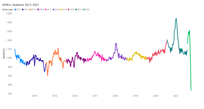
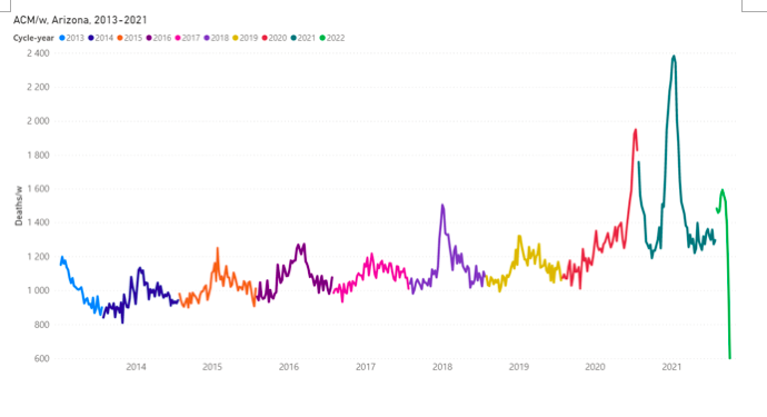
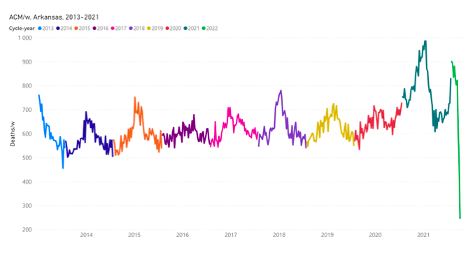
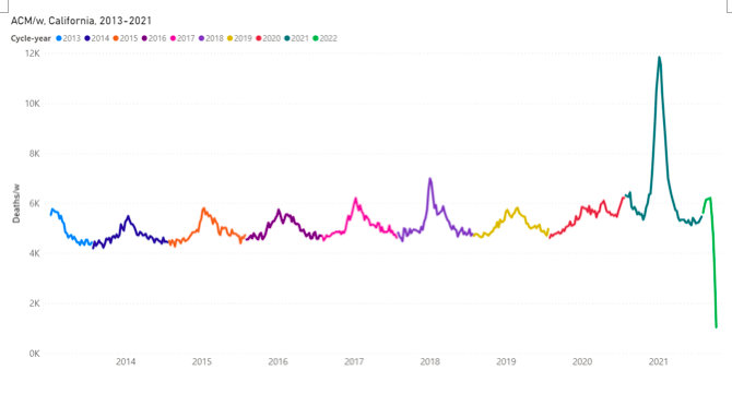
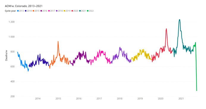
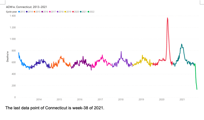
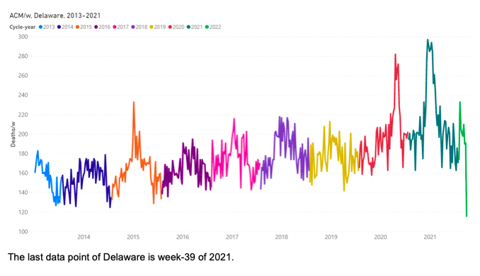
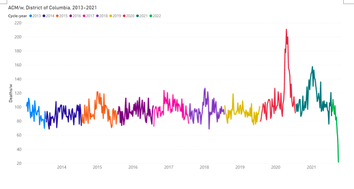
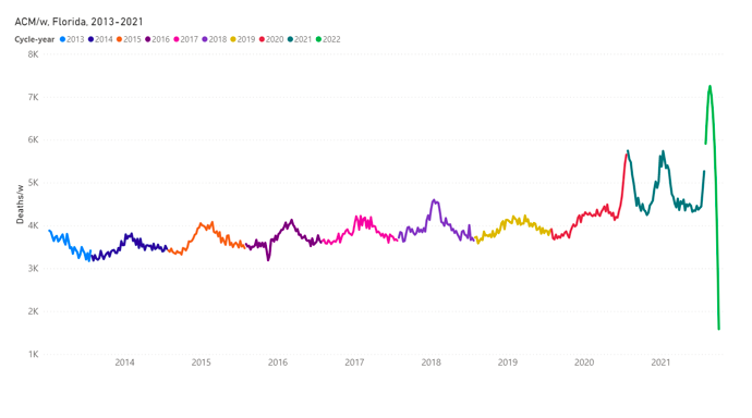
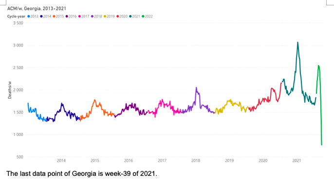
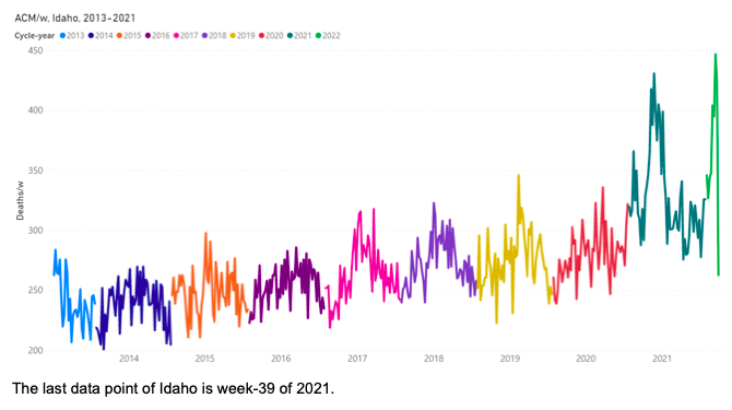
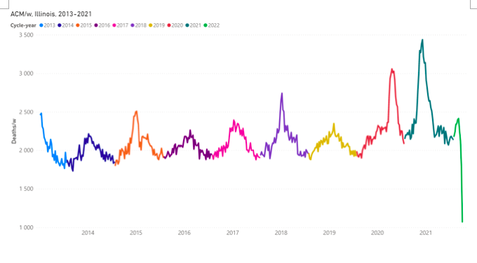
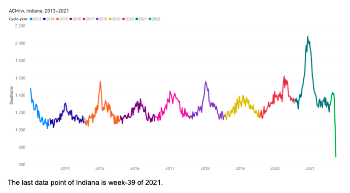
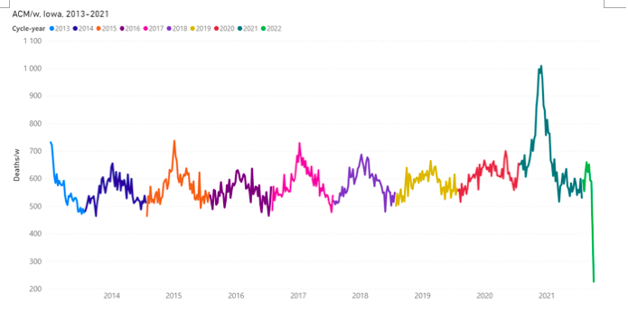
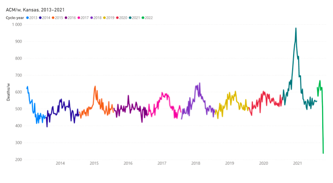
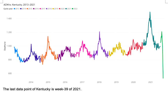
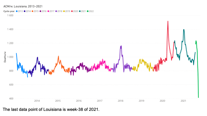
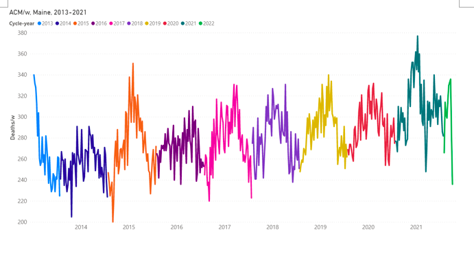
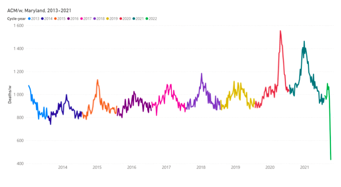
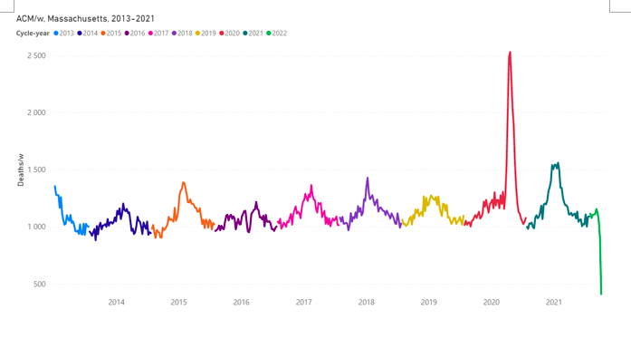
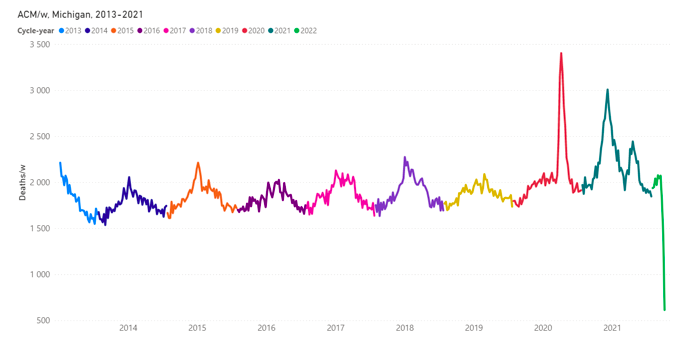
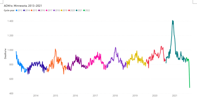
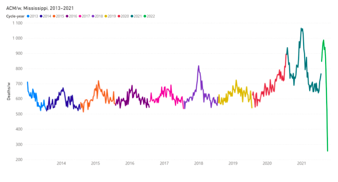
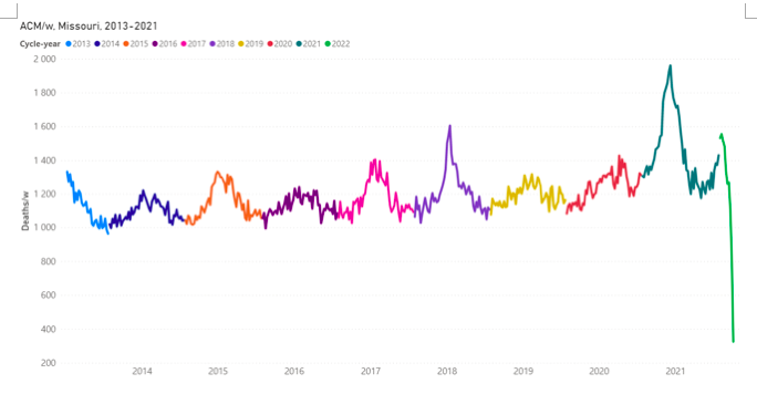
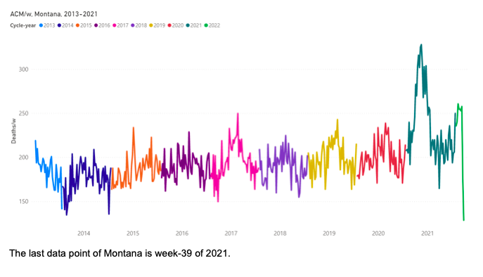
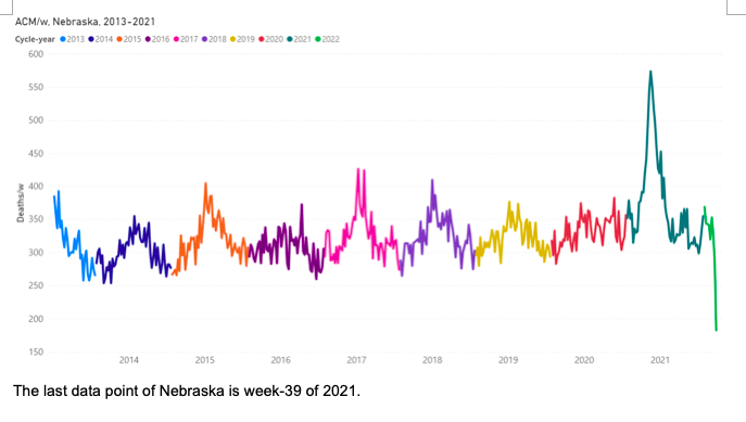
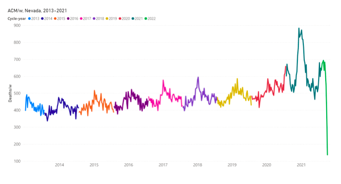
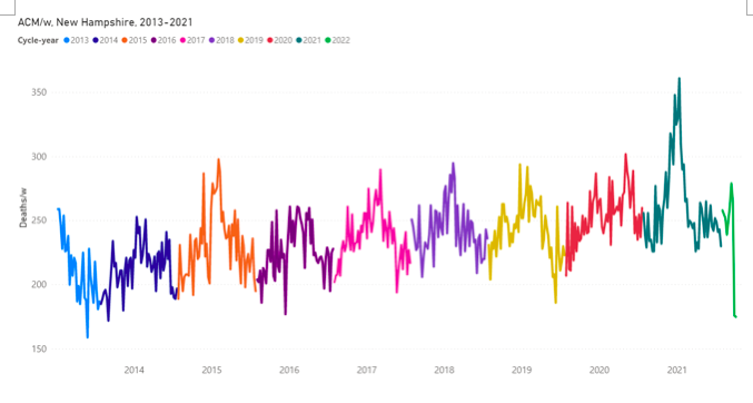
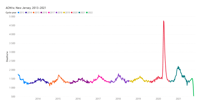
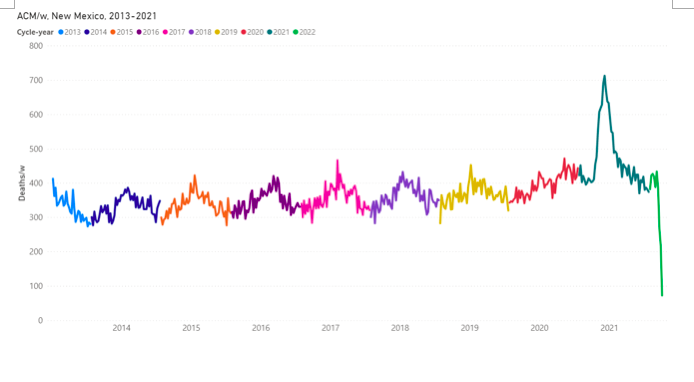
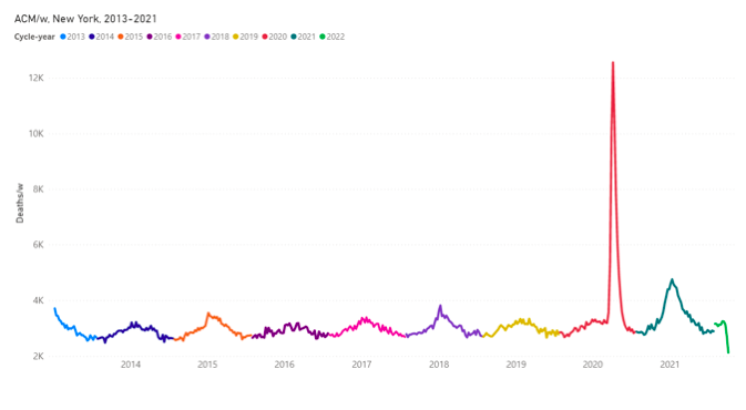
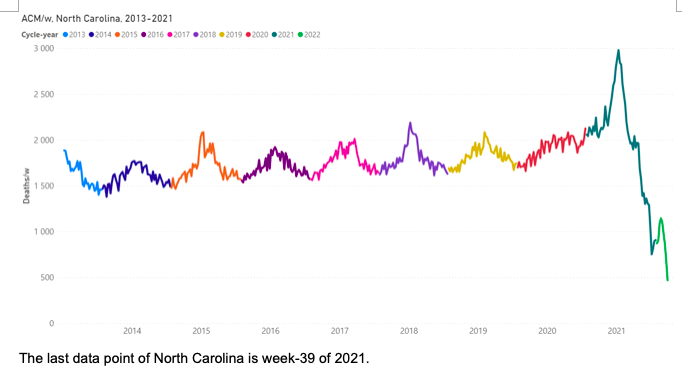
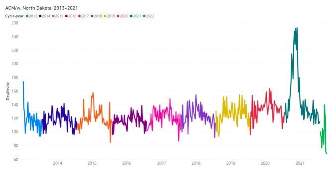
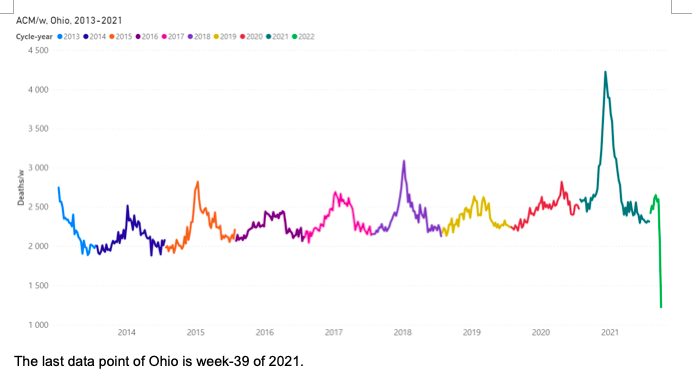
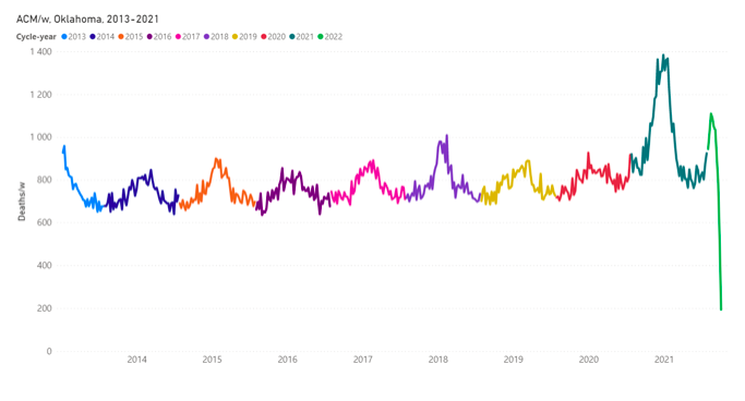
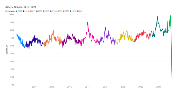

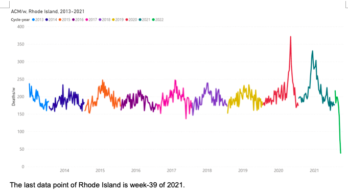
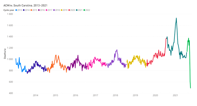
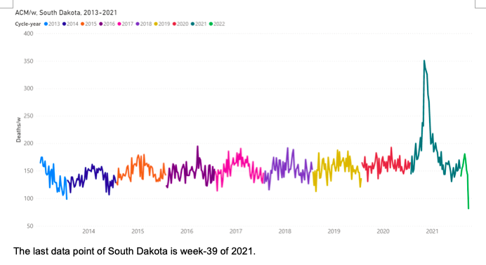
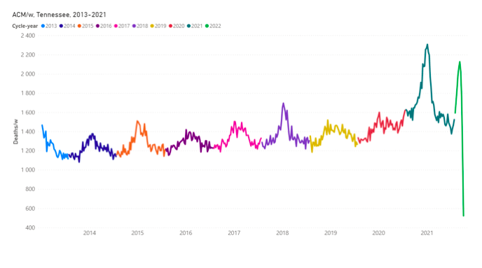
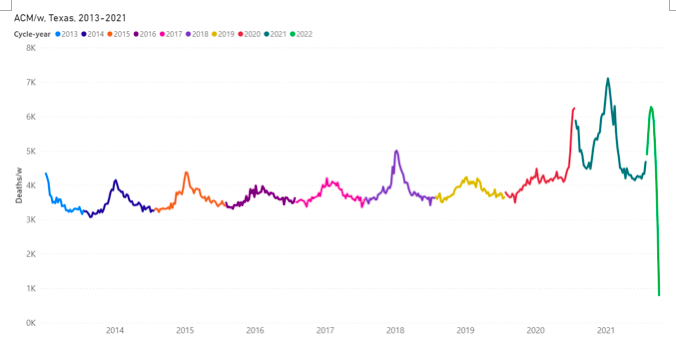
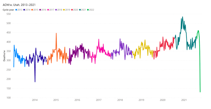
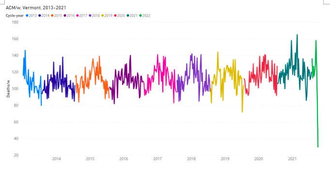
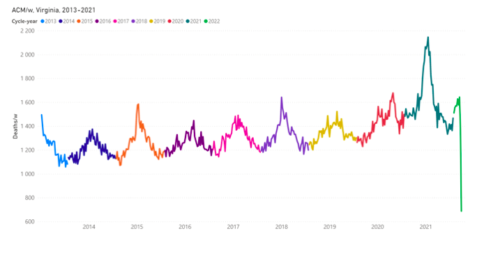
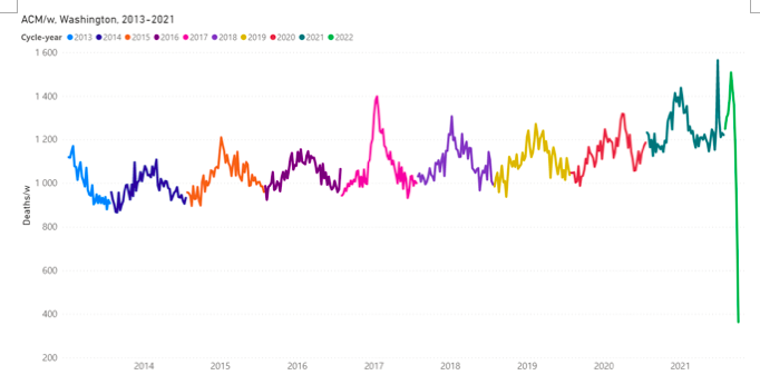
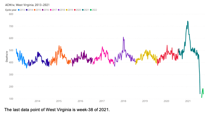
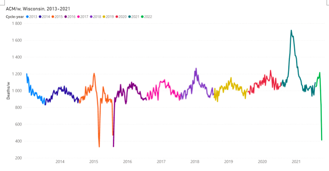
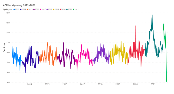
The original source of this article is Global Research
Copyright © Dr. Denis G. Rancourt, Dr. Marine Baudin, and Dr. Jérémie Mercier, Global Research, 2021


 and Derogate Fundamental Human Rights/By Mojmír Babáček")

/ By Basma Qaddour")


